Ombre walls are one of 2025’s most stunning paint trends—and they’re way easier to create than you’d think. If you’ve been staring at flat, one-note walls and craving something with visual interest and movement, gradient painting delivers exactly that. The beauty of ombre effects is that they work in any room, any color combo, and any budget. You can go bold with sapphire blue fading to white, or keep it cozy with earthy clay tones melting into warm beige. This guide shows you 25 specific ombre techniques, color pairings, and application methods so you can pick the style that matches your space—and your skill level. Whether you’re a first-timer or ready to tackle something ambitious, you’ll find ideas that actually work in real homes.
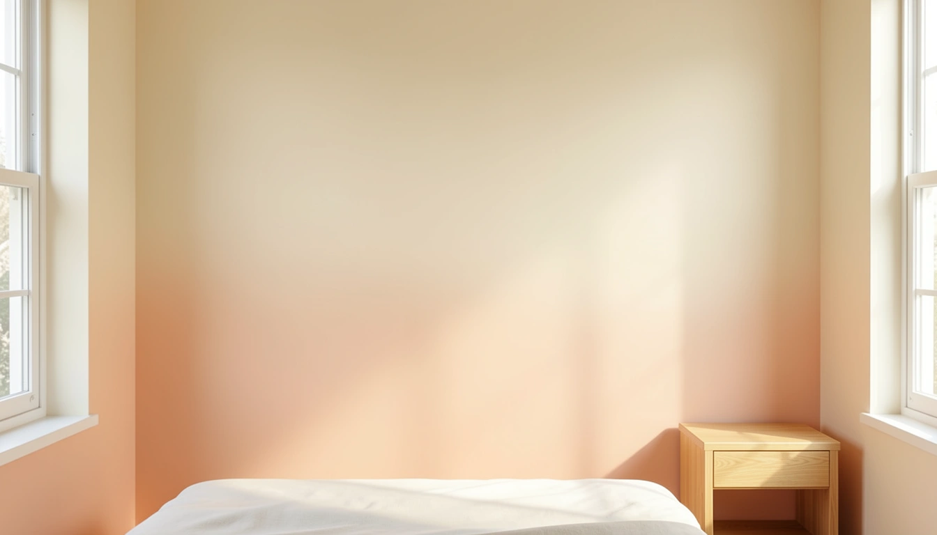
1. Soft Peachy to Cream Vertical Gradient
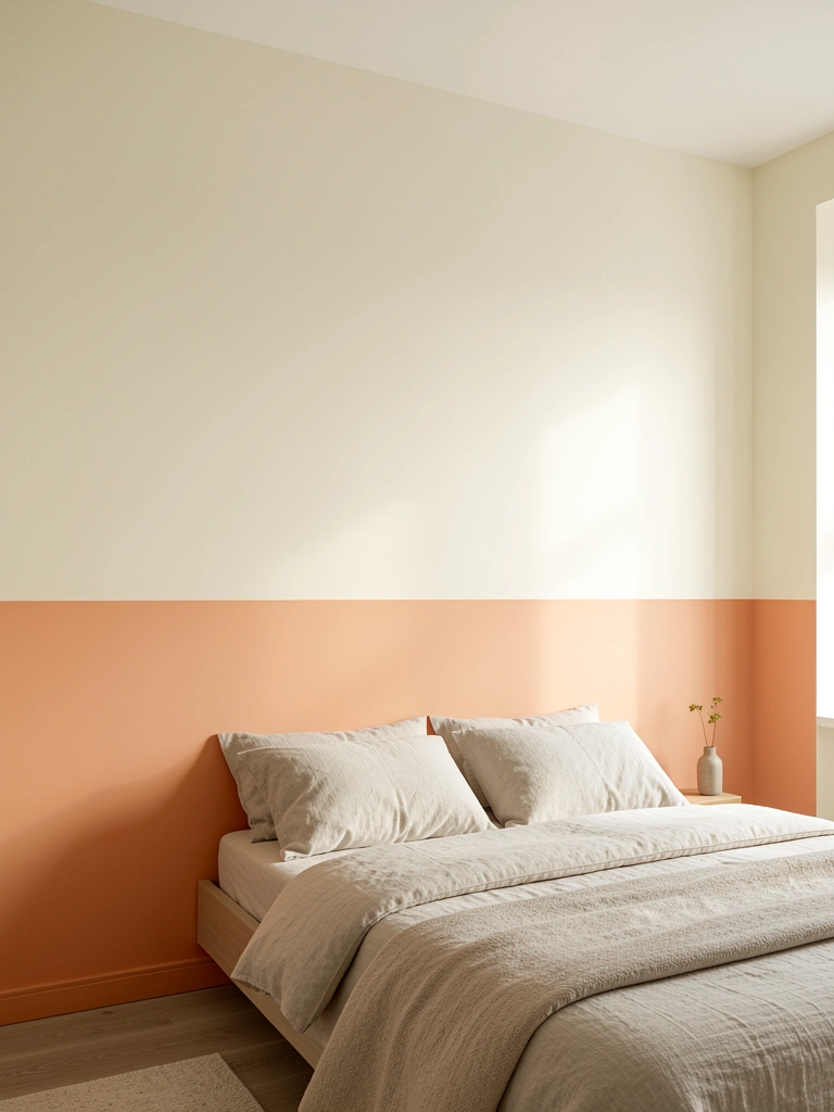
Vertical ombre creates height and draws the eye upward—perfect for rooms that feel cramped or low-ceilinged. Start with your darkest shade (peachy-orange) at the baseboard and gradually lighten as you move up, blending where colors meet.
Paint the bottom third with your base color using a roller ($12–18). Mix your middle tone on a palette, then apply it roughly in the middle section using a dry brush technique—blend edges where the two colors overlap by dabbing a slightly damp brush back and forth. Finally, paint the top third with your lightest shade (or white), feathering where it meets the middle tone. Work in sections and keep blending as you go—rough transitions are actually part of the charm. This takes one afternoon and requires only basic painting supplies from Home Depot or Amazon.
Your room feels taller, lighter, and way more intentional. The gradual color shift creates visual flow that static paint can’t match.
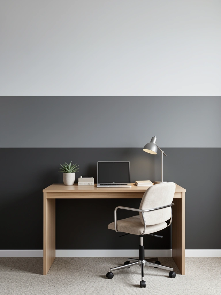
2. Deep Navy to Pale Gray Horizontal Ombre
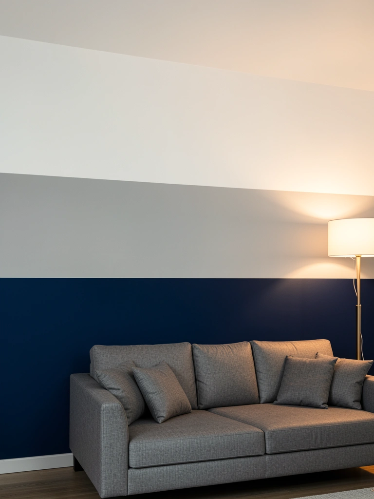
Horizontal ombre (the classic look) makes rooms feel wider and more open—ideal for smaller spaces or areas where you want breathing room. This navy-to-gray combo is moody without feeling cave-like.
Divide your wall into thirds with light pencil marks. Paint the bottom section with navy using a premium roller ($15–22) to avoid streaks. Mix your transitional gray shade and apply it to the middle section, using a damp sponge or brush to feather the overlap zone. Repeat with your lightest shade at the top. The key is overlapping colors while they’re still slightly wet—this creates that buttery gradient instead of harsh lines. Budget: $30–50 total for paint and supplies. Time: 2–3 hours.
The result is sophisticated depth that photographs beautifully and makes your seating area feel like a retreat.
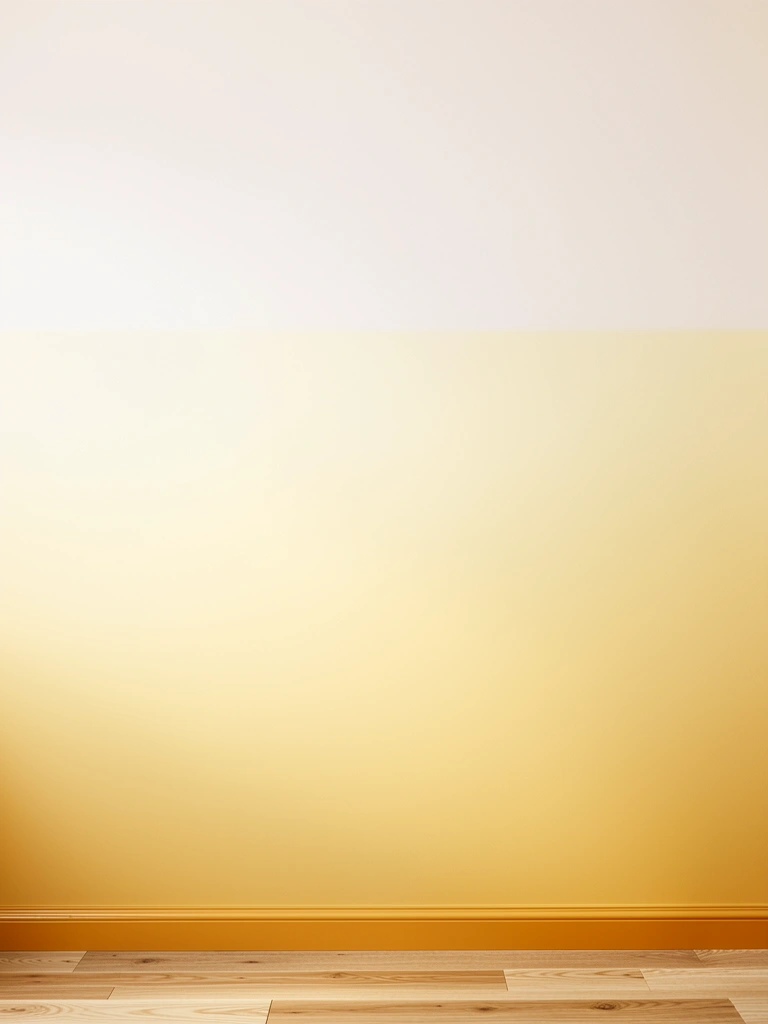
3. Burnt Orange to Warm Gold Sunset Effect

This warm color story mimics a real sunset and brings cozy energy to any room. It’s bold enough to feel intentional but grounded in earthy tones, so it never looks overwhelming.
Start with Benjamin Moore’s Burnt Orange (or similar: Sherwin-Williams Heartthrob) at the base. Transition through a warm amber middle (mix orange + yellow paint 50/50), then finish with soft yellow or cream at the top. Use a blending brush ($8–12) specifically for ombre work—the soft bristles prevent harsh lines. Apply your base color first, then while it’s still slightly tacky, apply your transition color and use gentle circular motions to blend. Repeat with your top shade. This technique works best with warm lighting (think Edison bulbs or warm white LEDs) that enhances the gradient’s glow.
Cost: $40–60 for quality paint. Weekend project. You’ll get compliments on how sophisticated and intentional your space feels—no one will guess you did it yourself.
4. Emerald Green to Soft Sage Biophilic Blend
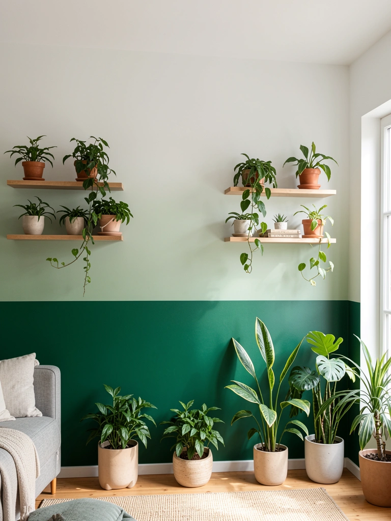
Deep emerald fading to pale sage connects your space to nature while staying balanced—this is modern biophilic design without feeling heavy. It’s perfect if you want drama paired with calm.
Choose deep emerald (Benjamin Moore Silhouette or Sherwin-Williams Evergreen Fog base) and soft sage (pale greens like Healing Aloe). Paint your bottom third with emerald, middle third with a medium sage created by mixing your two shades, and top with pale sage. The blend should feel organic—think of tree foliage getting lighter toward the sky. Use a soft sea sponge ($6–10) to dab and blend rather than brush stroke with precision. This creates a more natural, less “perfect” look that actually reads as higher-end. Total cost: $45–65. Time: 3–4 hours including drying between layers.
Your space immediately feels grounded and connected to nature, even in a small apartment or urban home.
5. Dusty Rose to Blush Pink Minimalist Gradient
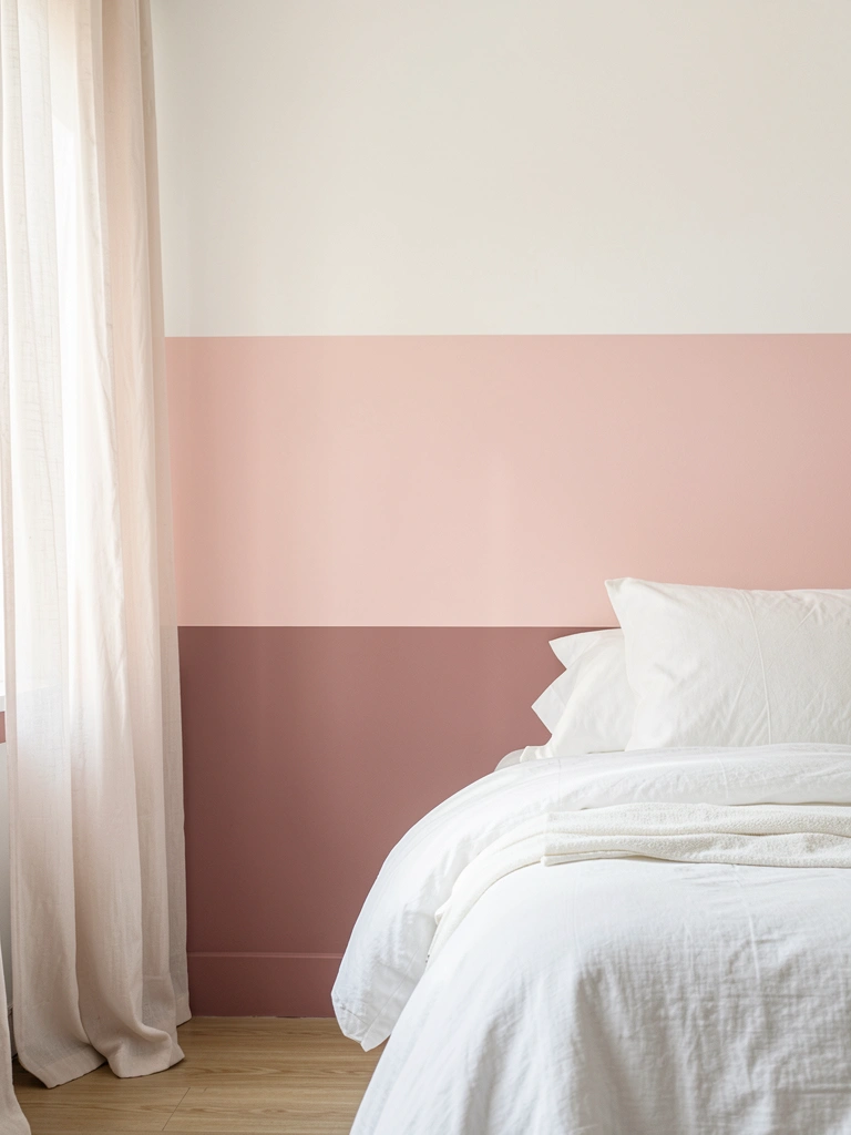
Soft pinks and roses are everywhere in 2025 design, and a subtle gradient version feels fresh instead of childish. This works beautifully in bedrooms, powder rooms, or any space where you want gentle sophistication.
Start with a quality dusty rose base color (Benjamin Moore’s Cinnamon Slate has pink undertones—or try Sherwin-Williams Weathered Peach). Transition to blush pink, then nearly white. The trickier part is keeping the colors from looking muddy during blending. Use a dry brush blending technique with a natural-bristle brush ($10–15)—apply your colors, then use a clean, barely-damp brush to feather the edges without over-working them. Pro tip: Work in small sections (2–3 feet at a time) so you don’t dry-blend too much. Paint cost: $35–50. Weekend project, 2–3 hours.
The finished wall feels calming and polished, like a luxury hotel or spa. Visitors will assume you hired a professional.
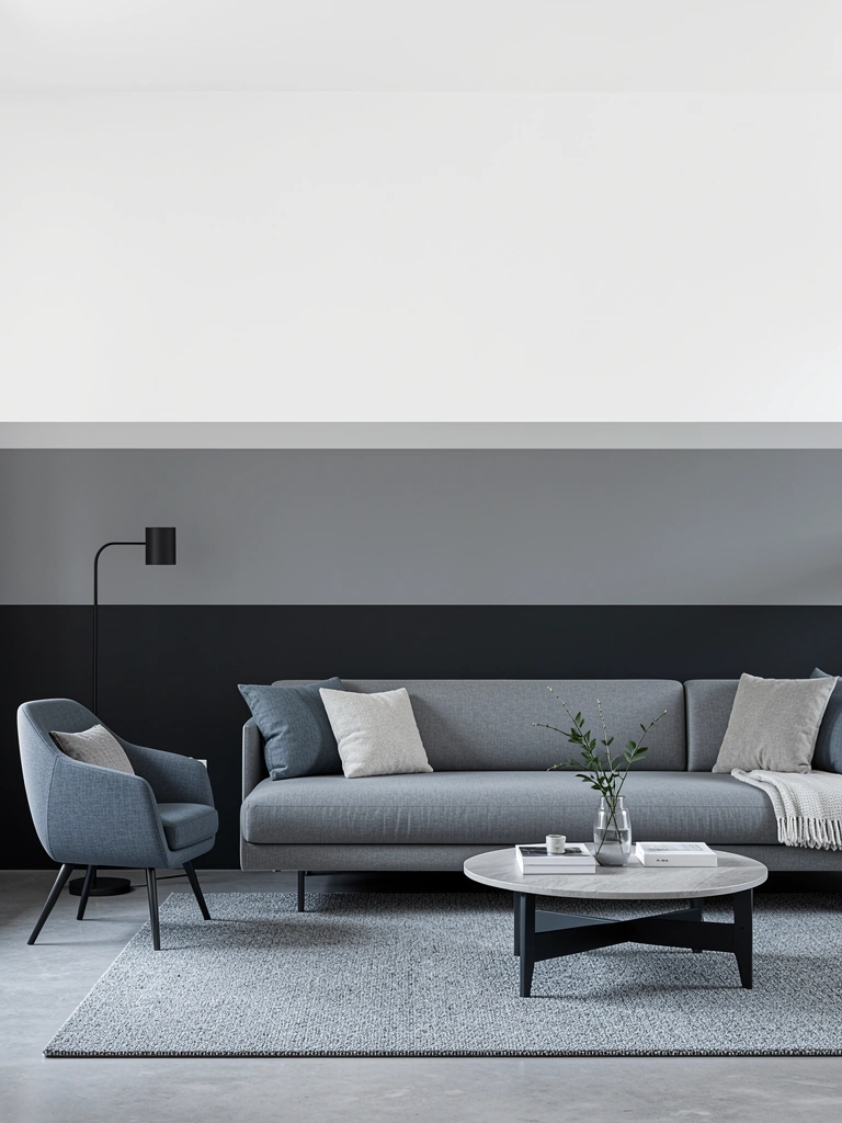
6. Charcoal Gray to White High-Contrast Drama
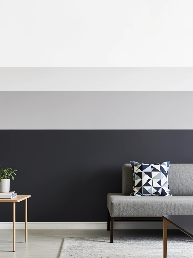
High-contrast ombre creates bold visual impact and works especially well in modern, industrial, or minimalist spaces. The sharp transition from dark to light makes a real design statement.
Paint your bottom half with deep charcoal gray (Sherwin-Williams Iron Ore or similar). For the middle transition zone, mix your charcoal 50/50 with white to create medium gray. Top with pure white. Instead of soft blending, create slightly visible transitions—this is intentional and looks contemporary rather than sloppy. Use a quality angled brush ($12–18) and work horizontally in overlapping strokes. Keep your transitions fairly tight (blended over 6–12 inches rather than 2–3 feet). Budget: $40–55. Time: 2–3 hours.
The result looks gallery-quality and adds architectural interest without any structural changes.
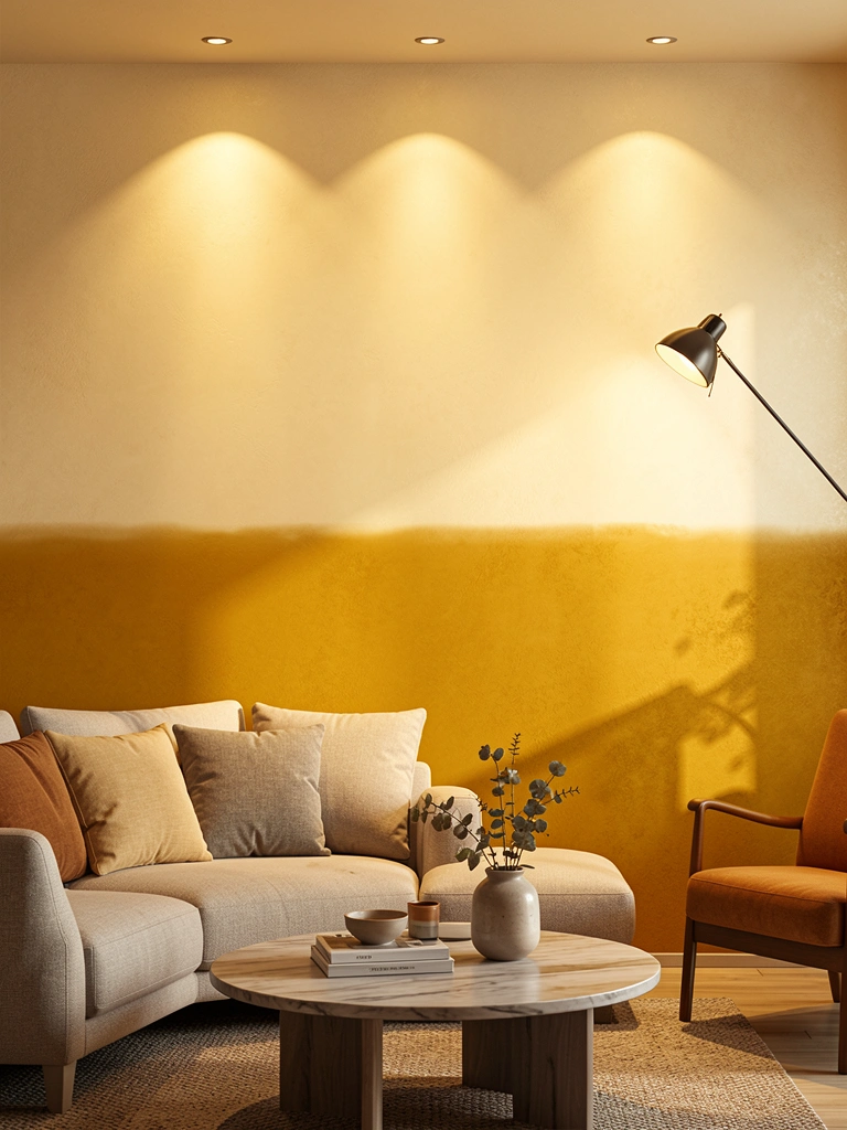
7. Mustard Yellow to Cream Warm & Inviting
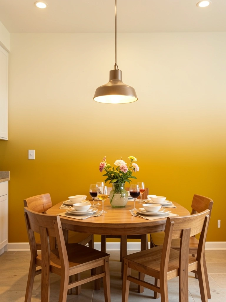
Mustard is one of 2025’s hottest accent colors, and an ombre treatment keeps it from feeling too heavy in a full room. This is perfect for kitchens, dining rooms, or entryways where you want energy without overwhelm.
Apply a base coat of mustard yellow (try Sherwin-Williams Earnest Gold or Benjamin Moore Golden Honey). Create a transitional beige by mixing mustard + white + a touch of brown, then apply to your middle section. Finish with soft cream or off-white. The key with warm colors is feathering generously—use a soft blending brush or sponge ($8–12) with light pressure. These colors blend more easily than cool tones, so avoid over-working or you’ll lose the gradient definition. Paint cost: $35–50. Afternoon project, 2–3 hours.
Your space feels warm, welcoming, and design-forward. Guests will comment on how thoughtful and pulled-together the room feels.
8. Cobalt Blue to Pale Blue Coastal Escape
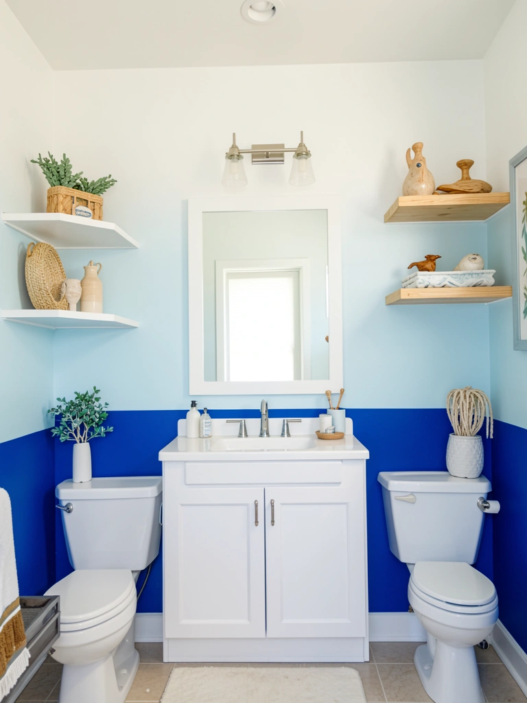
Cobalt ombre brings vacation vibes indoors and works in any room—bathrooms, bedrooms, kids’ spaces, or even home offices. The gradient makes it sophisticated rather than childish.
Start with cobalt blue (Sherwin-Williams Oceanside or Benjamin Moore Hale Navy as your base). Transition through sky blue (mix cobalt + white in stages), then finish with off-white. The challenge with blues is avoiding purple undertones during mixing. Add white gradually and test your transitions on poster board before committing to the wall. Use a lint-free roller ($15–20) for smooth application—cheaper rollers leave fibers. Work in overlapping horizontal strokes, blending as you go. Total cost: $40–65. Time: 3–4 hours.
Your bathroom or bedroom instantly feels like a coastal retreat. The ombre softens the boldness of cobalt while keeping the impact.
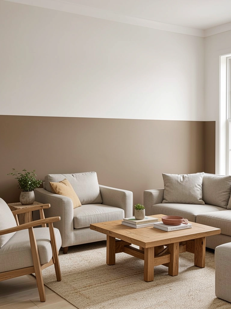
9. Warm Taupe to Beige Neutral Anchor Wall
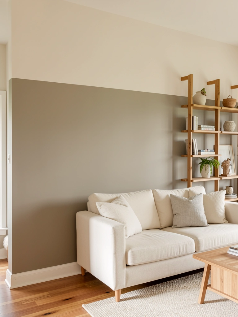
Taupe ombre is the sophisticated alternative to boring flat beige. It reads as intentional and high-design while staying universally complementary.
Paint your base with warm taupe (Sherwin-Williams Accessible Beige or Benjamin Moore Wheat Sheaf work beautifully). Transition through greige (warm gray-beige), then pale beige. These colors blend almost effortlessly since they’re all in the same family. Use a cheap foam roller ($5–8) to apply base color, then switch to a natural-bristle blending brush ($10–12) for transitions. Because these colors are so close in value, you’ll blend over larger areas (12–18 inches per transition zone). Paint budget: $35–50. Time: 2–3 hours, very beginner-friendly.
You get a high-end, professionally-designed look without bold commitment. The subtle gradient adds depth while keeping your space calm and versatile.
10. Deep Forest Green to Pale Mint Moody to Fresh
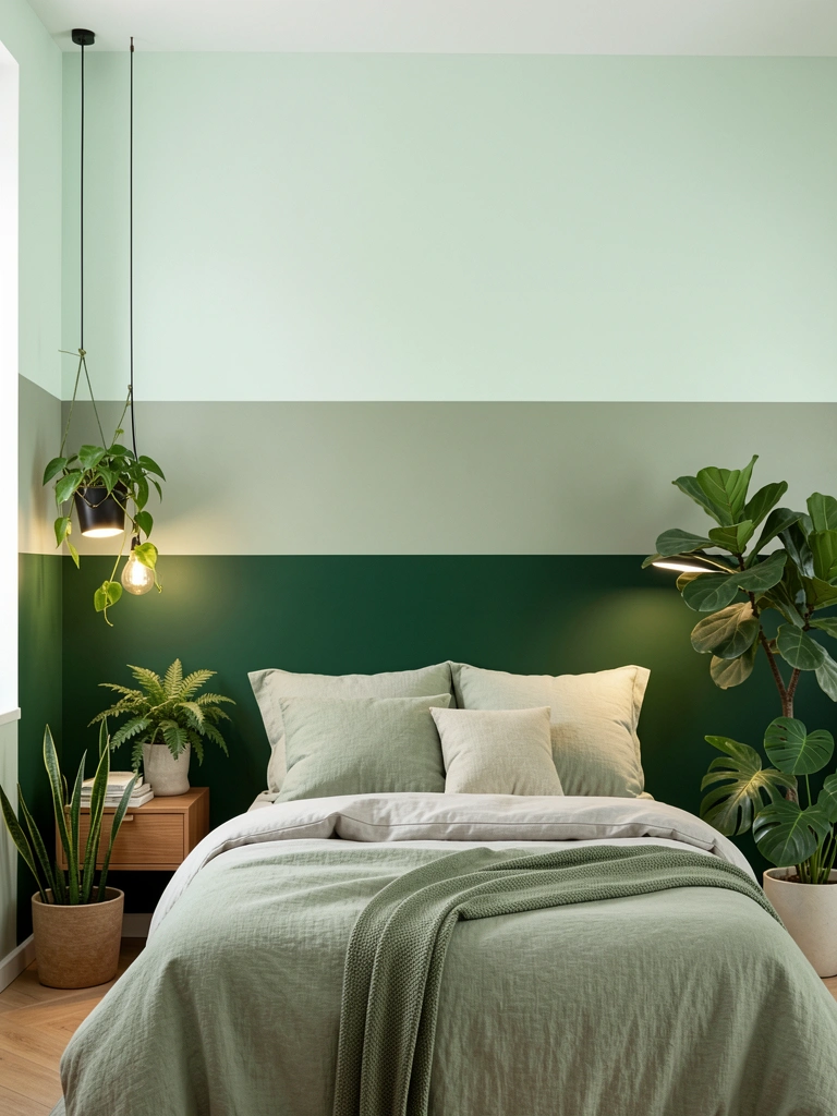
This gradient tells a nature story—from dense forest floor to spring leaves to fresh air. It’s on-trend for 2025’s emphasis on biophilic design and works beautifully in bedrooms or creative spaces.
Begin with deep forest green (Benjamin Moore Silhouette or Sherwin-Williams Evergreen). Mix a sage transition shade (about 40% green, 60% white), then finish with pale mint (mostly white with just a hint of green). Green is forgiving to blend because it’s easy to lighten gradually. Apply your base, then use a damp sea sponge ($6–8) to dab and feather your transition colors. Sponges create a more organic, natural feel than brushes. Total paint cost: $40–60. Weekend project, 3–4 hours.
The finished wall brings calm and sophistication—it feels like you’ve brought the forest indoors without making the room dark.
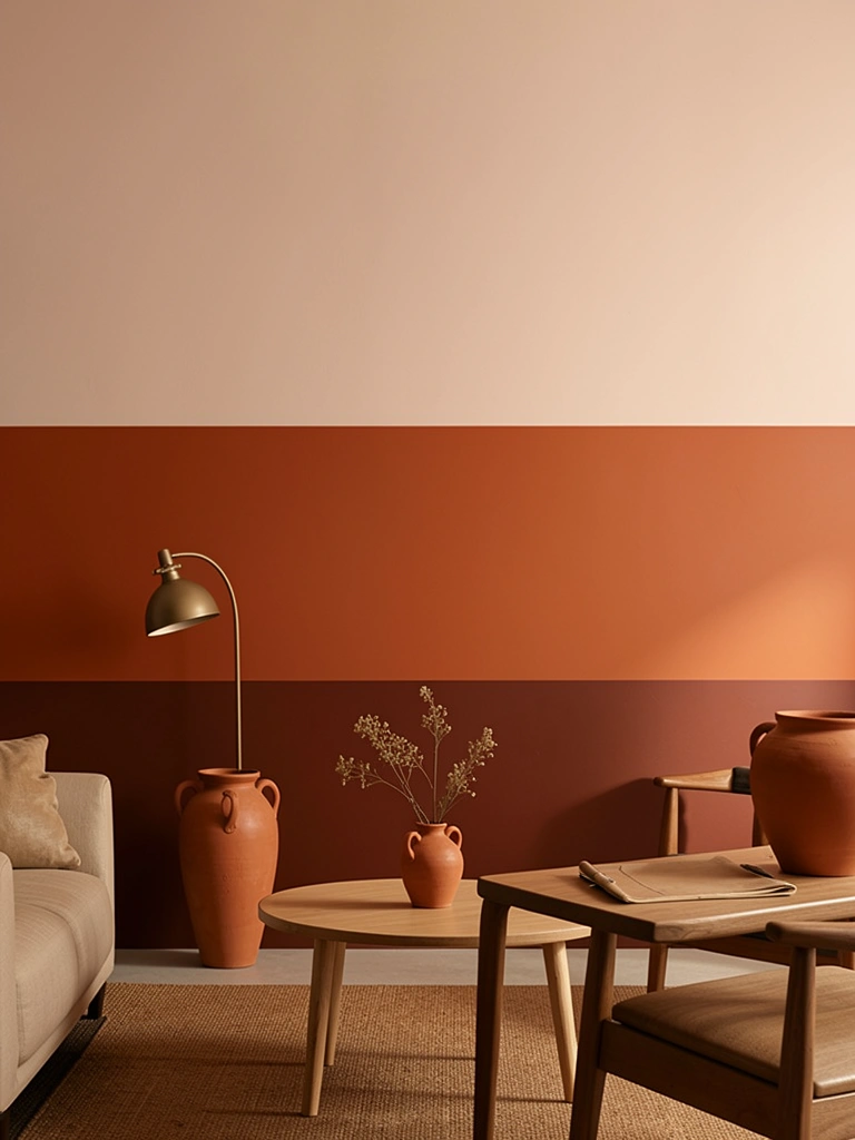
11. Terracotta to Peachy Sunrise Wall
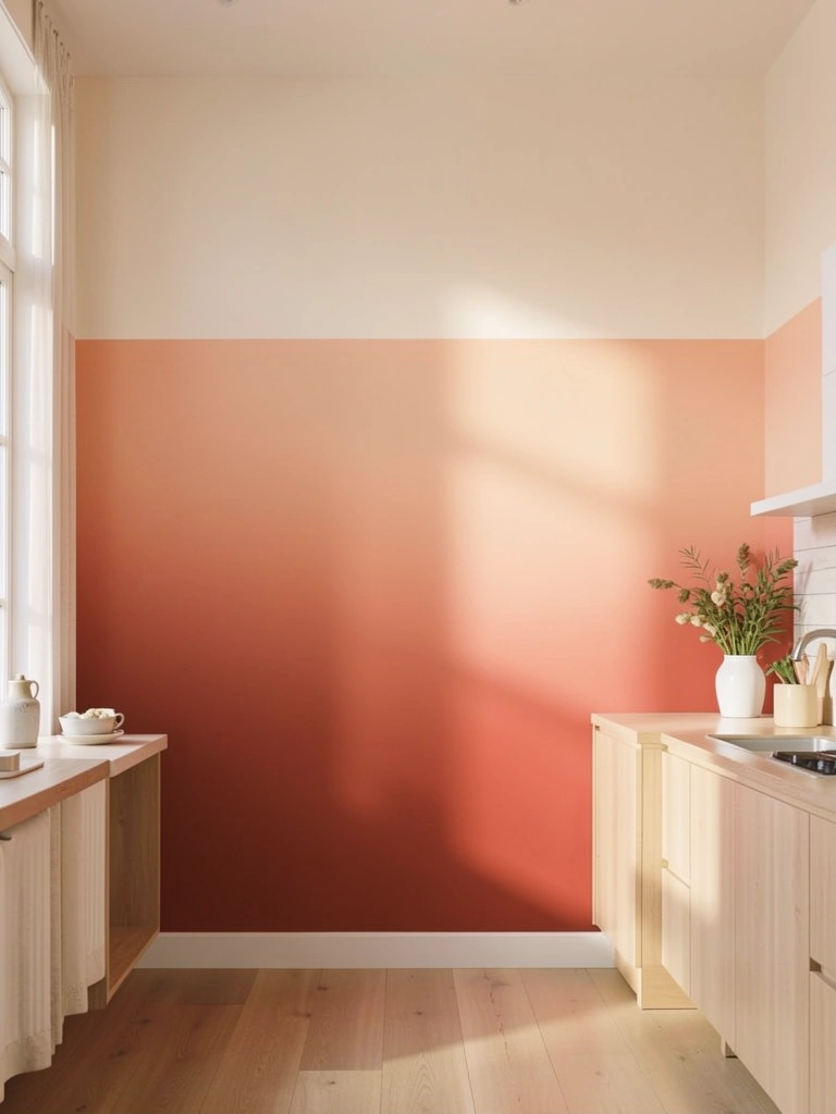
Terracotta ombre captures earthy, warm-country energy and complements both modern and rustic décor. This is 2025’s answer to the tired “coastal” look—more grounded and connected to earth tones.
Paint your base with deep terracotta (Sherwin-Williams Red Bay or a terra-cotta craft paint if budget is tight). Create your middle tone by mixing terracotta + a touch of yellow + white, then finish with soft peachy-cream. Use a premium angled brush ($12–15) for precise blending—cheaper brushes shed bristles into terracotta, which is visible. Work in horizontal strokes, slightly overlapping each row. Blend by using very light pressure with a clean, damp brush. Budget: $40–55. Time: 3 hours.
The wall feels warm, collected, and intentionally designed. Compliments are guaranteed, and it photographs beautifully on social media.
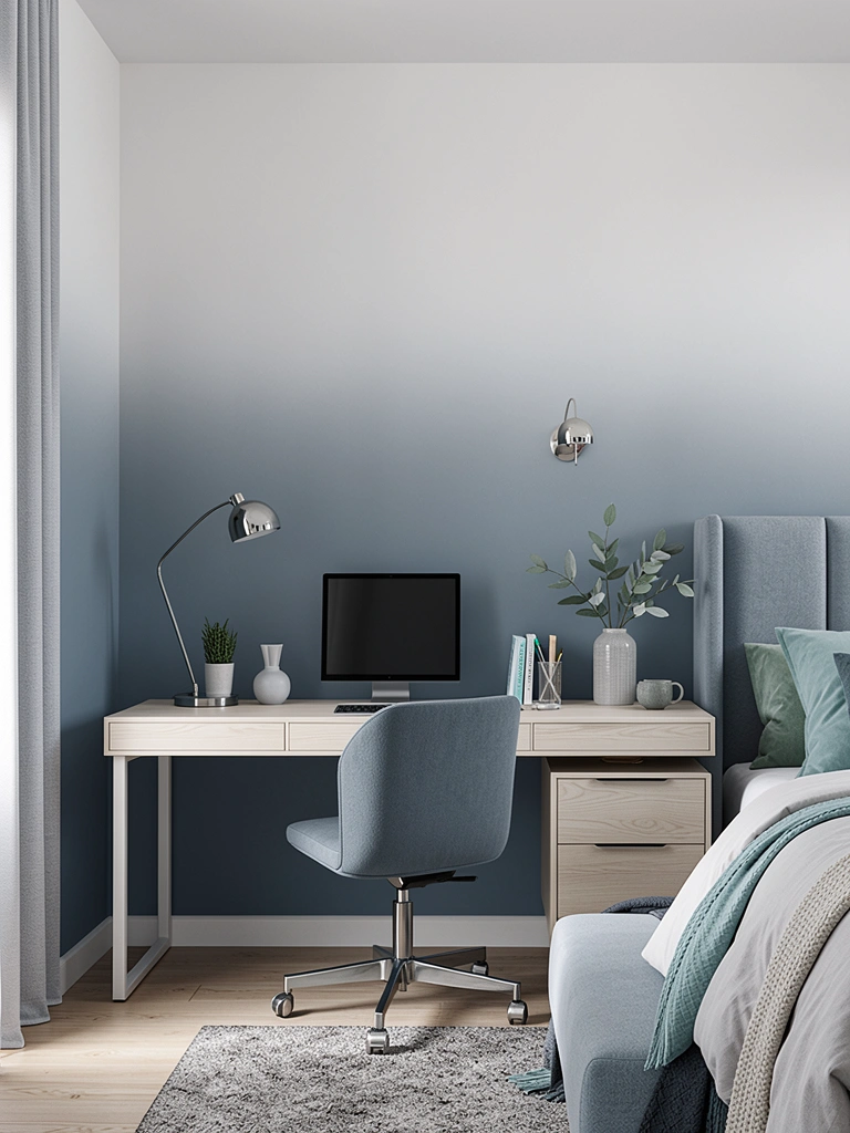
12. Sapphire Blue to Periwinkle to White Three-Tone
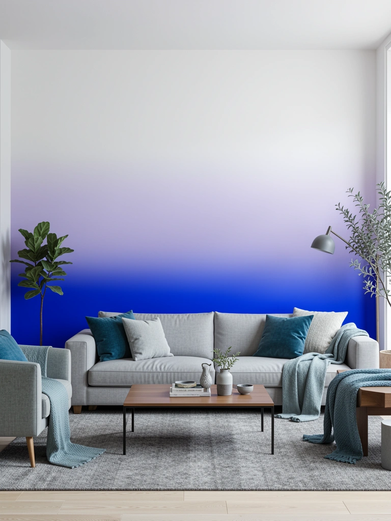
Three-color gradients are more forgiving than two-color ones because each transition zone is narrower, making mistakes less obvious. This sapphire-to-periwinkle combo is trendy and sophisticated.
Paint your base with sapphire blue (Benjamin Moore Royal Entrance or Sherwin-Williams Proper Blue). Your middle tone should be periwinkle—mix your sapphire 30% with white. Top with nearly-white. The advantage here is you have two transition zones instead of one, so you can work slowly and carefully. Use a blending sponge and work in small 2-foot sections. Let each section dry slightly (10–15 minutes) before moving to the next—this prevents over-blending. Paint cost: $45–65. Time: 4–5 hours over one weekend.
The result looks like a professional designer created it. The three-tone approach feels contemporary and intentional.
13. Charcoal to Steel Gray Monochromatic Sophistication
Monochromatic ombre (all one color family, different values) is the safest approach for nervous first-timers. You can’t go wrong because everything stays in harmony.
Choose your darkest shade—charcoal gray (Sherwin-Williams Urbane Gray or Benjamin Moore Onyx). Mix progressively lighter versions: medium gray (charcoal + 50% white), light gray (charcoal + 75% white), almost-white. Paint each section and blend with a soft natural-bristle brush using very light circular motions. Monochromatic gradients blend beautifully because there’s no color shift to manage, only value. Paint budget: $30–45. Time: 2.5–3 hours.
Your space feels calm, professional, and intentionally layered. The subtle depth adds visual interest without any risk of clashing.
14. Blush to Ivory Romantic Bedroom Gradient
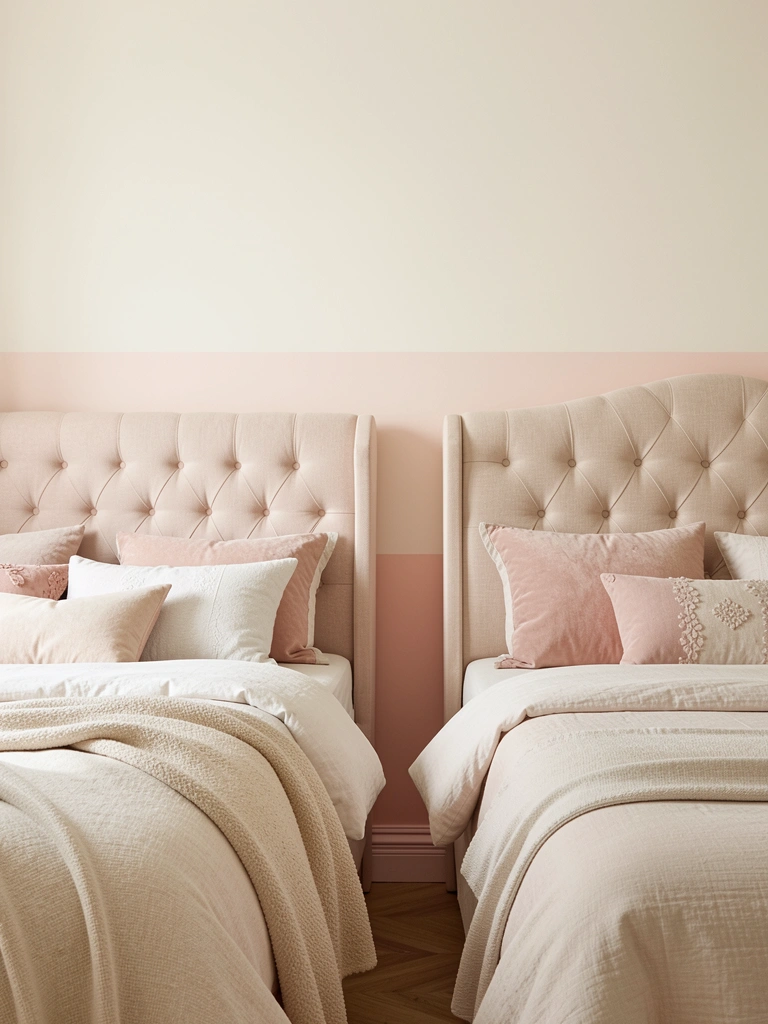
Romantic doesn’t have to mean frilly. A blush-to-ivory gradient is sophisticated, restful, and flattering in any lighting. This is perfect for master bedrooms or guest rooms where you want calm luxury.
Start with blush pink (Benjamin Moore Pink Attraction or Sherwin-Williams Blushing Rose). Transition through pale rose (blush + 40% white), finishing with ivory-cream. These soft colors blend almost automatically—the challenge is preventing them from looking washed out. Use a premium roller ($18–24) to apply each coat smoothly. Work in overlapping horizontal passes, then use a barely-damp blending brush to soften edges. The key is restraint—don’t over-blend or the colors blur together into beige. Paint cost: $40–55. Time: 2.5–3 hours.
Your bedroom feels like a sanctuary. The gentle gradient promotes rest and feels hotel-quality without being impersonal.
15. Burnt Sienna to Dusty Orange Clay Aesthetic
Clay-inspired earth tones are 2025’s answer to bland neutrals. This burnt sienna gradient brings warmth, depth, and an intentional art direction without shouting for attention.
Paint your base with burnt sienna (Sherwin-Williams Red Theatre or a craft-paint version). Mix your middle tone (sienna + orange + white), then transition to dusty peach (mostly white with orange undertone). These warm tones blend beautifully with a damp natural sponge ($8–10)—dab rather than stroke for an organic feel. Work in manageable sections and let each one rest 10–15 minutes before blending to the next. Budget: $35–50. Time: 3–4 hours.
The finished wall feels warm, collected, and intentionally designed—like it belongs in a curated home magazine.
16. Navy to Fog Gray Coastal Calm
Navy-to-gray ombre works beautifully in smaller spaces (bathrooms, powder rooms, bedrooms) where you want drama without feeling confined. The cooler gray transition keeps it from feeling too heavy.
Paint your base with navy blue (Benjamin Moore Hale Navy or Sherwin-Williams Naval). Your middle transition should lean gray—mix navy 40% with a cool gray. Finish with pale fog gray (cool undertones, not warm). Use a premium foam roller ($12–16) for the navy base (it requires good coverage), then switch to a blending brush for transitions. Cool colors can look muddy if overmixed, so blend carefully with light pressure. Paint cost: $45–65. Time: 3–4 hours.
Your space feels calm and intentionally designed. Visitors will ask if you hired a professional painter.
17. Ochre to Cream Golden Hour Glow
Ochre is 2025’s sophisticated alternative to mustard yellow—deeper, earthier, less trendy-feeling. An ombre treatment keeps it from overwhelming a room while maximizing its warm charm.
Start with golden ochre (Sherwin-Williams Rookwood Dark Green actually reads ochre, or mix a custom shade using yellow-brown base). Transition through light ochre (ochre + white), finishing with cream. Ochre can be tricky to blend because it has both yellow and brown undertones—mix your transition color carefully on a palette before applying. Use a soft blending brush ($10–14) with the lightest touch possible. Paint cost: $40–60. Time: 3–4 hours.
The wall glows warmly without feeling dated. It reads as intentional and well-researched in design—not just a random wall color.
18. Sage Green to White Airy Botanical
Soft sage is the most renter-friendly green gradient—it’s not too bold, pairs with anything, and makes rooms feel immediately calmer. This works in any space and with any décor style.
Paint your base with soft sage (Benjamin Moore Palladian Blue or Sherwin-Williams Sea Salt). Transition through very pale sage (sage + 70% white), finishing with near-white. Sage blends smoothly because it’s already a light, muted shade. Use a basic foam roller ($8–10) and your favorite blending brush ($8–12). Work in large overlapping sections—sage is forgiving, so don’t worry about perfect transitions. Paint budget: $30–45. Time: 2–3 hours. Beginner-friendly.
Your space feels peaceful and intentionally designed. The gradient adds dimension while keeping the room open and airy.
19. Deep Plum to Lavender Feminine Edge
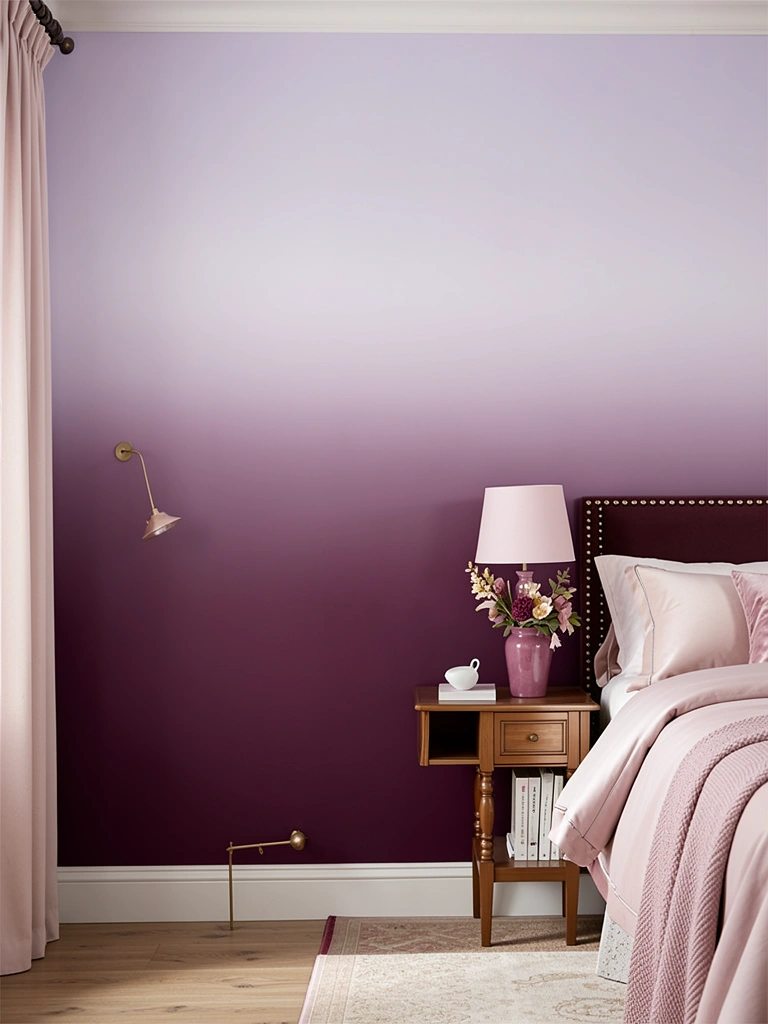
Plum-to-lavender is on-trend (Benjamin Moore’s 2025 Color of the Year, Cinnamon Slate, has plum undertones) and surprisingly versatile. This gradient feels sophisticated and artistic without being juvenile.
Paint your base with deep plum (Benjamin Moore Silhouette or Sherwin-Williams Purple Passage). Mix your transition shade (plum + white + touch of pink), then finish with pale lavender. Purple can lean blue or pink depending on your mixing—test on poster board first. Use a high-quality blending sponge ($10–12)—it handles purple’s complexity better than brushes. Work slowly in small sections, feathering generously. Paint cost: $45–65. Time: 4–5 hours.
The result is refined and artistic. Your space feels curated and thoughtfully designed—people will assume you work in interior design.
20. Copper to Rose Gold Metallic-Inspired Gradient
Metallic-inspired gradients are 2025’s way to add glam without full metallic paint (which can be overwhelming). This copper-to-rose-gold combo reads elegant and current.
Use metallic copper paint (many brands make copper for crafts—or use Benjamin Moore’s copper-toned Burnt Orange as a base). Your middle tone should be rose-gold (copper + touch of pink + white). Finish with soft cream. Metallic paints apply differently than matte—use smooth, deliberate strokes with a premium roller ($18–25). Blend transitions carefully because metallics can show overlap lines. Let each section dry before moving to the next. Budget: $50–75 (metallic paint costs more). Time: 4–5 hours.
Your accent wall looks upscale and gallery-worthy. The subtle metallic sheen catches light beautifully, adding luxury without tackiness.
21. Slate Blue to Silver-Gray Contemporary
Slate blue is 2025’s moody-but-not-dark choice for people who want drama without heavy feelings. The silver-gray transition feels modern and architectural.
Paint your base with slate blue (Benjamin Moore Hale Navy mixed lighter, or Sherwin-Williams Slate talk). Your middle transition should be cool silver-gray (slate + 50% white + touch of blue to keep it cool). Finish with silver-white (white + tiny bit of gray for warmth prevention). Use a premium blending brush ($12–16) and work in careful, methodical horizontal strokes. Cool colors can look harsh if blended too sharply, so aim for 12–18-inch transition zones. Paint cost: $40–60. Time: 3–4 hours.
Your space feels sophisticated and contemporary. The ombre adds visual interest while keeping the room calm and focused.
22. Warm Taupe to Stone White Versatile Neutral
This is the safe-bet gradient that works with literally any décor style and doesn’t date. Perfect for people who love subtle design changes without risk.
Paint your base with warm taupe (Sherwin-Williams Accessible Beige or Benjamin Moore Stucco). Transition through light taupe (taupe + 60% white), finishing with stone-white. These earth-neutral tones blend almost automatically and are very forgiving. Use a basic foam roller ($8–10) and any blending brush you have—this project is hard to mess up. Work in large overlapping sections. Paint budget: $30–45. Time: 2–3 hours. Perfect for beginners.
Your wall looks polished and intentional while staying universally complement to any furniture you add later. This is the “I can’t go wrong” option.
23. Claret Red to Dusty Rose Moody Romance
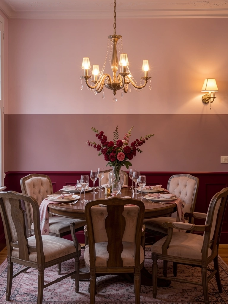
Deep reds intimidate people, but a claret-to-rose ombre keeps the drama while softening the intensity. This works beautifully in dining rooms, bedrooms, or powder rooms.
Start with claret red (Benjamin Moore Caliente or Sherwin-Williams Fine Wine). Mix your transition shade (claret + white + touch of pink to prevent brownish mudiness), then finish with dusty rose. Red is the trickiest color to blend because it can turn brown or purple if overmixed. Test your transition color on poster board first. Use a soft blending brush ($10–14) with very gentle pressure. Apply your base color, then blend the middle tone while it’s still slightly wet. Paint cost: $40–55. Time: 4–5 hours.
Your space feels refined and intentionally designed. The gradient reads as confident design choice, not a mistake.
24. Charcoal to White Minimalist Statement
Charcoal-to-white ombre is the most striking option if you want visual impact. The high contrast makes a real design statement in contemporary or industrial spaces.
Paint your base with very dark charcoal (almost-black gray like Sherwin-Williams Urbane Gray mixed darker, or Benjamin Moore Black). Your middle tone is medium gray (charcoal + 50% white). Top with pure white. The high contrast means you can work with slightly sharper transitions—this reads intentional rather than sloppy. Use a quality angled brush ($12–18) and keep transitions to 8–12 inches. Each transition zone should show visible but blended color shift. Paint cost: $40–55. Time: 3–4 hours.
The wall becomes a focal point—architectural and striking. Your space feels gallery-quality and thoughtfully designed.
25. Golden Honey to Pale Yellow Warm Cheer
Golden honey ombre brings sunshine indoors without the artifice of straight yellow. Perfect for kitchens, dining rooms, or any space where you want warmth and welcome.
Paint your base with golden honey (Sherwin-Williams Earnest Gold or Benjamin Moore Golden Honey). Transition through pale yellow (honey + 60% white + touch of cream), finishing with off-white. These warm colors blend easily but can look flat if you don’t add dimension through careful lighting. Use a soft foam roller ($10–14) for the base, then blending brush ($8–12) for transitions. Work in overlapping horizontal strokes and blend while paint is still slightly tacky. Paint cost: $35–50. Time: 3–4 hours.
Your space feels warm, welcoming, and intentionally designed. People gravitate toward rooms with this kind of golden warmth.
26. Seafoam to White Beach House Fresh
Seafoam ombre is the ultimate beach-house-without-commitment gradient. It’s trendy enough to feel current but timeless enough that you won’t tire of it.
Paint your base with seafoam green (Sherwin-Williams Sea Salt or Benjamin Moore Palladian Blue with green undertone). Transition through very pale seafoam (seafoam + 70% white), finishing with nearly-white. Seafoam blends beautifully and is incredibly forgiving. Use a basic foam roller ($8–10) and any blending brush ($8–12). Work in large overlapping sections—seafoam’s pale nature means you have built-in forgiveness for imperfect blending. Paint budget: $30–45. Time: 2–3 hours. Beginner-friendly.
Your space feels breezy, coastal, and intentionally curated. Even small rooms feel larger and more open with this soft gradient.
SOFT CTA:
Save this post for your next wall project and pick one gradient that speaks to you. The best part? You can start this weekend with just paint, brushes, and two hours. Which ombre style are you trying first?
Leave a Reply