Author: Clara Bennett

  • How To Style Dark Kitchen Cabinets For A Designer Look

    How To Style Dark Kitchen Cabinets For A Designer Look

    I used to love dark cabinets until my kitchen felt heavy and gloomy. I’d stare at the room and not know where to start.

    Small choices made it look unfinished, like a missing design layer.

    This guide shows how to style dark kitchen cabinets so they read designed, not cavernous.

    How To Style Dark Kitchen Cabinets For A Designer Look

    This is the method I use every time a dark cabinet scheme feels flat. You’ll learn simple layering—contrast, metal, wood, and open space—so cabinets read intentional and designer-made, not heavy or unfinished.

    What You’ll Need

    Step 1: Add a light anchor to break up the darkness

    I start by introducing a light anchor—usually a white or marble-look tray—on the countertop. I place it where the eye rests, near the sink or stove, so the dark plane has a bright moment.

    Visually, the kitchen stops reading as one heavy block and gains a focal point. The cabinets instantly feel intentional because the eye has contrast to land on.

    People often miss scale: the tray should be proportionate to the counter run. Avoid overcrowding the tray; a plant, a small bowl, and one board is enough.

    Step 2: Choose warm metals and repeat them

    I swap or add hardware in a warm metal—brass or aged gold—so the dark surface reads warm instead of flat. I repeat that metal across pulls, faucets, and a light fixture when I can.

    What changes visually is rhythm: the metal ties disparate surfaces together and feels purposeful. It makes the cabinets look specified, not random.

    One insight I rely on is restraint: using the same metal in two or three spots is enough. Don’t mix four finishes; that’s the common mistake. Keep it simple and repeated.

    Step 3: Soften with wood and woven textures

    I layer in warm wood and a woven basket to soften the cabinets. I lean a cutting board against the backsplash, add a seagrass basket under an open shelf, and drape a linen towel over a rail.

    Visually, wood warms the composition and woven textures add a lived-in softness. The cabinets no longer dominate; they sit within a tactile story.

    People often forget scale: pick boards and baskets that echo the cabinet proportions. A mistake I see is adding too many small items—one large board reads better than three tiny ones.

    Step 4: Create breathing room with curated counters and open space

    I clear most countertops and curate small groups instead. I leave stretches of counter empty so the eye can rest. The curated group sits on the tray or a corner so it reads intentional.

    This stage visually introduces rhythm and balance. The dark cabinetry benefits from these pockets of negative space—they make the color feel deliberate instead of overwhelming.

    One insight: less is more. People often style every inch and end up cluttered. Avoid filling horizontal space just because it’s available.

    Step 5: Add layered light and a living touch

    I finish with layered light and greenery. I add a black matte or brass sconce for warmth and place a small potted plant where it catches morning light.

    Visually, the lighting brings depth and shows off the cabinet finish. The plant adds life and softens edges. Together they make the space feel comfortable and deliberate.

    Most people underestimate how lighting changes perception. The small mistake to avoid is relying solely on overhead light—layered sources give dimension.

    Mixing Metals Without Chaos

    I keep metals in a simple hierarchy: one primary metal, one supporting finish, and occasional black or chrome accents. That keeps the dark cabinets grounded.

    • Primary: pulls or faucet (choose warm or cool)
    • Supporting: light fixtures or drinkware
    • Avoid more than three finishes in sight

    Keeping It Lived-In, Not Staged

    I leave small signs of daily life: a tea towel, a well-used cutting board, a bowl of lemons. It reads finished without being brittle.

    Rotate items seasonally. Swap a plant for a bowl of oranges in winter. These tiny shifts keep the room feeling current and cozy.

    Quick Styling Refreshes That Work

    When I want a fast update, I change the hardware, swap in a lighter tray, or add one new plant. These moves give immediate impact.

    • Hardware swap: biggest visual shift
    • One new texture: linen or seagrass
    • Adjust lighting: add a small sconce or under-cabinet lamp

    Final Thoughts

    Start with one change.

    Swap the hardware or add a light countertop vignette. I find a small marble tray, a plant, and a wooden board calms the mood and makes the cabinets feel planned.

    Take it slow. You’ll end up with a kitchen that feels intentional and comfortable, not heavy or fussy.

  • 24 Stunning Dark Kitchen Cabinets Ideas For A Modern Home

    24 Stunning Dark Kitchen Cabinets Ideas For A Modern Home

    I finally stopped being afraid of dark cabinets. They made the kitchen feel anchored, not heavy.

    I learned to balance them with light counters, warm wood, and the right lighting.

    These choices grew from mistakes — wrong pulls, glossy paint, too-small rugs — and from living with what actually works.

    24 Stunning Dark Kitchen Cabinets Ideas For A Modern Home

    These 24 ideas are hands-on, lived-in approaches for dark kitchen cabinets.

    They show finishes, hardware, color pairings, and lighting that I actually used.

    Follow along — there’s a practical option for small and large kitchens alike.

    1. Matte Black Cabinets with Warm Wood Open Shelves

    I painted my lower cabinets matte black and added oak floating shelves above the sink. I love that the shelves warm the space and keep things within reach.

    At first I overstuffed them and it looked cluttered. I edited down to cookbooks, a couple of bowls, and herbs.

    Visually, the mix reads modern and cozy. Keep shelf spacing even and show a few objects at different heights.

    What You’ll Need for This Look

    2. Deep Green Cabinets with Brass Pulls and Marble Counters

    I went with a deep hunter green for all lower cabinetry and added brass pulls. The marble counters keep things light and feel luxurious without being showy.

    My first mistake was cheap drawer pulls that tarnished quickly. I replaced them with solid brass and the room felt finished.

    Pay attention to undertones — choose a green that reads warm if you have wood floors. The brass and marble brighten the palette.

    What You’ll Need for This Look

    3. Navy Islands with Black Perimeter Cabinets

    I painted my island a deep navy while keeping perimeter cabinets a matte black. The island becomes a focal point instead of everything disappearing into one dark plane.

    People assume dark equals small, but the navy breaks up the mass and adds personality.

    Use stools with lighter wood seats to create contrast. Keep the island hardware slightly different so it reads intentional.

    What You’ll Need for This Look

    4. Dark Wood Cabinets with White Subway Backsplash

    I lived with dark-stained wood cabinets for years and finally added a classic white subway backsplash. The tile gave the room instant brightness and rescued a heavy feel.

    I originally chose a high-gloss grout that looked dingy fast. Switching to a clean white matte grout made maintenance easier.

    This combo is timeless. Keep countertop edges simple and don’t over-accessorize the backsplash.

    What You’ll Need for This Look

    5. Black Cabinets with Warm Brass Lighting

    I swapped in warm brass pendants above the island and the black cabinets stopped feeling cold. The brass reflects light and adds a lived-in warmth.

    Keep the pendants proportionate—small fixtures disappear, oversized ones overpower.

    I like one warm metal as an accent; too many finishes fight. Brass worked with my wood floors and white counters.

    What You’ll Need for This Look

    6. Two-Tone Cabinets: Dark Base, Light Upper Cabinets

    I painted my lowers a charcoal and chose creamy uppers. The room immediately felt taller and less heavy.

    My mistake was matching white that clashed with older trim. I repainted the trim to a warm white and everything harmonized.

    This approach keeps drama low while keeping visual balance. Use consistent hardware to tie both colors together.

    What You’ll Need for This Look

    7. Dark Blue Cabinets with Patterned Rug Anchor

    I added a long patterned rug in front of my dark blue cabinets and it changed the kitchen’s energy. The rug adds texture and keeps my feet warm on cold mornings.

    Pick a rug that tolerates spills and has a low pile. I traded a delicate runner for an indoor-outdoor style after one too many stains.

    Let the rug pick up accent colors from towels or dishes for a cohesive look.

    What You’ll Need for This Look

    8. Black Cabinets with Brass Faucet and Accessories

    I installed a brass faucet against black lower cabinets and a white sink. The metallic accents made daily tasks feel a little nicer.

    I once bought a faucet that didn’t match my other brass. It had a different undertone and looked off. Test finishes together before buying.

    Brass warms black without making it flashy. Add a matching soap dispenser and towel ring for cohesion.

    What You’ll Need for This Look

    9. Dark Cabinets with Warm Wood Countertops

    I switched from cool stone to butcher block on my island and the dark cabinets felt friendlier overnight. Wood introduces warmth and shows less smudging.

    You do need to maintain it with oiling; I neglected it at first and learned to sand and oil annually.

    Butcher block works well with black or deep blue cabinets. Keep prep space sealed where you cut.

    What You’ll Need for This Look

    10. Integrated Open Shelving with Dark Cabinets

    I removed a couple of upper doors and installed open shelving between dark cabinets. It makes the kitchen feel lighter and gives me a place for everyday plates.

    My rookie move was over-styling the shelves. Real homes need function — I kept stackable bowls and everyday mugs front and center.

    Use a couple of baskets or bins on the lower shelf to hide clutter. Open shelving is beautiful but only if edited.

    What You’ll Need for This Look

    11. Dark Cabinets with White Shaker Uppers

    I paired dark lower cabinets with white shaker upper cabinets for a clean, modern look. It made my kitchen feel airy while keeping a grounded base.

    The contrast draws the eye up and highlights molding and trim. I added simple stainless pulls to keep it neutral.

    This combo works especially well in open-plan homes where the kitchen meets a light living room.

    What You’ll Need for This Look

    12. Dark Green Cabinets Paired with Terracotta Accents

    I loved the moody green but felt it needed earth. Terracotta pots and wooden boards did the trick.

    At first I used too many orange-toned items and it felt autumnal year-round. I swapped to muted terracotta and warm wood for balance.

    The greens read more modern with natural accents. Bring in a woven towel or clay vase and it feels collected.

    What You’ll Need for This Look

    13. Black Cabinets with White Marble and Brass Trim

    I layered black cabinetry with white marble counters and a thin brass trim on drawer edges. It looks curated but still lived-in.

    The marble brightens the surface, while brass lines feel intentional. I kept accessories minimal so the materials sing.

    If your marble has veining, let it be the star and pair with simple linens.

    What You’ll Need for This Look

    14. Dark Cabinets with Integrated Appliance Panels

    I paneled my fridge and dishwasher to match the dark cabinets. It made the kitchen read as a piece of furniture.

    My early fridge panel didn’t align perfectly and I learned to confirm hinge placement before ordering. Fit matters here.

    Integrated panels minimize visual clutter. If you entertain often, this creates a calm backdrop.

    What You’ll Need for This Look

    15. Dark Cabinets with Glass-Front Upper Cabinets

    I replaced some upper doors with glass-front ones to lighten the visual weight. It’s a chance to display favorite dishes.

    I made the mistake of showing every dish. Editing to a curated set made the space feel intentional.

    Use warm interior cabinet lighting to highlight the glass and add a glow in the evening.

    What You’ll Need for This Look

    16. Dark Cabinets with Light Grout and Tile Pattern

    I used a patterned tile with light grout behind a dark cabinet run. The tile lifts the whole wall and reads fresh.

    I once chose a grout that stained and regretted it. Picking a durable, slightly darker grout than pure white saved me headaches.

    Patterns add personality but don’t overwhelm if kept to the backsplash area only.

    What You’ll Need for This Look

    17. Dark Cabinets with Warm Wood Flooring Contrast

    I paired dark cabinets with warm oak floors and it grounded the kitchen beautifully. The wood grain keeps the space from feeling flat.

    If your floors are cool-toned, add a warm runner to bridge the temperature difference. I swapped in a rug to get the balance right.

    The contrast reads intentional and comfortable, and it hides scuffs better than pale floors.

    What You’ll Need for This Look

    18. Dark Cabinets with Brass Open Shelf Brackets

    I swapped black brackets for brass on open shelves and the tiny change made the shelving feel coordinated with my faucets and lights.

    At first I mixed finishes and it looked messy. Keeping the metal family consistent cleared visual noise.

    Brass brackets are small but punchy — they repeat the warm metal and make styling feel deliberate.

    What You’ll Need for This Look

    19. Dark Cabinets with Soft Linen Window Treatments

    I added airy linen curtains to the kitchen window near my dark cabinets. The soft fabric eased the contrast and added a domestic touch.

    Choose washable linens — kitchens are messy and I learned the hard way with dry-clean-only panels.

    Light-filtering linen gives privacy without heavy darkness. It makes the space feel edited and lived-in.

    What You’ll Need for This Look

    20. Dark Cabinets with Under-Cabinet Lighting Strips

    I installed LED under-cabinet lighting and it made dark cabinets functional at night. Tasks become easier and the countertop gains depth.

    My initial strip was too blue and made food look odd. I swapped to warm 2700K LEDs, which look natural with wood and brass.

    Choose dimmable strips so you can set the mood for evening.

    What You’ll Need for This Look

    21. Dark Cabinets with Warm Metal Mixed Accents

    I used a mix of brass and black metal accessories to layer interest against my dark cabinets. Mixing metals felt risky but looks collected when done sparingly.

    My tip: pick a dominant metal (mine was brass) and use darker metals as secondary accents.

    This keeps the look curated instead of chaotic. Small switches like a black utensil holder with brass spoons balance the scheme.

    What You’ll Need for This Look

    22. Dark Cabinets with Tall Pantry Styling

    I organized a tall pantry within dark cabinets using glass jars and labeled baskets. It feels calm and helps me shop less.

    I once tried clear plastic bins and they looked messy. Glass jars and matching labels make everything feel intentional.

    Group like items and keep daily snacks at kid-friendly height. A small step stool fits neatly inside the pantry.

    What You’ll Need for This Look

    23. Dark Cabinets with Statement Black Sink and Matte Fixtures

    I chose a matte black sink to sit against my dark lower cabinets. It reads modern and hides wear better than stainless.

    Early on I regretted a sink that scratched easily. I switched to a durable composite matte sink and it looks newer longer.

    Pair black fixtures with lighter countertops so the sink silhouette reads crisp.

    What You’ll Need for This Look

    24. Dark Cabinets with Curated Wall Art and Functional Hooks

    I used a small wall next to my dark cabinets for framed art and brass hooks for aprons. It makes the kitchen feel personal, not like a showroom.

    I once hung too many frames and it read cluttered. I pared back to two frames and a hook — simple and useful.

    Art brings warmth to dark cabinets. Pick pieces that reflect your everyday life.

    What You’ll Need for This Look

    Final Thoughts

    Dark kitchen cabinets can feel bold without being fussy. I learned to balance them with light surfaces, warm metals, and practical storage.

    You don’t need to copy everything. Pick one or two ideas here and live with them for a month.

    Start small, tweak as you go, and choose materials that will age well in real life.

  • 27 Trendy Black Kitchen Cabinet Trends To Refresh Your Space

    27 Trendy Black Kitchen Cabinet Trends To Refresh Your Space

    I finally stopped treating kitchen cabinets like a design experiment and started thinking about how we actually cook and live here.

    Painting our lower cabinets black was the turning point. It hid smudges and somehow made the whole room feel anchored.

    These ideas are from living with real pots, kids’ homework, and too much coffee. I’ll tell you what worked and what I returned.

    27 Trendy Black Kitchen Cabinet Trends To Refresh Your Space

    These 27 ideas are practical, lived-in ways to use black cabinets in real kitchens.

    I include lighting, hardware, paint, and styling tips you can actually buy and use.

    1. Matte Black Lower Cabinets with Warm Wood Island

    I painted our lower cabinets matte black and left the island in warm wood. The contrast grounded the space and hid scuffs where the kids sit.

    At first I picked satin paint and regretted it—glossier finishes show every fingerprint. Matte read as richer and more forgiving.

    Visually, the wood island keeps things cozy. The kitchen stopped feeling cold and started feeling lived-in.

    What You’ll Need for This Look

    2. Two-Tone: Black Base, White Upper Cabinets

    I switched to black lowers and white uppers to keep the room light. It’s practical—dirt we touch most is on lower cabinets.

    I underestimated how much trim paint would matter; getting a true white with warm undertones fixed a cool, sterile look.

    The result felt modern but still familiar. It’s a safe way to adopt black without losing brightness.

    What You’ll Need for This Look

    3. Black Cabinets with Brass Hardware

    I swapped cheap knobs for brass pulls and it felt like a small splurge that paid off. Brass warms black in a way chrome never did.

    I initially chose bright polished brass and it read too new. Brushed or aged brass felt more relaxed and blended with our wood tones.

    Hardware changed how I reached for drawers—it made the kitchen feel intentional, not afterthought.

    What You’ll Need for This Look

    4. Black Shaker Cabinets for a Modern-Farmhouse Feel

    I chose shaker doors in black to get a modern-farmhouse vibe without being too trendy. The paneling creates shadow and depth that flat doors don’t.

    My mistake was buying shallow shaker profiles that looked toy-like. A deeper profile reads more substantial and real.

    Shaker black feels timeless in my house. It’s clean but cozy when paired with open shelving or wood accents.

    What You’ll Need for This Look

    5. Mix Black Cabinets with Marble Countertops

    We paired our black cabinets with a marble-look countertop to keep things bright. The veining plays nicely against the dark paint.

    I chipped a slab edge by mistake and learned to handle samples carefully. Choose a honed finish if you cook a lot—less glare, fewer worries.

    Marble makes black feel elegant and intentional, not just dark.

    What You’ll Need for This Look

    6. Black Cabinets with Open Wood Shelving

    I opened up a section above the sink and installed wood shelves over black cabinets. It broke the heaviness and added everyday display space.

    I tried floating shelves too thin; they sagged under plates. Thicker, solid wood shelves were more forgiving and looked homemade in a good way.

    Open shelves forced me to tidy a bit more, but the payoff is a warmer, more personal kitchen.

    What You’ll Need for This Look

    7. Black Cabinets with Brass Faucet and Sink Fixtures

    I replaced our chrome faucet with a brass one and it instantly softened the black below. The combo feels curated and a little old-house.

    I ordered the wrong finish (too yellow) the first time. Brushed or satin brass reads better and hides water spots.

    Brass hardware and fixtures together create continuity that makes black cabinets feel warm, not stark.

    What You’ll Need for This Look

    8. Satin Black for a Slight Sheen That Cleans Easier

    I used satin black paint in our laundry-adjacent kitchen where fingerprints are constant. It hides smudges but reads richer than high-gloss.

    My early test swatches included a flat finish that showed marks. Satin was the compromise—easier to wipe but not shiny.

    Satin black feels modern and practical, especially if you’re not repainting yearly.

    What You’ll Need for This Look

    9. Black Cabinets with Patterned Tile Backsplash

    I added a patterned tile backsplash to break up the black field. Pattern brings personality and gives me something to stare at while washing dishes.

    I picked a tile with busy grout and regretted the extra scrubbing. Choosing a simple grout color made maintenance easier.

    Patterned tile made our black cabinets feel playful and intentional without changing the whole kitchen.

    What You’ll Need for This Look

    10. Black Cabinets Framed by Floor-to-Ceiling Windows

    Our kitchen has big windows and black cabinets read less heavy with all that light. Natural light is your best partner with dark finishes.

    I once painted a dark kitchen with small windows black and regretted it. Light or lighter counters prevent a cave feeling.

    If you have good light, black feels dramatic and cozy at once.

    What You’ll Need for This Look

    11. Full Black Cabinets for a Moody, Cohesive Look

    I tried full-wall black cabinets when my partner wanted moody. It can work if you keep countertops light and add warm wood or brass.

    My mistake: I used only cool materials and the room felt too cold. Bringing in wood and plants balanced it.

    Full black can read luxurious and calm if you commit to texture and warmth.

    What You’ll Need for This Look

    12. Black Cabinets with Integrated Lighting

    Adding under-cabinet lighting changed how I used the kitchen at night. Warm LEDs brought out wood tones against the black.

    I first installed cold white LEDs and hated the clinical feel. Swapping to warm temperature made everything feel like evening, not a lab.

    Integrated lighting makes black more usable and visually softer.

    What You’ll Need for This Look

    13. Black Cabinets with Glass Door Inserts

    I swapped a few upper doors for glass fronts to break up the black and give display space for favorite dishes.

    First I loaded them with mismatched mugs and it looked cluttered. Editing to a few curated pieces made the glass look intentional.

    Glass doors add depth and let light bounce around, so black feels less solid.

    What You’ll Need for This Look

    14. Black Cabinets with Brass Open Shelving Brackets

    I added brass brackets to open shelves and the hardware tied back to cabinet pulls. It felt cohesive and a little curated.

    I tried mismatched brackets and it looked scattershot. Matching metal finishes anchors the look.

    Brass brackets against black read purposeful and hand-made.

    What You’ll Need for This Look

    15. Black Cabinets with Leather Pulls for a Soft Touch

    I installed leather strap pulls on a few drawers to soften the black and add tactile warmth. They’re unexpectedly practical.

    I ordered super-thin leather and it frayed quickly. Thicker straps lasted and got better with age.

    Leather pulls make black feel approachable and worn-in, like an old favorite.

    What You’ll Need for This Look

    16. Black Cabinets Paired with Warm Terracotta Tiles

    We added terracotta floor tiles to offset black lower cabinets. The warmth is instant and hides crumbs.

    I initially tried a pale tile and it read too cool. Terracotta made the whole space feel more lived-in and cozy.

    It’s a confident pairing that feels earthy, not trendy.

    What You’ll Need for This Look

    17. Black Cabinets with Wood Slab Doors for Modern Warmth

    I used wood slab doors on the island against black perimeter cabinets for a modern yet warm mix. It felt balanced and less fussy.

    My first wood was too yellow. Choosing a medium, neutral wood tone solved the mismatch.

    Slab wood breaks up the black while keeping lines simple and modern.

    What You’ll Need for This Look

    18. Black Cabinets with Matte Black Appliances for Cohesion

    We matched matte black appliances to our cabinets to create a calm, unified wall. It’s subtle and makes the kitchen read like a piece of furniture.

    I once mixed stainless and black appliances and it felt disjointed. Consistency made the space feel intentional.

    Matte black appliances don’t scream trend—they quietly blend in.

    What You’ll Need for This Look

    19. Black Cabinets with Open Pot Racks and Hooks

    I hung pots on a rack above black cabinets. It made reaching for pans effortless and looked like the kitchen was used, not staged.

    I overpacked hooks at first and it read cluttered. Spacing matters—let pieces breathe.

    A pot rack makes black feel functional and homey.

    What You’ll Need for This Look

    20. Black Cabinets with Soft Textiles and Rugs

    I added a runner to soften the floor in front of black cabinets. Textiles warm the palette and collect crumbs where I can sweep them easily.

    I bought a delicate rug that stained. Choose a durable, washable material for a busy kitchen.

    A rug makes black cabinets feel comfortable, not formal.

    What You’ll Need for This Look

    21. Black Cabinets with Warm Pendant Lighting

    I added warm pendant lights over the island. Lighting is the jewelry for dark cabinets—it can make or break the mood.

    I installed pendants that were too small and they disappeared. Bigger scale pendants gave presence and coziness.

    Pendant lighting makes black feel curated and evening-friendly.

    What You’ll Need for This Look

    22. Black Cabinets with Minimalist Open Storage

    I pared down to a few open cubbies to keep essentials visible. Minimal open storage against black feels modern and accessible.

    I once used too many open shelves and it looked messy. Limiting what you display keeps it calm.

    Minimal open storage keeps black cabinets from visual overload.

    What You’ll Need for This Look

    23. Black Cabinets with Integrated Wine Store

    We added a wine nook into our black cabinetry and it became the room’s cozy corner. The contrast of wood racks and black fronts is quietly elegant.

    I tried vertical racks that wasted space. Horizontal racks use depth better and keep bottles accessible.

    A wine store nook makes black cabinets feel custom and personal.

    What You’ll Need for This Look

    24. Black Cabinets with Contrasting White Grout on Tile

    I used white grout with subway tile behind black cabinets for crisp contrast. It reads graphic and clean.

    At first I picked gray grout to hide dirt, but it dulled the tile. If you like graphic contrast, white grout pops.

    This look feels fresh and architectural next to dark cabinets.

    What You’ll Need for This Look

    25. Black Cabinets with Warm Open Display for Cookbooks

    I carved a little open display for cookbooks into the black run. It adds personality and a human touch to an otherwise sleek wall.

    I made the shelf too shallow at first so books leaned awkwardly. Deeper shelves solved that and handle daily use.

    A small cookbook nook makes black feel like home, not a show kitchen.

    What You’ll Need for This Look

    26. Black Cabinets with Mixed Metals for Interest

    I layered brass, black, and stainless accents across the kitchen. The mix felt risky but it created a collected look.

    I overdid shiny metals initially. Tonal finishes in matte or brushed textures read better together.

    Mixed metals keep black interesting without feeling chaotic when balanced.

    What You’ll Need for This Look

    27. Black Cabinets with Green Houseplants for Life

    I never realized how much plants soften black until I filled the sill with herbs and a trailing pothos. Green and black is simple and lively.

    I lost a few plants early from bad light and blamed the color. The plants that survived were low-light tolerant and forgiving.

    Plants bring motion and oxygen to a space; with black cabinets they read fresh and real.

    What You’ll Need for This Look

    Final Thoughts

    Black kitchen cabinet trends are flexible. You don’t need to do everything here.

    Pick one or two moves—hardware, lighting, or a wood contrast—and live with them for a while.

    Small, honest changes make a kitchen feel like yours, not a showroom.

  • 20 Gorgeous Navy Blue Kitchen Cabinets To Elevate Your Kitchen

    20 Gorgeous Navy Blue Kitchen Cabinets To Elevate Your Kitchen

    I painted my first full kitchen navy and lived with it for three years. It wasn’t a showroom — it held coffee rings, school lunches, and a crooked framed print I loved.

    I learned what works by living in the color. Small changes made big differences.

    If you’re nervous about navy blue kitchen cabinets, I get it. These ideas are what I actually used, returned, or kept.

    20 Gorgeous Navy Blue Kitchen Cabinets To Elevate Your Kitchen

    These 20 ideas are practical and photo-ready. I include what I did, what I’d change, and exact items to buy. Each idea is focused so you can pick what fits your space.

    1. Full Shaker Navy Cabinets with Brass Pulls

    I painted our lower and upper shaker cabinets a deep navy and added slim brass pulls. It grounded the kitchen and made the white counters pop. I thought brass would be too flashy — but it warmed the navy perfectly.

    The look feels grown-up but cozy. I’d warn you: order a sample pull first. My first batch was too yellow and I returned them.

    What You’ll Need for This Look

    2. Two-Tone: Navy Island, White Upper Cabinets

    I swapped our island to navy while keeping upper cabinets white. It made the island a focal point without overwhelming the room. People gravitate to the island now — it feels anchored and social.

    My mistake: I originally painted the whole room navy and regretted it. Two-tone gave balance, and the navy island hides fingerprints better.

    What You’ll Need for This Look

    3. Navy Lower Cabinets Only to Ground the Space

    In my small kitchen I painted only the base cabinets navy. It grounded the room and kept things light above. It’s a gentle way to get the look without commitment everywhere.

    The change made the counters feel taller. I did underestimate how quickly dirt shows on the toe kicks — add a washable rug.

    What You’ll Need for This Look

    4. Navy Cabinets with Glass Fronts and Open Shelving

    I swapped a few solid upper doors for glass fronts and opened a shelf run beside them. It breaks up the navy and gives you a spot to show everyday plates. The kitchen feels collected, not staged.

    One thing: glass doors reveal clutter. I edited my plates down and kept only pieces I reach for daily.

    What You’ll Need for This Look

    5. Navy Cabinets Paired with Warm Wood Countertops

    I tried navy with quartz and with wood. The wood countertop added warmth I hadn’t expected. The kitchen felt less formal and more like home.

    Be careful: wood needs sealing. I didn’t seal the edge well once and learned the hard way with watermarks. Seal early.

    What You’ll Need for This Look

    6. Navy with Warm Brass Fixtures and Faucet

    I swapped chrome for brass fixtures across the kitchen. The brass made the navy feel warmer and cozier. It’s the kind of detail you notice every time you wash your hands.

    Mistake alert: I bought cheap brass that tarnished. Spend a little more for a finish that ages nicely.

    What You’ll Need for This Look

    7. Matte Navy Cabinets with Black Hardware for a Modern Look

    I painted our cabinets in a matte finish and added thin black bar handles. The navy read modern and grounded. It’s quieter than high-gloss and easier to live with.

    At first I chose glossy handles that felt too flashy. Matte black was the calmer choice.

    What You’ll Need for This Look

    8. Navy Cabinets with White Marble or Marble-Look Counters

    I paired navy cabinets with a white marble-look countertop. The contrast made the navy more elegant without feeling cold. Veining hides crumbs in a nicer way than solid white.

    I did stare at options for weeks. Real marble needs care; I went with a durable marble-look quartz to avoid stains.

    What You’ll Need for This Look

    9. Navy Cabinets with Natural Rattan and Woven Accents

    I added rattan stools and woven baskets to soften navy cabinets. It introduced texture and made the kitchen feel casual. The woven pieces contrast the painted wood in a friendly way.

    I once ordered stools that were too delicate for kids. Choose sturdy rattan with a solid frame.

    What You’ll Need for This Look

    10. Navy Cabinets with Patterned Tile Backsplash

    I used a patterned tile behind the stove to add personality to navy cabinets. The tile became a small work of art and made the space lively.

    Tip: pick a grout color that hides cooking splatter. I chose white and regret it — grout cleaner became a weekend job.

    What You’ll Need for This Look

    11. Navy in a Small Galley Kitchen to Add Depth

    In our narrow galley, I painted lower cabinets navy. It added depth and made the corridor feel intentional rather than cramped. The dark base draws the eye down the length.

    I almost painted everything dark and it would have felt boxy. Keep the ceiling and uppers light.

    What You’ll Need for This Look

    12. Navy Cabinets with Under-Cabinet Lighting for Warmth

    I installed warm LED strips under the upper cabinets. The navy looked softer in the evenings and prepping food became easier. The lighting also highlighted the backsplash texture.

    My first lights were too cold. Warm temperature (around 2700K) made the navy feel lived-in.

    What You’ll Need for This Look

    13. Navy Cabinets with an Open Pot Rack Above the Stove

    I hung a pot rack over the range and kept navy cabinets behind it. Pots and pans add life and make the kitchen feel like it’s used. The metallics pop against navy.

    Warning: make sure your ceiling can support the weight. I had to reinforce the joist after the first install.

    What You’ll Need for This Look

    14. Navy Cabinets with Statement Pendant Lighting

    I swapped basic lights for two statement pendants above the island. The navy made the pendants sing. It made evenings feel special without changing the cabinets.

    I once chose pendants that were too low. Measure the drop — you don’t want them hitting heads during breakfast.

    What You’ll Need for This Look

    15. Navy Cabinets with Patterned or Checkerboard Flooring

    We added a subtle checkerboard floor to our navy base. It gave the kitchen personality and hid scuffs well. It reads retro-modern and always gets compliments.

    I initially picked high-contrast tiles and they felt busy. I settled on a softer black-and-white to balance the navy.

    What You’ll Need for This Look

    16. Navy Cabinets with Subtle Gold Accents (not flashy)

    I used satin gold knobs sparingly — a few drawers and the pantry door. It reads curated, not flashy. The navy became softer and friendlier.

    I learned that full-on shiny gold can compete with navy. The satin finish is calmer and ages more gracefully.

    What You’ll Need for This Look

    17. Navy Cabinets with Butcher Block Island Top

    Our island got a butcher block top while the perimeter stayed stone. The wood warmed the navy and made the island feel like a gathering spot.

    Heads-up: the wood needs maintenance. I sanded and oiled it a few times the first year.

    What You’ll Need for This Look

    18. Navy Cabinets with Upper Glass Displays and Warm Styling

    I styled glass uppers with a mix of white ceramics, wood, and a few colored pieces. Against navy the displays felt deliberate. The kitchen looks curated and used.

    My first display was too theme-y. Mixing textures and neutral shapes made it feel natural.

    What You’ll Need for This Look

    19. Navy Cabinets with Coastal Touches: Linen and Light Wood

    If you want a beachier feel, I paired navy cabinets with pale wood, soft linen, and glass jars. It reads coastal without being literal.

    I once overdid blue accents and it felt themed. Keep linens neutral and add only a few sea-glass touches.

    What You’ll Need for This Look

    20. Navy Cabinets Styled with Plants and a Small Herb Station

    I added a small herb station near the sink and planted a few pots on open shelves. The green pops against navy and makes the kitchen feel alive.

    I forgot to pick herbs that tolerate low light once. Choose resilient varieties if your counter doesn’t get full sun.

    What You’ll Need for This Look

    Final Thoughts

    Navy blue kitchen cabinets feel bold but lived-in when balanced with wood, brass, plants, or light counters. You don’t need every idea — pick one that fits your life.

    I’d rather have a functional, comfortable kitchen than a perfect Pinterest shot. Start small and enjoy the change.

  • 29 Elegant Dark Wood Kitchen Cabinets For A High-End Look

    29 Elegant Dark Wood Kitchen Cabinets For A High-End Look

    I used to think dark cabinets would make my kitchen feel closed in. Then I lived with them.

    They grounded the room. They hid the smudges. They made the brass sing.

    Here are real, usable ways I styled dark wood kitchen cabinets so the space reads high-end, not heavy.

    29 Elegant Dark Wood Kitchen Cabinets For A High-End Look

    These 29 ideas are practical and photographed in real homes.
    I tested these choices myself.
    You’ll find clear buys and honest tips for each.

    1. White Marble Countertops for Contrast

    I installed white marble next to dark wood kitchen cabinets and felt the room breathe. The veins add movement against the deep grain. At first I loved the look and then panicked about stains. A little sealant and regular care fixed that.

    Visually, marble brightens the work area. It also makes the cabinets feel intentional, not just dark.

    Watch edges. Thin honed slabs read softer than glossy book-matched tiles.

    What You’ll Need for This Look

    2. Brass Hardware for Warmth

    Brass made my dark wood kitchen cabinets feel warmer immediately. I swapped cheap knobs for solid brass pulls and the room stopped feeling somber. I once ordered shiny brass and returned it—too yellow. I prefer aged or satin brass now.

    Small change. Big impact. The hardware catches light and looks expensive next to deep wood tones.

    Pick consistent sizes so your eye rests, not jumps.

    What You’ll Need for This Look

    3. Open Shelving to Break the Mass

    I cut a run of upper cabinets and added open shelving across dark wood kitchen cabinets. It immediately lightened the top third of the room. At first I over-styled the shelves and it looked cluttered. I learned that three spaced pieces per shelf reads calmer.

    Shelves let you show white dishes and glassware that contrast with dark wood. They also give a place for herbs and everyday items.

    Keep styling simple and rotate seasonally.

    What You’ll Need for This Look

    4. Warm Under-Cabinet LED Strips

    I added warm LED strips under my uppers and suddenly the counters read bright. They solve the “dark cabinet shadow” problem without changing cabinet color. My first strips were too cool—blue tones looked harsh against the wood. Warm 2700K to 3000K is the ticket.

    They also make the space feel more usable at night. I hide strips behind a rail for a clean look.

    Install dimmable lights if you want mood and task flexibility.

    What You’ll Need for This Look

    5. Checkerboard or Patterned Tile Floor

    I installed a small checkerboard tile and it added personality next to dark wood kitchen cabinets. The floor pattern lifts the room, so the cabinets feel like part of a designed palette. I worried the pattern would fight with everything; it didn’t.

    Pick a matte finish to hide wear. A small rug in front of the sink anchors the space and softens kitchen traffic.

    Patterns can be bold without being loud if you limit other competing elements.

    What You’ll Need for This Look

    6. White Subway Backsplash with Dark Grout

    White subway tile reads classic next to dark wood kitchen cabinets. I used dark grout to hide splatters and it gave the wall a tailored grid that ties to the cabinet tone. My first grout choice was too light; stains showed quickly.

    Dark grout makes grout lines a design feature instead of a maintenance worry. It’s an affordable way to look curated.

    Keep tiles simple. Let the cabinet finish be the star.

    What You’ll Need for This Look

    7. Two-Tone Cabinets: Dark Lower, Light Upper

    I painted my upper cabinets a creamy white and left the dark wood lowers. The result felt custom, not mismatched. It saved me the cost of replacing everything. I did try painting the lowers first and hated how the warmth vanished.

    Two-tone keeps the room airy while preserving the richness of dark wood kitchen cabinets. It’s a compromise that feels deliberate.

    Use a durable semi-gloss paint for uppers for easy cleaning.

    What You’ll Need for This Look

    8. Add Greenery and Herbs

    Plants soften the seriousness of dark wood kitchen cabinets. I keep basil and rosemary on the sill and a trailing pothos on a shelf. One summer I killed a few herbs (too much sun), but the low-light plants survived.

    Plants bring texture and life. They also give a lived-in, casual look that balances luxe finishes.

    Use varied pot sizes and natural materials for a cohesive feel.

    What You’ll Need for This Look

    9. Butcher Block Island Top for Warmth

    I swapped a stone island top for butcher block to warm up my dark wood kitchen cabinets. It made the island feel like a place to linger. I did nick it with a knife at first—lesson learned: use a cutting board.

    Butcher block introduces a second wood tone that reads intentional, especially with lighter floors. It’s forgiving and ages nicely with oiling.

    Choose a hardwood top and keep a maintenance oil handy.

    What You’ll Need for This Look

    10. Sleek Gold Pendant Lighting

    Pendant lights in brushed gold made my kitchen feel like a room you’d want to stay in. They add a metal tone that complements dark wood kitchen cabinets beautifully. I installed oversized shades once and they dominated the sightline—smaller, layered pendants work better.

    Gold warms the palette and picks up the brass hardware. Choose low-glare finishes to keep the light soft.

    Center pendants over prep zones for maximum effect.

    What You’ll Need for This Look

    11. Glass-Front Uppers with Warm Interiors

    I swapped solid doors for glass-front uppers and lit the inside with warm bulbs. The cabinets instantly felt airy. At first I overfilled them with mismatched items. Now I keep just a few white plates and glassware.

    Glass fronts highlight what you choose to display. They make dark wood kitchen cabinets feel curated and intentional, not heavy.

    Stick to a simple color story inside.

    What You’ll Need for This Look

    12. Integrated Stainless Appliances for Balance

    I brought in stainless appliances to break up the wood and add a modern edge. A built-in fridge with surrounding dark wood kitchen cabinets looks sleek. I once chose a fingerprint-prone finish—regret. Now I opt for smudge-resistant steel.

    Stainless reads crisp against deep wood and pairs well with marble or concrete counters.

    Keep visible seams tight for a high-end feel.

    What You’ll Need for This Look

    13. Fluted Island Panels for Texture

    I added fluted panels to my island front and it made the whole kitchen feel custom. The vertical texture plays beautifully with the horizontal grain of dark wood kitchen cabinets. At first I thought fluting would feel trendy; it hasn’t aged that way in my space.

    It’s an easy detail that reads like craftsmanship. Paint or stain the fluting in a coordinating tone for continuity.

    Keep other surfaces simple so it can sing.

    What You’ll Need for This Look

    14. Brass Faucet and Sink Fixtures

    I swapped my chrome faucet for brass to tie into hardware on dark wood kitchen cabinets. The warm metal made the sink area glow. I initially bought a shiny brass and returned it for a softer finish—matte brass hides fingerprints better.

    A statement faucet is functional jewelry. Pair it with a simple sink to avoid clutter.

    Match finishes but vary textures for depth.

    What You’ll Need for This Look

    15. Statement Range Hood in Complementary Wood

    I had a plain metal hood and swapped it for a wood-clad one that echoes my dark wood kitchen cabinets. It made the cooking wall cohesive and less appliance-y. The first hood I ordered was too small—scale matters here.

    A wood-clad hood reads like a built-in mantel and adds height. Keep it vented properly.

    Add a slim stainless trim to avoid it feeling too heavy.

    What You’ll Need for This Look

    16. Layered Rug Runners for Comfort

    I layered a sisal rug under a patterned runner in front of my sink and it made the kitchen feel cozier. Dark wood kitchen cabinets read less severe with textiles underfoot. I did pick a runner that was too thin once—get non-slip backing.

    Rugs break up hard floors and warm the palette. They also protect floors from water and wear.

    Choose washable or easy-care fibers for longevity.

    What You’ll Need for This Look

    17. Leather Bar Stools for Texture

    I swapped metal stools for leather-upholstered ones and the island area felt more grounded. Leather adds a slightly lived-in elegance next to dark wood kitchen cabinets. My first stools scratched the floor—get felt pads.

    Choose warm brown or cognac leather to echo wood tones. It ages beautifully and hides small marks.

    Balance the look with a simple metal base.

    What You’ll Need for This Look

    18. Matte Black Pulls for a Modern Edge

    I tried matte black pulls when I wanted a modern counterpoint to my dark wood kitchen cabinets. The contrast felt clean and deliberate. Initially I mixed finishes and regretted it—pick one dominant metal.

    Matte black reads contemporary and pairs well with white counters or brass accents. It’s a small detail with a crisp effect.

    Make sure the pull size feels comfortable in hand.

    What You’ll Need for This Look

    19. Built-In Beverage Nook or Wine Fridge

    I carved a niche for a beverage fridge in a bank of dark wood kitchen cabinets. It created a focal point and usefulness. I once tried an open shelf for bottles and it looked messy. The fridge keeps everything tidy and cool.

    A wine fridge reads custom and is surprisingly compact. Add a small countertop for prep and glassware.

    Consider ventilation requirements for tight spaces.

    What You’ll Need for This Look

    20. Dark Granite or Soapstone Counters for Depth

    I used soapstone on one side of the kitchen to deepen the palette with my dark wood kitchen cabinets. It’s softer than granite and develops a patina that I love. At first I worried it was too dark, but the texture keeps it interesting.

    Soapstone hides heat marks and looks professional. It’s a quieter alternative to high-contrast marble.

    Keep cutting boards at hand to avoid scratches.

    What You’ll Need for This Look

    21. Use Light Walls to Balance the Darkness

    I painted my kitchen walls a soft warm white and it let my dark wood kitchen cabinets sing. Dark cabinets can feel heavy; light walls keep the room balanced. I tried cooler whites and they clashed with the wood tone.

    A warm neutral warms the whole space and complements brass hardware.

    Test big swatches near the cabinets before committing.

    What You’ll Need for This Look

    22. Toe-Kick Lighting for Subtle Ambience

    I installed toe-kick lighting under my dark wood kitchen cabinets and it added an unexpected layer of atmosphere. At night it’s a soft guide light. My first install was too cool and looked like a hospital; warm tone fixes that.

    It’s a small luxury that reads expensive and is practical for late-night trips.

    Use a recessed strip and dimmer for the best effect.

    What You’ll Need for This Look

    23. Crown Molding to Frame the Ceiling

    I added crown molding above my uppers and it finished the look of my dark wood kitchen cabinets. It read custom, not DIY. I did mis-measure one corner and fixed it—measure twice.

    Crown molding gives vertical weight and ties cabinets to the ceiling architecture. It’s a subtle cue that the kitchen is intentional.

    Choose a profile that matches your home’s style.

    What You’ll Need for This Look

    24. Hidden Appliance Garage for Counter Clutter

    I built an appliance garage to tuck away the toaster and mixer. Dark wood kitchen cabinets can look cluttered if counters are full. The garage keeps daily tools handy without visual noise. My first door jammed—choose hardware rated for weight.

    A roll-top or tambour door reads polished and keeps surfaces clean.

    Match the garage finish to your cabinets for continuity.

    What You’ll Need for This Look

    25. Mix Light Floors with Dark Cabinets

    I painted my floors a light blonde and it offset my dark wood kitchen cabinets perfectly. The contrast keeps the room feeling contemporary and airy. At first I worried about maintenance; sealed wood floors have been forgiving.

    Light floors reflect light and make the cabinets feel intentional. They also show crumbs more, so be prepared to sweep.

    Pick a finish that resists scuffs.

    What You’ll Need for This Look

    26. Floating Microwave Shelf and Prep Nook

    I freed up counter space by installing a floating shelf for the microwave within my dark wood kitchen cabinets. It made a tiny prep nook feel intentional. My first shelf was too low—measure clearance for doors.

    A dedicated microwave shelf keeps counters clear and visually tidy. Use a vented shelf and anchored brackets.

    This small tweak adds function without cost.

    What You’ll Need for This Look

    27. White Farmhouse Apron Sink

    I replaced a stainless under-mount with a white apron-front sink and it softened my dark wood kitchen cabinets. The white sink creates a bright focal point and feels classic. I did scratch the porcelain once—avoid dropping heavy pans.

    An apron sink pairs beautifully with brass or black faucets and adds a tactile contrast to dark wood.

    Choose a deep basin for practical use.

    What You’ll Need for This Look

    28. Tall Pantry Cabinets with Pull-Outs

    I added a tall pantry with pull-out shelves next to my dark wood kitchen cabinets and it changed daily life. Everything is reachable and neat. Initially I bought fixed shelving and regretted the wasted depth.

    Pull-outs make deep spaces usable. They keep the visual lines uncluttered and help maintain the luxe look.

    Invest in soft-close drawers for a refined feel.

    What You’ll Need for This Look

    29. Small Art and Countertop Vignettes

    I stopped fighting the emptiness on my counters and started styling small vignettes. A framed print, a bowl of lemons, and a mortar and pestle sit nicely against my dark wood kitchen cabinets. I once did a huge sculpture—too heavy for the space.

    Small curated items make the kitchen feel lived-in and intentional. Rotate pieces seasonally to keep it fresh.

    Keep surfaces functional; style only where it won’t impede use.

    What You’ll Need for This Look

    Final Thoughts

    Dark wood kitchen cabinets can feel high-end without being precious.
    I learned by doing, returning, and living with choices.
    Pick a few of these ideas and start there—small changes add up fast.

  • How To Paint Dark Kitchen Cabinets Like A Pro

    How To Paint Dark Kitchen Cabinets Like A Pro

    I stood in my kitchen staring at the dark cabinets and felt stuck. They read heavy, but the room had good bones.

    I wanted a lighter, balanced feel without losing the richness. I learned to nudge color, hardware, and styling so dark cabinets read intentional, not overpowering.

    I can show you how.

    How To Paint Dark Kitchen Cabinets Like A Pro

    I’ll show you how to paint dark kitchen cabinets so they feel balanced with the rest of the room. It’s about color direction, hardware choices, and small styling edits for a lived-in result.

    What This Solves

    This helps when dark cabinets make the kitchen feel heavy, boxed-in, or unfinished. You’ll get a comfortable, intentional balance without a full remodel.

    What You’ll Need

    Step 1: Read the light and the room

    I start by standing where I cook. I look at the cabinets from different angles and at different times of day. Light makes dark paint feel warm or flat; noticing that first shapes every other choice.

    Visually, you’ll see whether a cabinet looks like a mass or like part of a layered room. The trick most people miss is checking the ceiling and trim color — they change how dark paint reads.

    A small mistake to avoid: deciding color or hardware before you understand the light. That’s when dark cabinets end up feeling heavy instead of comfortable.

    Step 2: Set the color direction

    I pick a direction instead of a single swatch: warmer or cooler, deeper or muted. That guides sheen and accents so the cabinets sit with counters and backsplash, not fight them.

    What visually changes is depth — a warmer undertone will make the cabinet feel cozy; a cooler undertone will read modern. One insight I learned: sheen changes perception more than you think. A soft satin keeps depth without glare.

    Don’t pick a color purely from a chip at the store. The common mistake is ignoring how the cabinet finish will interact with surrounding materials in your actual light.

    Step 3: Edit hardware and small finishes

    I change the hardware and live with it. Swapping to brass or matte black can shift the whole mood. Hardware acts like punctuation; it tells your eye if the space is warm, matte, or sleek.

    Visually, the room feels rearranged when the hardware aligns with light and countertop tones. Most people miss the power of consistent scale — keep knob sizes and pull lengths balanced across drawers and doors.

    A mistake to avoid is mixing too many styles. A deliberate mix of two metal tones is fine. Random mismatched pieces will read unfinished.

    Step 4: Layer lighting and textiles

    I add warm under-cabinet light and a natural runner. Light brings out the cabinet’s depth. Textiles — a jute runner or linen towels — soften the heaviness and add texture underfoot and on counters.

    Visually the space becomes layered and approachable. The insight people often miss is that textiles change perceived scale; a runner can make a long run of dark cabinets feel grounded and cozy.

    Don’t use a rug with a busy pattern that competes with cabinet color. A simple, natural rug keeps the eye calm and balances the dark plane.

    Step 5: Style simply and live with it

    I style countertops and open shelves with a few repeat elements: white canisters, a plant in a ceramic pot, and folded linens. Repetition creates rhythm against a dark backdrop and makes the cabinets read intentional.

    Visually, the kitchen goes from “painted and forgotten” to “lived-in and chosen.” One insight: live with the edits for a week. Small additions or removals after daily use fine-tune the balance.

    Avoid over-decorating every shelf at once. Too many objets will fight the calm that dark cabinetry can provide.

    Choosing the Right Color

    When deciding how dark to go, consider the surrounding materials. Warm wood floors, marble counters, or white backsplash all pull a dark cabinet toward a different feel.

    Make sample boards and observe them in the room. A single sample can look convincing in one corner and different across the room. Trust the whole-room view.

    Hardware & Finishes

    Hardware anchors the cabinet visually. Brass warms, matte black modernizes, and a weathered finish can read casual. Match scale and keep styles consistent to avoid a cluttered look.

    Think beyond knobs: hinge finishes, light fixtures, and visible screws all contribute. A small, consistent edit goes further than many big changes.

    Styling & Everyday Living

    Dark cabinets feel best when paired with light, tactile objects. White canisters, a plant in a simple ceramic pot, and neutral linens keep the look layered but livable.

    Keep a short list of go-to items — the ones in your “What You’ll Need” list — and rotate them. Small swaps help the room breathe without constant overhaul.

    Final Thoughts

    Start with one run of cabinets or just the island. It’s less risky and gives a quick sense of how the room shifts.

    Work with light, hardware, and a few edited accessories. Live with the changes for a week before adjusting.

    Small, intentional edits make dark cabinets feel calm and comfortable, not heavy. You’ve got this.

  • 23 Sheer Curtain Layering Ideas for Elegant Light Flow

    23 Sheer Curtain Layering Ideas for Elegant Light Flow

    Introduction

    Layered curtains are the secret weapon of every interior designer—and honestly, they’re way easier to pull off than you think. If you’ve ever felt stuck between wanting natural light and needing privacy, or you’re tired of your living room looking flat and one-dimensional, this guide is for you. We’re breaking down 23 specific layering combinations, styling tricks, and budget-friendly ways to create that elegant, high-end look without the designer price tag. Whether you’re renting or own your home, work with tiny windows or soaring walls, you’ll find ideas that fit your space and your style. Let’s get started.

    1. Layer Sheer + Blackout for Light Control

    Sheer curtains filter harsh sunlight while blackout panels give you total privacy and darkness when you need it. This combination solves the biggest living room dilemma: you want natural light by day and complete blackout by night, without buying two separate rod systems.

    Hang lightweight sheers on a tension rod close to the window glass using clip rings ($8–15 from IKEA or Amazon). Mount your blackout curtains on a standard rod 6 inches above the window frame. The sheers stay open during the day to diffuse light and reduce glare, while blackouts sit behind them ready to close at night. This setup takes about 30 minutes to install and works in rentals if you use adhesive hooks instead of drilling. The result? Blackout curtains reduce energy costs by 10–25%, and you get that curated, layered look that reads expensive.

    2. Mix Linen + Velvet for Texture Contrast

    Pairing lightweight linen with luxurious velvet creates visual and tactile depth that makes your space feel intentionally designed. Linen is breathable and photographs beautifully; velvet adds that high-end feel without requiring a huge budget.

    Layer natural linen panels (starting at $35–60 per panel from Target, West Elm, or Wayfair) on your main rod, then add velvet-look drapes behind them ($50–150 from IKEA, Amazon, or Overstock). Real velvet can feel delicate, so velvet-look synthetics are renter-friendly and machine-washable. Mount both on the same rod using rings or a double-curtain rod system. Install time: 20–30 minutes. The linen softens light while velvet provides structure and anchors the look. You get texture that catches light differently depending on the time of day, making your room look dimensional and carefully styled.

    3. Go Sheer + Patterned for Visual Interest

    Solid sheers alone can feel one-note, but adding a patterned layer behind them gives you intrigue without overwhelming the space. This approach lets the pattern peek through the sheer, creating a sophisticated mixed-print effect.

    Install white or cream sheers ($20–40 per panel) on your front rod using a tension rod or standard system. Behind them, hang a printed linen or cotton-blend panel ($40–80 per panel). Choose patterns that complement each other—think solid + ikat, or sheer + subtle geometric print from Wayfair, West Elm, or Anthropologie. The sheers diffuse the pattern, so it reads as subtle rather than busy. Assembly takes about 25 minutes. This layering trick makes your windows look professionally styled and gives you the flexibility to adjust both panels independently throughout the day.

    4. Frame Small Windows with Short Curtains + Height Illusion

    Small windows don’t need floor-length curtains—in fact, keeping them short actually makes rooms feel bigger. Mounting rods high above the window creates the illusion of taller ceilings and draws the eye upward.

    Hang your curtain rod 4–6 inches above the window frame (or higher if your wall allows), and choose panels that end at the sill or just below. Use lightweight synthetics or cotton ($15–35 per panel from IKEA or Target) to keep visual weight minimal. Layer a sheer in front and a linen or cotton blend behind to add depth without clutter. Installation: 20 minutes. This approach is perfect for apartments, rooms with low ceilings, or spaces where floor-length drapes would overwhelm the window. Your living room gains height and airiness just from the rod placement and curtain length.

    5. Create Asymmetrical Panels for Modern Edge

    Asymmetrical curtains break the “match and mirror” rule, giving your space an intentional, designer-forward look. This trend works especially well in modern and minimalist living rooms.

    Hang one full-length sheer panel ($25–50) on one side of the window, then layer a solid or slightly darker panel ($40–80) partially covering the other side. You can use adhesive hooks or standard rods (from IKEA, Amazon, or Home Depot). The beauty of this look is it’s not about perfection—it’s about controlled asymmetry. Installation time: 15 minutes. The result feels editorial and modern, and honestly, it gives you flexibility: close one panel for privacy while keeping the other open for light, or adjust the drape throughout the day based on your mood. It’s a high-impact styling choice that costs very little.

    6. Layer Earth Tones for Cohesive Warmth

    Earth tones are dominating 2025 interiors, and layering them creates a sense of harmony and calm. This palette makes any living room feel intentional and restful.

    Choose a sheer in soft sage, cream, or warm sand ($30–60 per panel) from Target, Wayfair, or West Elm, then back it with a deeper earth tone like terracotta, clay, or warm taupe ($50–100 per panel). Both fabrics should have some natural texture—linen, linen-blend, or cotton work best. Mount on a standard rod or tension rod system ($15–40). Setup takes about 25 minutes. The layered earth tones make your living room feel grounded and gallery-like, while still maintaining openness. Light passes through the warm layers, creating a soft, glowing effect that changes throughout the day.

    7. Introduce Muted Pastels for Soft Elegance

    Muted pastels are having a major moment in 2025—think dusty rose, mauve, soft periwinkle, and pale sage. Layering them creates an effortlessly elegant, almost romantic vibe.

    Layer a pale pastel sheer ($25–50 per panel) in blush, lavender, or soft sage from Target, IKEA, or Wayfair over a cream or off-white base panel ($30–70). Both should be lightweight fabrics like cotton or cotton-linen blends. Use standard rings or a tension rod system ($15–35). This setup works beautifully in vintage-inspired or cottagecore spaces, and it’s particularly effective if your room gets afternoon light—the pastel filters the warmth into something almost ethereal. Installation: 20 minutes. The result feels intentional and designed, without being matchy-matchy or overdone.

    8. Double Rod System for Maximum Layering

    A double-curtain rod system ($40–80 from IKEA, Home Depot, or Amazon) takes layering to the next level by letting you hang two sets of curtains simultaneously without stacking them. This is the professional designer move.

    Install the double rod 6 inches above your window frame. Hang your sheers on the front rod and your blackout or textured panels on the back rod. Everything hangs independently, so you can adjust both throughout the day or style them differently. The setup takes about 30–40 minutes but pays off immediately—you get professional-looking dimension that a single rod can’t achieve. Popular systems from IKEA’s RÄCKA or Wayfair’s designer collections are budget-friendly and sturdy. This method works especially well if you have large windows or want maximum light control without sacrificing style.

    9. Mix Prints Strategically for Pattern Layering

    Pattern mixing is trending in 70% of design guides—the key is balancing scale and color. Sheer patterns read softer, so they pair beautifully with bolder prints behind them.

    Hang a sheer with a subtle print like stripes or small geometric shapes ($30–60 per panel) on your front rod. Behind it, add a bolder pattern like ikat, suzani, or Moroccan tile ($50–100 per panel) in a coordinating color palette from Wayfair, West Elm, or Anthropologie. The front sheer diffuses the back pattern, preventing visual chaos. Installation: 25 minutes. The styling trick is to keep your furniture and walls neutral so the curtains become the star. This approach feels curated and globally inspired without reading as chaotic.

    10. Use Tension Rods for Renter-Friendly Layering

    Tension rods are the renter’s secret weapon—no drilling, no damage, and you can layer multiple panels without any permanent installation. This is the most flexible approach.

    Buy two tension rods ($12–25 each from IKEA, Target, or Amazon) and layer sheer and solid panels independently. Mount them at the same height for a stacked look, or stagger them for visual interest. Use lightweight fabrics ($20–60 per panel) so the rods can support the weight easily. Installation: 10 minutes with no tools required. You can adjust, remove, or change the curtains anytime without penalty—perfect for apartments or temporary spaces. The downside is tension rods don’t hang quite as cleanly as permanent rods, but the convenience trade-off is worth it for most renters.

    11. Combine Sheer + Linen for Breathable Layers

    Sheer + linen is the ultimate combo for spaces where you want light, air, and texture without weight. Both fabrics breathe beautifully and age well.

    Layer a crisp white or cream sheer ($20–50 per panel from Target or IKEA) over a natural linen panel in ecru or sand ($40–80 per panel from Wayfair or CB2). Both fabrics are machine-washable and get softer with every wash. Mount on a standard or tension rod ($15–30). Setup takes 20 minutes. The beauty here is that both fabrics feel organic and move naturally, creating gentle shadows that shift throughout the day. This approach works beautifully in coastal, Scandinavian, or minimalist interiors. You get the spa-like calm of natural materials without sacrificing function.

    12. Add Motorized Tracks for Accessible Adjustments

    Motorized curtain systems are emerging as a major accessibility upgrade—especially helpful if your windows are high, large, or hard to reach. Modern systems are more affordable than ever.

    Install a motorized track system ($150–400 from Amazon, Wayfair, or smart home retailers like Best Buy) and pair it with lightweight sheer and blackout panels ($40–100 per set). Most systems work with a remote or app control, so you adjust curtains from the couch. Installation requires drilling but isn’t complex—or hire a handyman for $100–150. The benefit? Accessibility for anyone with mobility challenges, plus it just feels luxe and modern. If motorized feels too steep, start with a manual pulley system ($50–100) that lets you draw heavy curtains effortlessly.

    13. Style with Coordinating Hardware for Cohesion

    Hardware matters more than people realize—it’s the jewelry of your curtains. Coordinating your rod, rings, and brackets instantly elevates the whole look.

    Choose a metal finish (brushed brass, matte black, or brushed nickel) and stick with it across all layers. Pair your main rod ($25–60) with matching rings or clips ($15–30 per set) and finials ($10–20). Sources: IKEA, Target, Home Depot, or Wayfair. All these pieces should come from the same line for visual cohesion. Installation: 30 minutes. The coordinated hardware ties everything together and makes the setup look intentional rather than random. This small detail shifts the whole aesthetic from “just curtains” to “designed space.”

    14. Layer Neutral Linens for Minimalist Calm

    Minimalist doesn’t mean boring—layering neutrals in different textures and weights creates sophisticated depth that reads calm and intentional. This approach is huge in Scandinavian design.

    Choose three coordinating neutral linens in varying weights: start with a crisp sheer ($25–45), add a medium-weight linen ($50–90), and back it with a heavier linen blend ($60–100) from Crate & Barrel, Muuto, or Nordic Nest. Mount on a double rod system ($50–80) using simple metal rings ($20–30). Installation: 40 minutes. The result is layered, textural depth that shifts throughout the day as light moves through each fabric. This approach works beautifully in open-plan spaces where you want definition without visual noise.

    15. Incorporate Global Prints for Boho Layering

    Global patterns like ikat, suzani, and Moroccan prints are trending up 40% according to design reports. Layering them with sheers keeps the look sophisticated rather than overwhelming.

    Start with a neutral or cream sheer ($25–50 per panel), then layer a global print panel in warm tones ($50–100 per panel from West Elm, Anthropologie, or Etsy) behind it. The sheer diffuses the pattern so it reads as intentional rather than chaotic. Use a standard rod with macramé or wooden rings ($20–40) for extra boho vibes. Installation: 25 minutes. The result feels well-traveled and collected, which is the heart of boho style. Light plays beautifully through both layers, casting patterned shadows that shift throughout the day.

    16. Go Monochromatic for Unified Impact

    Monochromatic layering creates visual interest through texture and weight rather than color, resulting in a refined, curated look. This works beautifully in any color family.

    Select your primary color (blue, green, warm gray, etc.), then buy sheers, linens, and blackout panels in progressively deeper shades of that color ($25–100 per layer from Target, Wayfair, or IKEA). Layer from lightest to darkest. Use coordinating hardware in a complementary finish ($40–80 total). Installation: 30 minutes. The monochromatic approach feels expensive and intentional because the eye reads it as a thoughtful color study. Light moving through tonal layers creates subtle, sophisticated depth that photographs beautifully for Pinterest or Instagram.

    17. Add a Valance or Cornice for Architectural Detail

    A valance or cornice adds architectural polish to your layered curtains, especially in traditional or transitional spaces. It also hides rods and hardware for a cleaner look.

    Install a simple cornice board ($30–80 from IKEA or Home Depot) above your existing layers, then drape it with a complementary fabric ($15–30 in scraps) or wrap it with trim ($10–20). Alternatively, buy a pre-made fabric valance ($25–60 from Wayfair or Target) and mount it above your layers. Installation takes 45 minutes to an hour. The valance instantly elevates the look, adding formality and intentionality. This approach works beautifully if you’re layering patterns or bold colors and want a finished, cohesive frame.

    18. Layer Machine-Washable Synthetics for Low Maintenance

    Not everyone wants high-maintenance fabrics. Machine-washable synthetics solve the cleaning dilemma and cost significantly less than natural fibers—65% of homeowners prioritize this feature.

    Choose polyester or polyester-blend sheers and panels ($20–60 per panel from Walmart, Target, Amazon, or IKEA) that clearly state “machine washable” on the label. Layer them just like natural fabrics. Most can handle a gentle cycle in cold water. Installation: 20 minutes. The beauty? You can actually wash them without worry or dry-cleaning costs. They resist wrinkles better than linen, and many synthetics now look and feel remarkably close to natural fabrics. This is especially practical if you have pets, kids, or live in a dusty climate.

    19. Use Contrast for Bold Statement Layering

    If you want your curtains to make a statement, go high-contrast. Pairing crisp white sheers with deep charcoal or black drapes is striking and modern.

    Hang a bright white or cream sheer ($25–50 per panel) on your front rod, then layer a deep charcoal, navy, or black panel ($60–120 per panel) behind it from Wayfair, West Elm, or IKEA. The contrast is dramatic but sophisticated. Use sleek metal hardware in black or brushed nickel ($30–50 total). Installation: 25 minutes. This approach works beautifully in modern, industrial, or contemporary spaces. The strong contrast makes a visual statement without needing pattern or color.

    20. Experiment with Puddling vs. Floating Hems

    The puddle vs. float debate has valid points on both sides. Puddling looks romantic and traditional; floating looks modern and practical. Layer both approaches for visual interest.

    Measure your window height, then decide: puddled curtains extend 6–12 inches past the floor (romantic, traditional), while floating curtains end 1–2 inches above (modern, easy to clean). For layering, try puddled sheers over floating blackout panels, or vice versa. Most fabric is priced the same regardless. Installation: 20–30 minutes. The benefit? You get to choose based on your aesthetic. If you’re unsure, buy fabric with a generous hem allowance so you can adjust later—most curtain shops offer free hemming with purchase.

    21. Create Summer-to-Winter Swaps with Two Sets

    If budget allows, buy two complete sets: lightweight sheers and linens for summer, heavier thermal-lined drapes for winter. You get maximum functionality and can swap seasonally.

    Invest in a lightweight summer set (sheer + linen, $80–150 per window) and a thermal winter set (insulated blackout or thermal-lined, $150–250 per window) from Wayfair, Amazon, or Target. Store off-season curtains in vacuum bags. Installation is the same, just swap rods out. Cost per window: $230–400 for both sets. Time to swap: 30 minutes per window. The benefit? In winter, thermal-lined curtains reduce heating costs by 10–15%. In summer, lightweight fabrics breathe and let breezes through. This approach is best if you have a storage space and the budget flexibility, but it’s the most functional long-term solution for climate control.

    22. Layer Sheer + Faux Silk for Affordable Luxury

    Faux silk gives you the sheen and drape of real silk without the delicate care or expense. Layering it with sheers creates a premium feel at a fraction of the cost.

    Choose a sheer in cream or white ($20–50 per panel) and layer it over a faux silk panel in champagne, blush, or warm white ($60–120 per panel from Ballard Designs, Wayfair, or Overstock). Faux silk is usually polyester but looks and feels remarkably similar to real silk. Use standard rings or a tension rod ($20–30). Installation: 20 minutes. The faux silk catches light beautifully and creates an elegant drape. Bonus: it’s machine-washable, so you skip the dry-cleaning costs of real silk. This is the perfect option if you want a luxury look on a mid-range budget.

    23. Add Optical Illusions with Vertical Stripes

    Vertical stripes are a designer trick that elongates windows and makes rooms feel taller. Layer them with solids to balance the visual impact and keep things from feeling too busy.

    Hang a solid sheer in white or cream ($25–50 per panel) as your base layer, then add a striped panel with vertical lines ($50–100 per panel) in a complementary color from Wayfair, Target, or Etsy. Keep your stripe width moderate—too-thin stripes can look busy, too-thick ones flatten the illusion. Use simple metal hardware ($20–30) that doesn’t compete with the stripes. Installation: 25 minutes. The vertical lines naturally guide the eye upward, making ceilings appear higher. This optical illusion is especially helpful in rooms with low ceilings or small windows.


    Save this post and try just one layering idea this weekend—you’ll be amazed at how much depth and dimension two simple panels create. Whether you’re mixing textures, playing with light, or adding pattern, layered curtains are the easiest way to make your living room look intentionally designed. Which combination speaks to you?

  • 25 Small House Exterior Design Ideas That Maximize Curb Appeal

    25 Small House Exterior Design Ideas That Maximize Curb Appeal

    Your small house’s exterior is the first impression guests get—and honestly, the first impression you get when you pull into your driveway. The good news? You don’t need a major renovation or a huge budget to completely change how your home looks from the street. We’ve rounded up 25 specific, actionable ideas that work for any small home, whether you’re renting or own. You’ll find everything from free refresh tricks to affordable upgrades that take a weekend, plus a few investment pieces that pay dividends for years. Ready to make your neighbors stop and stare? Let’s go.

    1. Paint Your Front Door a Bold, Welcoming Color

    A fresh coat of paint on your front door is the easiest, most affordable curb appeal upgrade you can make. Colors like emerald green, burnt orange, navy, or even deep plum instantly signal personality and draw the eye.

    Pick a high-quality exterior paint (Benjamin Moore, Sherwin-Williams, or Behr run $35-$50 per quart). A single door needs about one quart. You’ll need a primer coat first—budget $20-$30 total for supplies. The paint job takes 2-3 hours including prep and drying time between coats. Update hardware (hinges, house numbers, knocker) with brass or matte black pieces ($15-$40 on Amazon or Home Depot) for extra polish.

    Pro tip: Test your color on the door with paint samples first. What looks good in the paint store can surprise you in natural light. Your front door becomes the focal point of your entire home’s exterior the moment guests arrive.

    2. Add Architectural Interest with Window Shutters

    Shutters add instant architectural depth, especially on homes with plain, flat facades. They create shadow and dimension that photographs beautifully and catches the eye from the street.

    Pre-made vinyl shutters from Home Depot or Lowes cost $20-$50 per pair. If your home needs multiple sets, budget $100-$300 total. Installation involves simple brackets and screws—a 15-minute DIY job per window. For a more custom look, consider composite or wood shutters ($60-$150 per pair) that last longer and weather gracefully. Paint them to match your door or choose a contrasting shade.

    Pro tip: Shutter size matters. They should frame about two-thirds of your window height for proper proportion. Mismatched or too-small shutters cheapen the look. Your windows gain definition and your home suddenly looks intentional and cared-for.

    3. Create a Charming Entryway with Planters and Flowers

    Nothing says “we take pride in our home” like lush planters flanking your entrance. This works whether you’re renting (portable pots) or own your home.

    Buy two large planters (14-18 inches wide) for $15-$40 each from Target, Wayfair, or a local garden center. Fill them with quality potting soil ($8-$12) and seasonal plants ($5-$10 per plant, 3-4 plants per pot). Total investment: $60-$150 for a show-stopping pair. Refresh seasonally—pansies and mums in fall, petunias in summer, ornamental grasses year-round. Water daily in warm months and deadhead spent blooms weekly.

    Pro tip: Use odd numbers of plants (3 or 5) per pot for visual balance. Vary heights by adding a small shrub or upright plant in the center. Your entryway transforms into an Instagram-worthy welcome space that makes your home feel established and cared-for.

    4. Install Outdoor Lighting That Highlights Key Features

    Strategic outdoor lighting does double duty: it makes your home safer and looks stunning after dark. It’s one of the most underrated curb appeal upgrades.

    Install sconces flanking your front door ($25-$60 each), uplights to highlight trees or architectural details ($20-$40 each), and solar path lights ($15-$30 for a set of 8-10). Total budget: $100-$250 depending on scope. Installation is straightforward—sconces take 30-45 minutes and most require basic wiring. Solar lights are the easiest renter option: just push them into soil along your walkway. Choose warm white bulbs (2700K) for a welcoming glow.

    Pro tip: Layer your lighting. Overhead sconces provide general light, uplighting adds drama, and path lights guide safely. Avoid harsh white LEDs that look cold and institutional. Your home gains both function and romance once the sun sets.

    5. Define Your Front Beds with Fresh Mulch and Edging

    Messy, overgrown front beds drag down your entire curb appeal. Fresh mulch and clean edging instantly make your landscaping look maintained and intentional.

    Buy bagged mulch ($3-$5 per bag, need 10-15 bags typically) from any garden center. Get a landscape edging kit ($15-$30) to define bed borders. Rent a small mulch spreader or shovel by hand in 2-3 hours for a typical small home front. Remove old weeds and overgrown plants first. Edge the beds sharply—this single move makes everything look manicured.

    Pro tip: Dark mulch recesses the background and makes plants pop; lighter mulch (cedar chips) smells good but shows dirt easily. Keep beds mulch-fresh by reapplying thin layers each spring. Your front yard instantly looks maintained, even if the rest of your landscaping is still a work in progress.

    6. Paint or Stain Your Front Steps and Deck

    Weathered, peeling steps send the message that your home isn’t well-cared-for. A fresh stain or paint job transforms them instantly.

    Power wash your steps (rent a washer for $50-$75, or hire someone for $100-$200). Once dry, apply deck stain or exterior paint ($30-$50 per gallon). You’ll need about half a gallon for typical small-home steps. Stain takes 2-4 hours to dry between coats; paint dries faster. Budget one weekend for the full job including prep and multiple coats. Choose warm gray, honey, or charcoal—colors that complement your home’s exterior.

    Pro tip: If your steps are concrete, use concrete paint or stain designed for foot traffic. Skip the slippery finish and add texture for safety. Your entry steps become a genuine invitation rather than an afterthought.

    7. Add House Numbers That Make a Statement

    Visible, stylish house numbers tell the story of how you care about details. Good numbers are functional and decorative.

    Upgrade from plastic stick-on numbers to solid brass, stainless steel, or powder-coated metal numbers ($25-$75) from Wayfair, Amazon, or a hardware store. Install them 4-6 inches from your front door, at eye level, where they’re clearly visible. Most installations take 10 minutes and need just a drill and screws. For renters, look for adhesive-backed options that don’t require drilling.

    Pro tip: Oversize your numbers slightly (4-6 inches tall). Small numbers disappear and look cheap. Mix finishes intentionally—brass numbers with a black door, matte numbers with a colored door. Your home gains polish and people can actually find your house.

    8. Define Your Walkway With Path Lighting or Edging

    A defined, well-lit walkway guides visitors and makes your home feel established. It’s a small detail that reads as intentional care.

    Install solar path lights every 2-3 feet ($15-$30 for a set of 8-10). Alternative: lay decorative pavers or stepping stones ($1-$3 each) in a curved or straight line. Budget $30-$75 depending on walkway length. If you want year-round definition, edge the walkway with low hedges or ornamental grasses ($10-$20 per plant). No installation needed for solar lights—just push them into soil.

    Pro tip: A curved walkway feels more welcoming than a straight one. Avoid harsh white lights; choose warm solar options that evoke ambient mood. Your walkway becomes a visual throughline that guides people safely and signals “this home is thoughtfully designed.”

    9. Create a Living Wall With Climbing Vines or Ivy

    Climbing vines add softness, texture, and vertical interest to plain walls. They’re living design that requires minimal ongoing care once established.

    Buy a wooden or metal trellis ($20-$50) and climbing vine plants like clematis, ivy, or climbing hydrangea ($15-$30 each). You’ll need 2-3 plants to fill a small trellis. Secure the trellis to your wall with brackets ($10-$20) in 15 minutes. Plant vines at the base, water weekly, and tie stems loosely to the trellis as they grow. Most vines are established and low-maintenance by year two.

    Pro tip: Avoid invasive ivy like English ivy on your home siding—it can damage mortar. Stick with clematis, climbing hydrangea, or trumpet vine instead. Your plain wall softens into a living, breathing feature that changes seasonally.

    10. Refresh Your Front Door Hardware

    The little details—hinges, handles, knockers, plates—announce whether your home is loved and maintained. Mismatched or dated hardware cheapens even a beautiful entry.

    Replace door hardware with matching brass, stainless, or matte black pieces ($30-$75 total). A door handle runs $15-$30, hinges are $5-$10 each, a deadbolt $20-$40, and a house number plate $10-$25. Installation takes 30 minutes with a drill and screwdriver. Buy coordinating pieces from the same brand (Baldwin, Rejuvenation, or hardware.com) for cohesion.

    Pro tip: Shiny brass or matte finishes photograph best; avoid chrome or brushed nickel mixes. Cohesive hardware transforms your door from “generic” to “designed.” Your entry hardware catches light and signals intentional attention to detail.

    11. Paint Your Siding or Trim in a Fresh Neutral

    Faded, dated siding color drags down your entire curb appeal. A fresh coat of paint in a neutral refreshes everything.

    Hire a professional painter ($1,500-$4,000 depending on home size) or DIY with quality exterior paint ($40-$60 per gallon, budget 3-4 gallons). You’ll need primer, roller, brush, and drop cloth ($40-$60). Total DIY: $150-$250 in supplies. If you hire out, the job takes 3-5 days. Choose warm neutrals like cream, soft taupe, greige, or pale gray—colors that complement landscaping and add light.

    Pro tip: Paint your trim a crisp white or fresh gray that contrasts with siding for architectural definition. This simple contrast elevates the entire exterior. Your home reads as newer, fresher, and meticulously maintained.

    12. Add a Welcoming Porch Bench or Seating

    A porch bench signals that your home is welcoming and meant to be enjoyed. It’s functional décor that invites people to linger.

    Find a simple wooden or metal bench ($50-$150) from Wayfair, Target, or a local antique shop. Add weather-resistant cushions and pillows ($30-$60). Total investment: $80-$210. Bench installation is just placement—no tools needed. Choose a bench that fits your porch scale; oversized looks awkward on a tiny porch. Paint it to match your door or trim for visual cohesion.

    Pro tip: Pair your bench with a small side table ($30-$50) for drinks or decor. Keep cushions fresh and pillows fluffed for a lived-in, inviting look. Your porch becomes an extension of your home’s personality and an actual place people want to sit.

    13. Install Window Boxes for Year-Round Color

    Window boxes are old-school charm that work on any home. They add softness, color, and intentional detail to your facade.

    Buy ready-made wooden or plastic window boxes ($20-$50 each) and mounting brackets ($10-$15 per pair). You’ll need potting soil and seasonal plants ($20-$30 per box). Installation takes 20 minutes per box and requires a drill and screws. Budget $60-$150 per window for full setup. Change plants seasonally—pansies in cool months, petunias in summer, ornamental kale in fall.

    Pro tip: Paint boxes to match your trim for a finished look. Overwater window boxes slightly in hot months since they dry fast. Your windows gain a layered, intentional appearance that signals care and creativity.

    14. Upgrade Your Front Gate or Entry Arbor

    A gate or arbor creates a visual “wow” moment and signals the boundary between public and private space. It’s surprisingly affordable.

    Buy a prefab wooden or metal arbor ($80-$300) or gate kit ($100-$400) from Amazon, Wayfair, or a garden center. Paint it to match your home’s trim. Installation takes 2-4 hours for a DIY person; hire help if unsure ($200-$400 labor). Plant climbing vines at the base to cover the structure over time. For renters, look for removable arbor kits that don’t require permanent installation.

    Pro tip: An arbor doesn’t need a gate to be beautiful. A simple arch overhead signals arrival and creates a threshold moment. Your entryway gains ceremony and intentionality.

    15. Add Architectural Interest With Exposed Rafter Tails

    Exposed rafters add old-world charm and architectural dimension to plain rooflines. This is pricier but creates major curb appeal impact.

    Prefab decorative brackets or rafter tails run $30-$100 each. Most homes need 4-8 pieces depending on roofline ($200-$800 total). Hire a carpenter for installation ($500-$1,500 labor) unless you’re experienced. Once up, they require minimal maintenance. Paint them to match your trim or leave natural wood stained.

    Pro tip: This works best on homes with clean, simple rooflines. On complex rooflines, a few carefully placed brackets create more impact than covering everything. Your roofline gains heritage charm and architectural definition that changes how people perceive your entire home.

    16. Install Charming Window Shutters With Personality

    Beyond basic shutters, decorative styles like board-and-batten or louvered options add personality and cottage charm.

    Decorative wood or composite shutters run $60-$150 per pair. Budget $300-$800 for a typical small home’s front-facing windows. Installation takes 30-45 minutes per pair with basic tools. Paint them in coordinating colors—navy, forest green, burgundy, or charcoal gray work beautifully against white trim. Choose quality composite shutters if weather is harsh; they outlast wood.

    Pro tip: Mix and match shutter styles on different windows for eclectic charm, or keep them uniform for classic symmetry. Your shutters become a design statement beyond pure function.

    17. Create Depth With Layered Landscaping and Levels

    Layered, tiered landscaping creates depth that makes small yards appear larger and more designed.

    Plant tall shrubs (3-4 feet) in the back ($15-$40 each), medium evergreens in the middle ($10-$25 each), and low perennials or ornamental grasses in front ($5-$15 each). Budget $100-$300 for a typical small yard. Installation and spacing takes half a day. Water new plants regularly for the first season. Choose evergreens for year-round structure.

    Pro tip: Use odd numbers (3 or 5) of each plant type for natural balance. Avoid crowding; plants need room to mature. Your yard gains visual complexity and maturity that transforms a flat landscape into a designed garden.

    18. Paint Your Garage Door to Match Your Aesthetic

    Your garage door takes up major real estate on your home’s front. Painting it intentionally ties your aesthetic together.

    Use high-quality exterior paint designed for metal ($25-$40 per quart). Most garage doors need 1-2 quarts. Prep takes 2-3 hours (clean, sand, prime). Painting takes 2-3 hours. Total DIY time: one weekend including drying. For large doors or complex colors, hire a painter ($200-$500). Choose colors that complement your door, trim, or landscaping.

    Pro tip: Avoid white or standard beige if they’re already default colors. Bold or coordinating colors show intentionality. Your garage door transforms from a bland necessity into a design statement.

    19. Add Texture With a Stone or Brick Accent Wall

    Stone or brick accents add luxury-looking texture without a full renovation. A small section creates maximum impact.

    Install natural stone veneer ($10-$15 per square foot) or faux stone ($3-$8 per square foot) as an accent on a featured wall. Budget $300-$800 for a small accent area (30-50 square feet). Hire a mason for installation ($1,000-$2,000 labor) or use lightweight faux stone if DIY-comfortable. The result reads as high-end and custom.

    Pro tip: An accent wall around your front door or entryway creates the most impact without overwhelming the facade. Your home gains textural sophistication and architectural weight.

    20. Refresh Your Mailbox With a New Post or Design

    Your mailbox is a small detail that people see constantly. Upgrading it shows attention to the whole home.

    Replace a worn mailbox with a new style ($30-$100) in matching or contrasting colors. Upgrade the post with painted wood ($15-$50) or metal ($20-$75). Installation takes 30 minutes to an hour. For renters, adhesive mailbox covers ($20-$40) update the look without replacing the fixture. Choose designs that complement your home’s era—modern lines for contemporary homes, vintage styles for cottages.

    Pro tip: A quality mailbox that matches your front door color creates a polished, finished look. Avoid plastic or generic gray defaults. Your mailbox becomes a detail that signals intentional design.

    21. Plant Specimen Trees or Shrubs as Focal Points

    A single well-chosen specimen tree or shrub creates instant maturity and focal point interest in a small yard.

    Plant a medium-sized specimen tree ($50-$150) like a Japanese maple, serviceberry, or ornamental cherry. Position it front and center as a visual anchor. Choose trees with year-round interest—interesting bark, seasonal color, or sculptural shape. Installation and establishment take one growing season. Water regularly the first year.

    Pro tip: Choose trees sized to your home’s scale. A massive oak overwhelms a small cottage; a petite maple perfectly frames it. Your yard gains a living focal point that photographs beautifully and creates seasonal interest.

    22. Define Entryway Steps With Contrasting Paint or Stone

    Contrasting step edges create definition, safety, and visual interest. It’s a small detail with outsized impact.

    Paint your step risers or edges in a contrasting color ($20-$30 in paint). Alternatively, add contrasting stone trim ($100-$300). Painting takes 2-3 hours. The result guides people visually and adds a custom detail that signals thoughtfulness.

    Pro tip: High-contrast paint colors (white edges on dark steps, or vice versa) create the most impact. Your steps gain definition and your entry feels more intentional and professional.

    23. Install Exterior Wall Sconces With Artistic Design

    Quality lighting fixtures are jewelry for your facade. Artistic sconces add sophistication and nighttime drama.

    Choose mid-range sconces ($50-$150 each) from West Elm, Rejuvenation, or Wayfair. Budget $100-$300 for a matching pair. Installation takes 45 minutes to an hour and requires basic wiring (hire an electrician if unsure, $150-$300 labor). Choose designs that complement your home’s style—industrial for modern homes, traditional for classic cottages.

    Pro tip: Mount sconces at eye level (about 60 inches from ground) on either side of your door for symmetry. Add dimmer switches so you control ambiance. Your entry becomes a sophisticated, inviting space that looks beautiful day and night.

    24. Create Privacy With a Living Hedge or Screen

    A hedge or screen creates privacy, defines your yard boundary, and softens your home’s street presence.

    Plant a fast-growing hedge like privet, boxwood, or arborvitae ($10-$25 per plant) spaced 2-3 feet apart. Budget $100-$300 for a small hedge line. Or install a decorative screen or fence ($100-$400). Plants need regular watering and seasonal trimming. Growth takes 1-2 seasons to reach full visual impact.

    Pro tip: Evergreens provide year-round privacy; deciduous options work for seasonal privacy with winter tree views. Your front yard gains boundary, privacy, and intentional design.

    25. Add Seasonal Décor and Porch Styling

    Seasonal styling signals that your home is loved and actively enjoyed. It keeps your curb appeal fresh and engaging year-round.

    Refresh your porch with seasonal plants ($20-$40), decorative pumpkins or branches ($15-$30), and accent pillows or blankets ($20-$60). Budget $50-$100 per season for fresh looks. Update your planters quarterly, swap pillows seasonally, and add thematic accents like wreaths, lanterns, or garland.

    Pro tip: Keep styling simple and coordinated—avoid cluttered chaos. Choose one seasonal theme (fall harvest, winter evergreen, spring pastels) and execute it cleanly. Your porch transforms quarterly and tells visitors your home is actively enjoyed and cared for.

    26. Define Your Home’s Character With Intentional Landscaping Color

    Coordinated landscaping colors create visual harmony and signal that your yard is thoughtfully designed, not randomly planted.

    Choose a color theme: warm earth tones (burgundy, orange, golden foliage), cool grays (silver foliage, purple blooms), or clean greens (all-evergreen structure). Select plants that fit your palette ($10-$30 each) and arrange them by color and texture. Budget $150-$400 for a cohesive front planting. This approach creates year-round visual interest and sophisticated design.

    Pro tip: Use repetition—plant the same shrub or perennial in 3-5 spots for rhythm and flow. Your front yard reads as designed and intentional rather than randomly assembled plants. The overall effect is maturity, sophistication, and care.


    Save this post and tackle one idea this weekend—you’ll be amazed how quickly one small change refreshes your entire curb appeal. Share this with a friend who’s been talking about updating their front entrance. Which idea are you trying first?

  • 27 Modular Sofa Layout Ideas That Adapt to Any Room Shape

    27 Modular Sofa Layout Ideas That Adapt to Any Room Shape


    Introduction

    Open-plan living sounds amazing until you realize your sofa doesn’t fit. Or it does, but it leaves your room feeling disconnected and awkwardly arranged. Modular sofas solve this problem—they’re like furniture LEGOs for your space. Whether you’re working with an L-shaped room, an awkward corner, or a sprawling open concept, these 27 layout ideas show you exactly how to configure sectionals, chaises, and ottomans to match your actual room shape, not some designer’s idealized Pinterest board. You’ll discover free rearrangement hacks, budget-friendly sectional buys, and professional layout strategies that instantly adapt as your life changes. Let’s find your sofa’s perfect arrangement.


    1. Create an L-Shape for Corner Maximization

    An L-shaped sectional turns awkward corners into your room’s focal point instead of dead space. This classic layout works in nearly every floor plan and gives you maximum seating without consuming the entire room.

    Measure your corner walls first—you need at least 8 feet on each side for a comfortable L. An IKEA Kivik or Wayfair’s Article sectional runs $400–$900 depending on fabric. Position the longer piece along your longest wall, the shorter section against the perpendicular wall. This takes 30 minutes to arrange and zero assembly if you buy pre-made pieces.

    Pro tip: Leave a 2-foot gap from the corner itself so the inner angle isn’t too tight—you want to actually sit there comfortably.

    The beauty of an L is that it naturally defines your seating zone while keeping the rest of your room open and walkable.


    2. Float a U-Shaped Setup in Open Concepts

    A floating U-shape in an open-plan home creates a conversation pit without walls, perfect for families who want defined zones but need visual flow. You’re essentially building a room within a room.

    You’ll need at least a 15-by-18-foot space to do this justice. Three modular pieces (two corner sections plus one straight component) or a combination sectional with chaise works beautifully here. Budget $1,200–$2,500 for quality pieces from Living Spaces or a made-to-order option like What A Room. Pull everything away from walls, arrange in a U, and add an area rug underneath to anchor the space. Takes about 45 minutes to position pieces and step back to assess.

    Pro tip: Keep the gap between the two sides narrow enough for easy conversation but wide enough for a coffee table.

    This setup makes an open floor plan feel purposeful instead of cavernous, while guests can still see into your kitchen and entryway.


    3. Use Modular Pieces to Divide an Open Floor Plan

    A strategically placed modular sofa becomes architecture without walls, separating your living area from the kitchen or dining zone while keeping sightlines open.

    Choose a sectional with a lower back (under 30 inches) so people in adjacent areas don’t feel blocked. Brynna Evans at Living Spaces recommends this for open homes that need subtle boundaries. Position your sectional perpendicular to your main wall, essentially creating a peninsula of seating. Look for $800–$1,800 pieces on Wayfair or Article that have a clean profile. No tools needed—just placement strategy, about 20 minutes of rearranging.

    Pro tip: Add a console table or credenza behind the sofa’s back to amplify the room-divider effect.

    You’ll get a defined living room that doesn’t sacrifice the openness you paid for in your open-concept home.


    4. Try an Angled Sectional for Awkward Rooms

    Rooms that are too long, too narrow, or just oddly proportioned resist traditional furniture placement—until you angle the sectional. This design hack instantly makes proportions feel more balanced.

    Measure your room diagonals and mark where a 45-degree angle would sit using painter’s tape first (free!). Then position your modular pieces along that line. This works especially well for modern L-shaped or one-wall sectionals from IKEA ($300–$700) or custom pieces from What A Room ($1,500–$3,000 for exact specs). Arranging takes 30–45 minutes including the tape-marking strategy phase.

    Pro tip: Use an angled area rug to echo the sofa’s angle and tie the look together.

    Suddenly your awkward rectangle becomes a room with architectural interest and intentional design flow.


    5. Build a Sectional + Chairs Configuration

    Sometimes more seating pieces create better flexibility than one giant sectional. A modular sofa plus two chairs lets you adapt the layout as needs change—someone wants to read, kids need homework space, or guests arrive unexpectedly.

    Start with a smaller L-sectional ($600–$1,200 from Wayfair or Article) and add two accent chairs ($300–$600 each). Position the sectional as your anchor, then angle the chairs to create a conversation triangle. This takes one hour to arrange thoughtfully, but you get way more layout options. Look for modular pieces designed to work together—brands like Living Spaces make collections that coordinate.

    Pro tip: Choose chairs in a complementary color or fabric to the sofa—this reads as intentional, not accidental.

    You get comfortable seating for six-plus people plus the flexibility to pull chairs out for events or rearrange when the mood strikes.


    6. Position a Chaise Extension for Lounging

    Adding a chaise to your sectional transforms it from seating furniture into a lounge space where people actually relax instead of perching on the edge.

    Most modular sectional systems offer chaise add-ons—check if your existing pieces are compatible or budget $400–$800 for a standalone piece. Position the chaise perpendicular to your main seating or as an extension of your L-shape, depending on your room. This is a $0 rearrangement if you own modular pieces already, or a one-weekend addition if buying new. Try it out with a ottoman first (borrow or rent from a furniture store to test before committing).

    Pro tip: Layer the chaise with oversized cushions and throws to make it extra inviting.

    Suddenly your living room becomes a genuine relaxation zone where you’ll actually want to spend your entire evening.


    7. Create Symmetry with Mirrored Sectional Ends

    A formally balanced room with two identical sectional pieces on opposite walls creates a gallery-like calm that works especially well in formal living rooms or master suites.

    This requires either two matching sectionals ($1,500–$2,500 each) or identical modular configurations. Position them facing each other with a console table or low credenza down the middle. Arrange in one afternoon—it’s straightforward symmetry. Brands like Article and Living Spaces make matching sectionals in multiple colors, so you’re not hunting two different pieces.

    Pro tip: This layout is renter-friendly because moving day is simple—pick each sofa up and go. Plus, you could resell them as a matching pair.

    This arrangement gives formal spaces an intentional, curated feeling while keeping traffic flow easy down the center.


    8. Maximize a Studio or One-Bedroom with a Sleeper Sectional

    In a studio or one-bedroom, a modular sleeper sectional does double duty—it’s your sofa by day and guest bed by night, saving you square footage and money.

    Hunt for sleeper sectionals from Article ($900–$1,500), IKEA Friheten ($600–$900), or a custom design from What A Room ($1,800–$3,000 for premium mattresses and configurations). Position it along your longest wall, leaving the rest of your room open for living space. Assembly takes 45 minutes to two hours, plus testing the mechanism to ensure it’s smooth. This is a one-time weekend project.

    Pro tip: Choose a quality mattress insert—cheap ones squeak and feel awful. Spend the extra $200 if you can.

    You’ll gain an extra bedroom’s worth of functionality without needing an extra bedroom, perfect for renters or anyone in a compact home.


    9. Use Corner Chaises to Maximize Unused Angles

    Corner chaises are modular seating designed to fit snugly into awkward angles—they’re like the sectional’s sophisticated cousin that solves the “what do we do with this corner?” problem.

    A standalone corner chaise runs $400–$900 from Wayfair, Article, or West Elm. No assembly needed; just slide it into place. This takes 10 minutes. Pair it with a small side table for coffee or books, add a throw blanket, and suddenly your dead corner becomes a sanctuary. Perfect for renters since it’s portable and doesn’t require wall mounting.

    Pro tip: Add a tall plant in the corner behind the chaise to soften the edges and create visual interest.

    You’ve created a legitimate reading nook that makes your room feel larger (not cramped) by purposefully using empty space.


    10. Arrange Modular Pieces as Individual Chairs in Small Spaces

    What if you didn’t push your modular pieces together? Arrange them separately as individual chairs around a coffee table to maximize flexibility in a small footprint.

    Modular pieces like IKEA’s modular line ($200–$400 per component) are designed to snap together, but they also work independently. Buy three or four coordinating pieces and scatter them around your room in a conversation circle. You can reconfigure in minutes any time you want. Perfect for renters and anyone who moves frequently—each piece weighs less than a traditional sofa and fits through doorways easily.

    Pro tip: Choose pieces on casters (wheels) so your kids can slide them around for fort-building or game nights.

    Your space stays functional yet flexible, and you’ll use more of your room instead of anchoring one giant sofa against a wall.


    11. Float a Sectional Away from Walls for Flow

    Pulling your sectional even two feet away from the wall opens up sightlines and makes your room feel larger and more intentional—it’s a simple trick with big impact.

    No budget required if you already own a sofa; this is pure rearrangement strategy. Measure to ensure you leave at least 18 inches between the sofa back and the wall so it doesn’t feel cramped. Add a console table behind the sofa for styling or a rug underneath to anchor the floating arrangement. This takes one hour including fine-tuning. Best for open homes or rooms larger than 200 square feet.

    Pro tip: Use the wall space behind the sofa for gallery art, floating shelves, or a console that adds function to that zone.

    A floating sectional instantly looks more designed and creates better traffic flow through your living area.


    12. Layer Two Smaller Sectionals for Extra Seating

    Instead of buying one massive sectional, buy two smaller L-shapes and arrange them to cover more ground while maintaining flexibility—you can rearrange them individually when needed.

    Two $600–$800 sectionals from Article or Wayfair gives you more layout options than one $1,500 piece. Position them perpendicular to each other or stagger them around your room. Budget $1,200–$1,600 total plus one afternoon for arrangement. This strategy is ideal for larger rooms where one sectional looks lonely but a massive sectional dominates.

    Pro tip: Choose the same fabric but different configurations (one U-shape, one L-shape) to keep options open.

    You get more seating, more flexibility, and honestly, better conversation flow than one giant corner piece monopolizing the room.


    13. Create a Media-Viewing Wall with Sectional Placement

    For movie nights and TV watching, arrange your modular pieces in a gentle arc facing your media wall—everyone gets a good view without anyone craning their neck.

    Position your sectional roughly eight to ten feet from your TV, angled slightly inward if it’s an L-shape. This takes 30 minutes to plan and arrange. Most sectional styles work for this—you’re just being intentional about the angle. No additional budget if rearranging existing pieces.

    Pro tip: If your sectional is tight against the wall, add a low sofa table behind it for plants, lamps, or decor that fills the gap.

    Every seat becomes a good seat, and your living room finally feels optimized for how you actually use it.


    14. Use Ottomans as Flexible Extra Seating

    Modular ottomans are the secret flexibility weapon—they’re seats, footrests, coffee tables, or extra sleeping surfaces depending on what your day requires.

    Buy one to three ottomans ($200–$400 each from Article, Wayfair, or IKEA) that coordinate with your sectional. Arrange them in front of your sofa as footrests or pull them out when guests arrive. Look for ottomans with hidden storage ($300–$500) to maximize small-space function. Zero assembly time; just position them where you need them. Move them around in seconds when your needs change.

    Pro tip: Mix and match ottoman heights and fabrics for visual interest—this looks intentional, not accidental.

    You’ve added seating capacity and comfort without claiming permanent square footage.


    15. Arrange a Curved Sectional for Conversation Flow

    Curved and serpentine sectionals are 2025’s big trend—they create an organic, conversation-friendly arrangement where everyone naturally faces each other instead of staring straight ahead.

    These pieces cost more—budget $2,000–$4,000 for quality curved sectionals from Article, Living Spaces, or a designer brand. Position the curve roughly in the center of your room with furniture arranged to face inward. No wall placement needed; float it freely. This takes one hour to arrange thoughtfully.

    Pro tip: A curved sectional in a smaller room (under 200 square feet) might overwhelm the space—test the dimensions carefully before buying.

    Conversations flow more naturally, and your room instantly reads as more designed and intentional than a standard L-shape.


    16. Divide Your Sectional for Two Separate Zones

    If your sectional components are truly modular, separate them into two different rooms or zones—a small piece in the bedroom, another in the office or guest room.

    Check whether your sectional is actually modular by reviewing the product specs; some pieces only look like they separate. Truly modular pieces from IKEA ($300–$600 per component) or custom options from What A Room ($1,500–$2,500 per zone) work here. You can rearrange this in 30 minutes any time. Perfect for open-plan homes where you need subtle seating in multiple areas without a massive sectional monopolizing one room.

    Pro tip: Cushions from one zone can migrate to the other for styling flexibility.

    Your furniture works harder for you—why confine it to one room when components could solve problems in multiple spaces?


    17. Position an L-Sectional in a Living Room-Dining Combo

    In homes where living and dining merge, tuck your L-shaped sectional into one corner with one arm gently pointing toward the dining zone—you create separation without walls.

    Position the sectional’s corner roughly six to eight feet from your dining table, angled to create a psychological divide. Brynna Evans at Living Spaces calls this “subtle zoning”—you’re not blocking sight lines, just creating spatial intention. One afternoon of rearrangement, no additional cost if you own pieces already. Works with any L-sectional from $600–$1,200.

    Pro tip: Add an area rug under the sectional and extend it partially under the dining table to tie both zones together visually.

    Your dining guests don’t feel like they’re sitting in your living room, and your seating zone doesn’t feel cramped or overshadowed by the dining setup.


    18. Stack Modular Pieces for Vertical Storage Appeal

    In ultra-compact homes, position your modular sectional along one wall and install floating shelves or tall bookcases above—you’re stacking storage and seating into one efficient zone.

    A corner sectional ($800–$1,200) tucked against a wall plus floating shelves ($150–$400 from IKEA, Target, or Wayfair) creates a cozy nook that maximizes every inch. This is a half-day weekend project if mounting shelves—or keep it renter-friendly with no wall damage if you don’t add storage. The spatial strategy takes 30 minutes to plan.

    Pro tip: Add baskets on the shelves above for hidden storage that keeps visual clutter contained.

    Your small space becomes a design powerhouse—seating, storage, and style all in one efficient corner.


    19. Create an Asymmetrical Layout for Modern Flair

    Symmetry is safe, but asymmetry is interesting—mix sectional configurations, chair styles, and table heights to create a modern, collected look instead of a matchy-matchy showroom aesthetic.

    Combine pieces from different eras or brands ($600–$1,500 total for coordinated-but-different components). Position the larger sectional on one wall, offset a chair or smaller sectional on the adjacent wall at different heights or angles. This is a creative afternoon project as you play with arrangement. Best for renters and anyone who loves eclectic design.

    Pro tip: Tie the asymmetrical layout together with a cohesive color story (all earth tones, all jewel tones) so it looks intentional.

    Your room reads as thoughtfully designed rather than thrown together—and you have total freedom to evolve it as your taste changes.


    20. Use Sectional Orientation to Direct Traffic Flow

    How you orient your sectional either speeds up or slows down foot traffic through your room—position the open side toward your main entry or walkway to create natural flow.

    Position the opening of your L-sectional or U-shape toward the room’s main entry and away from walls you need to access (kitchen, bathroom, bedroom doors). This is pure strategy—zero cost, just thoughtful arrangement. Takes 30 minutes to reassess and adjust.

    Pro tip: If your sectional blocks a natural walkway, pull one end away from the wall slightly to create a passage.

    People move through your space more naturally, furniture shuffles happen less often, and your room feels more spacious.


    21. Arrange a Sectional + Sleeper Chair Combo for Guest Flexibility

    Pair your modular sectional with a sleeper chair to maximize guest accommodation without dedicating an entire guest bedroom or looking like you’re running an Airbnb.

    A quality sleeper chair runs $400–$800 from Article, West Elm, or Wayfair—choose one in a matching color family to your sectional. Position it perpendicular to the sofa or in a corner nearby. This takes 30 minutes to arrange plus testing the mechanism (one-time). Budget-friendly for small-home entertaining—you can accommodate guests comfortably.

    Pro tip: Pair it with a ottoman that has hidden storage to keep guest bedding or blankets contained nearby.

    You’ve got legitimate sleeping accommodations that still look like intentional living room design, not a pull-out bed that screams “sorry, we’re out of rooms.”


    22. Position a Sectional as a Room’s Architectural Feature

    Instead of tucking your sectional against a wall, make it the room’s statement piece—position it as the primary focal point and build the rest of your design around it.

    A bold-colored or textured sectional becomes the room’s anchor—think deep jewel-toned Article sectionals ($1,200–$2,000) or a made-to-order design from What A Room ($2,000–$3,500). Float it in the room’s center or position it floating perpendicular to the TV wall. This takes one thoughtful afternoon to design and arrange. Best for rooms where the sofa is your biggest furniture piece and deserves to be the visual hero.

    Pro tip: Paint walls a complementary shade to make the sectional pop even more—neutral walls let a bold sofa absolutely shine.

    Your room becomes design-forward and intentional rather than defaulting to safe, expected furniture placement.


    23. Create a Reading Nook with Sectional + Chaise

    A sectional with chaise extension becomes your home’s unofficial library—arrange it in a corner with proper lighting, side tables, and cushions for a genuinely cozy reading retreat.

    Position the sectional’s corner where natural light is best, position the chaise perpendicular to catch light from a nearby window or where you’ll place a floor lamp. A quality sectional with chaise runs $1,000–$1,800 from Wayfair or Article. Add a swing-arm floor lamp ($100–$200) and side table ($150–$300) for function. One afternoon to arrange, but the result is a room within a room.

    Pro tip: Mount floating shelves above the chaise for books, creating a built-in library aesthetic without actual shelving installation.

    Suddenly you have a legitimate reading sanctuary that rivals a library chair—and it’s in your living room.


    24. Use Low-Profile Modular Pieces for Airy, Modern Rooms

    Low-profile sectional silhouettes make rooms feel larger and more open—the Scandinavian minimalist trend continues into 2025 for good reason.

    Look for modular pieces under 28 inches tall from IKEA ($400–$700), Article ($800–$1,200), or minimalist-focused brands. Position them to maintain sight lines across your room—no bulky backs that block windows or views. This is as important for what you don’t see as what you do. Takes 30 minutes to arrange, and suddenly your space breathes more.

    Pro tip: Pair low-profile seating with tall thin-profile side tables to keep the airy aesthetic intact.

    Your room feels more spacious, modern, and intentionally designed—perfect for small-to-medium spaces that need to feel open.


    25. Arrange a Sectional with Two Entry Points for Accessibility

    Design your sectional layout with two access points—gaps or breaks in the arrangement—so older relatives, kids, or anyone with mobility considerations can enter and exit easily.

    Position modular pieces with deliberate gaps rather than one continuous wall of seating. Two small sectionals arranged facing each other with clear passages between them (or an L-shape with open ends) takes one thoughtful hour to plan. No additional cost, just strategic arrangement.

    Pro tip: Make sure gaps are at least 24 inches wide—narrow passages feel awkward to navigate.

    Your space becomes genuinely welcoming for all guests and ages, not just nimble 25-year-olds who can squeeze past tight furniture arrangements.


    26. Position a Sectional to Maximize Natural Light Interaction

    Arrange your sectional so natural light can showcase its color and texture—position it perpendicular to (not opposite) windows so light hits the upholstery rather than washing it out.

    Measure where your best natural light enters the room, then position the sectional to interact with that light rather than fight it. This takes 30 minutes of observation and rearrangement; no budget required. Most powerful in the mornings or during golden hour. Works especially well with lighter fabrics (creams, beiges, soft grays) or statement colors that benefit from light highlight.

    Pro tip: Avoid positioning upholstery directly opposite a window where glare will wash out the color and create harsh shadows.

    Your sectional becomes more beautiful throughout the day as light shifts, and you’re working with your home’s natural features instead of against them.


    27. Mix Modular Sectionals with Built-In Seating for Hybrid Spaces

    Combine moveable modular pieces with permanent built-in seating—the built-in anchors your design while the modular pieces adapt as needed.

    This strategy works if you own your home or can convince your landlord. A corner sectional ($1,000–$1,500) plus a simple built-in bench or window seat (DIY from basic framing, $300–$800 in materials) creates a hybrid that’s both flexible and rooted. Arrangement takes a full weekend if building a simple bench, but just 30 minutes if the built-in already exists.

    Pro tip: Use the same fabric on both the built-in cushion and sectional to tie them together visually.

    You get permanent design appeal with the flexibility to evolve your layout as your life changes—best of both worlds.


    Save this post and try just one layout this weekend. Whether you’re rearranging what you own or shopping for your first sectional, one of these configurations will fit your room. Snap a before-and-after photo—you might be surprised how much a simple repositioning changes how your space feels.

  • 27 Neutral Room Color Schemes That Create Timeless Style

    27 Neutral Room Color Schemes That Create Timeless Style


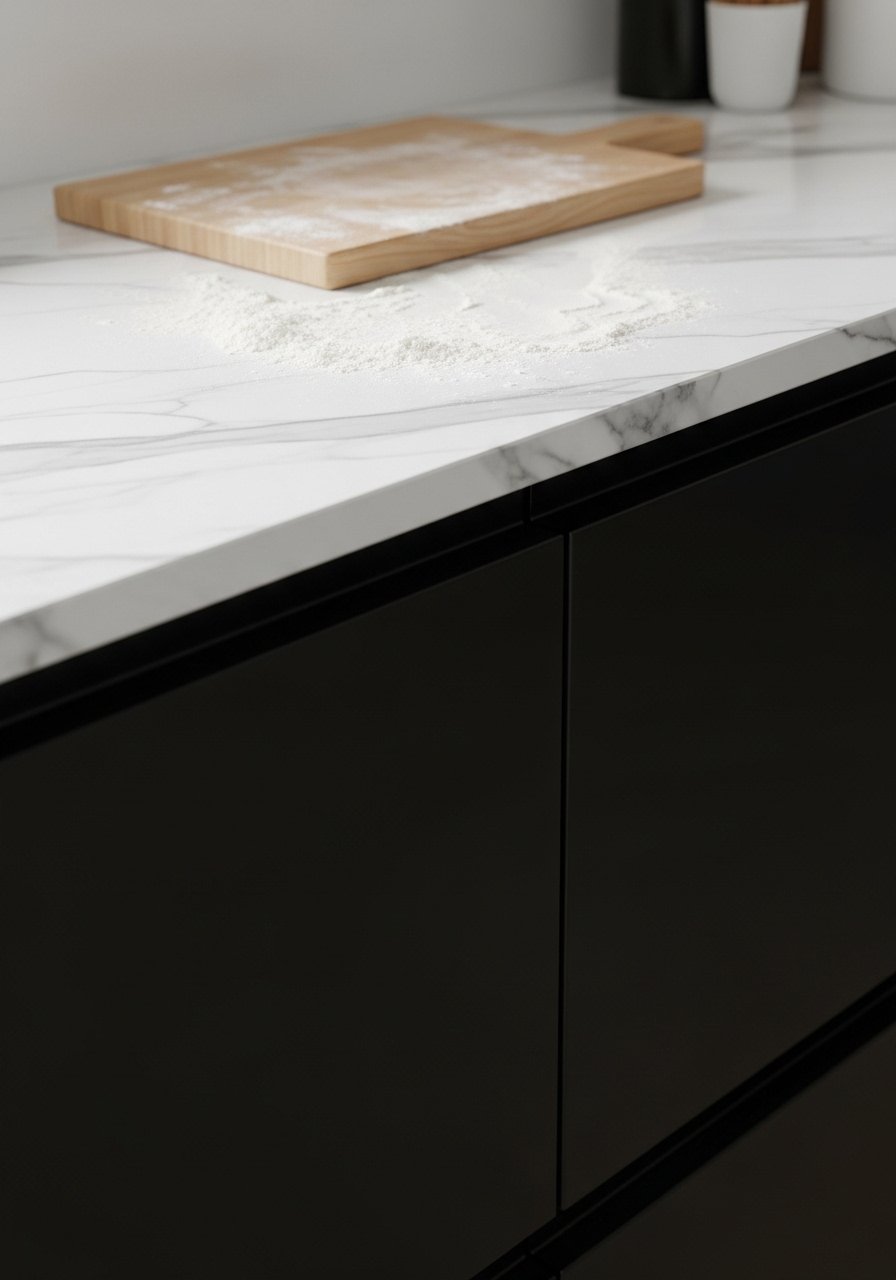
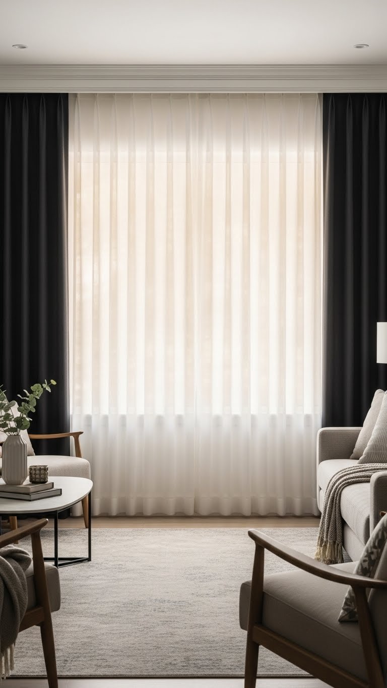
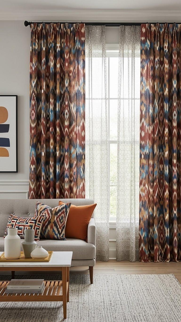
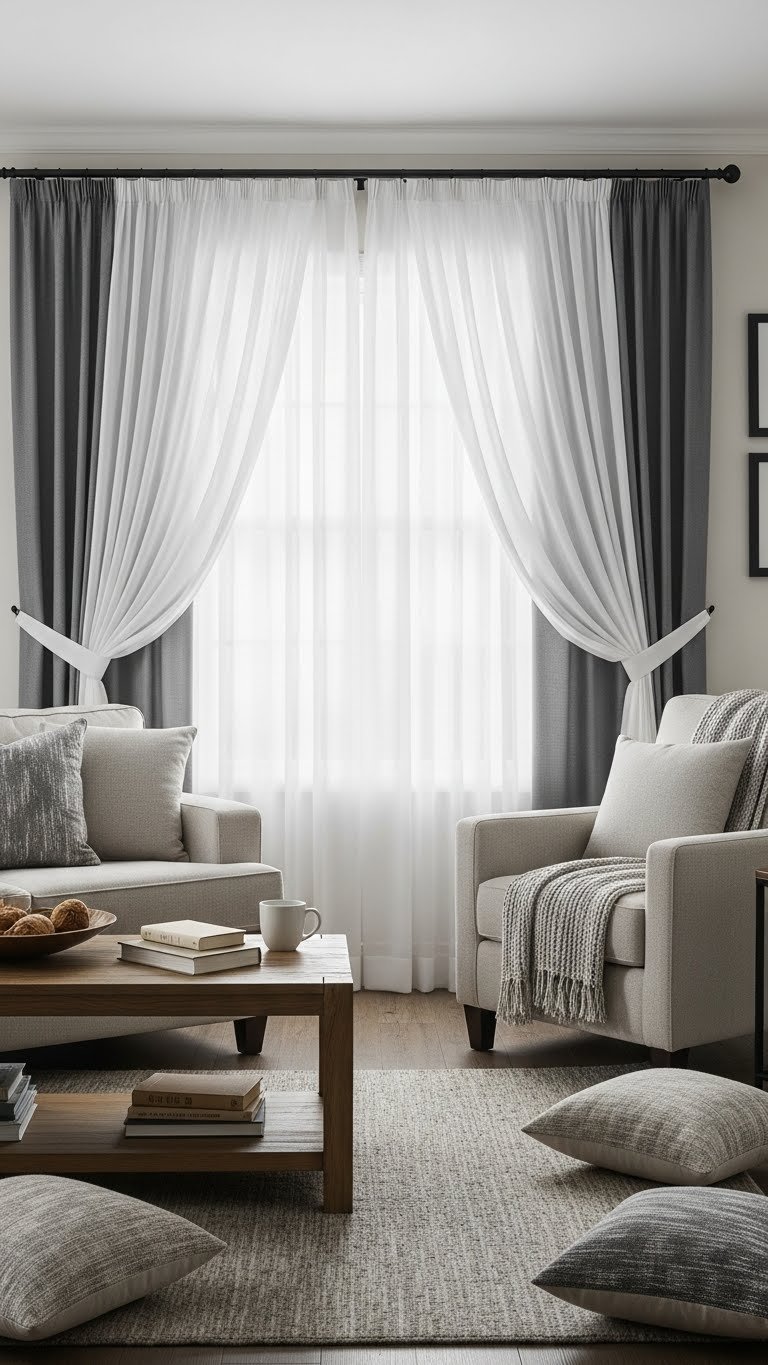
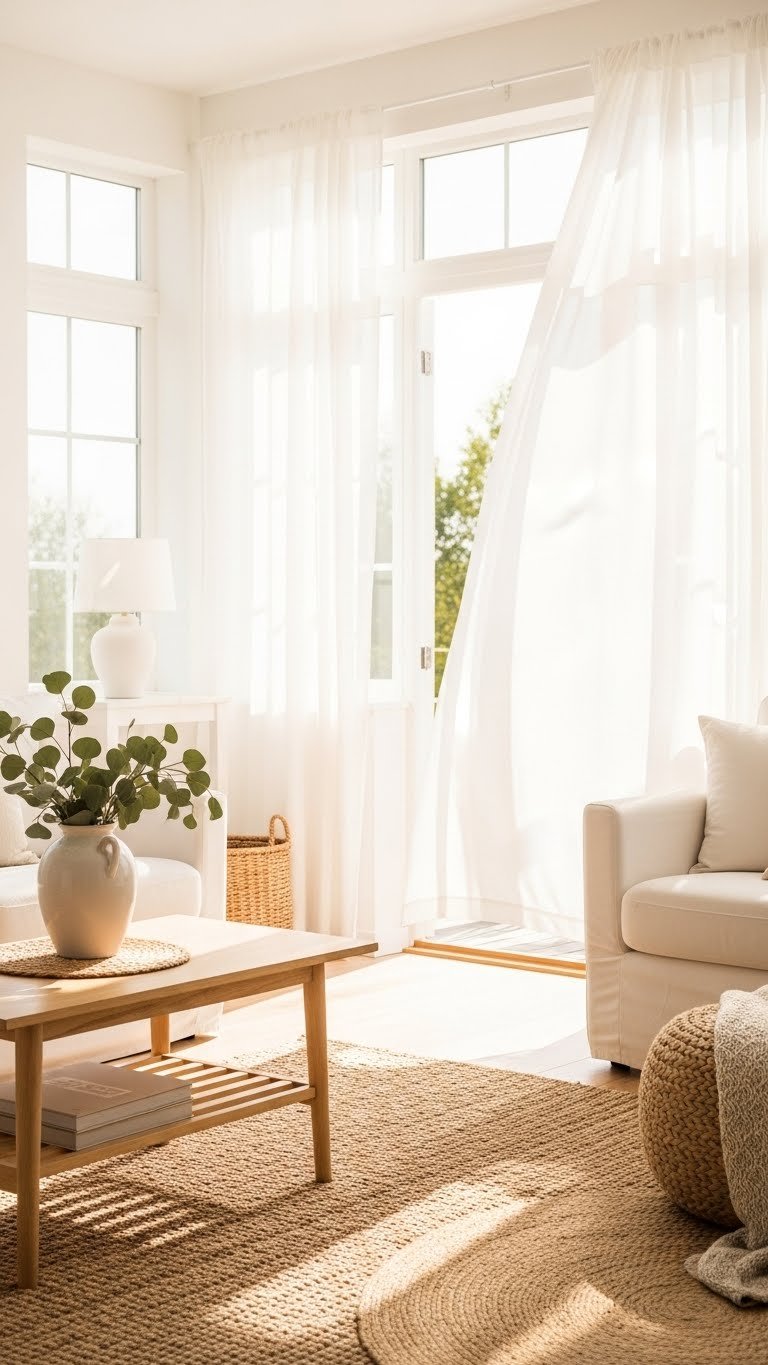
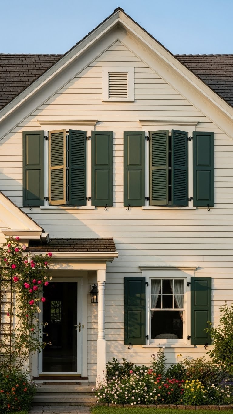
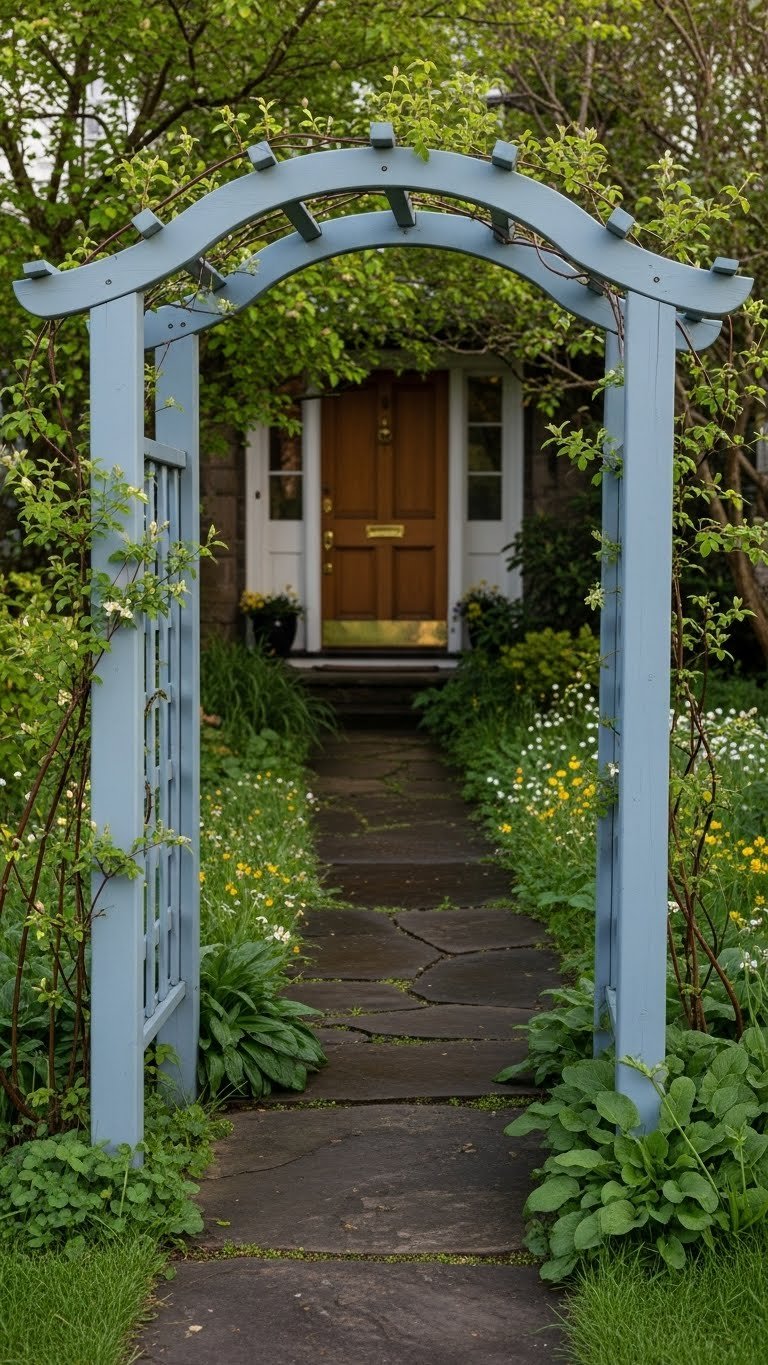
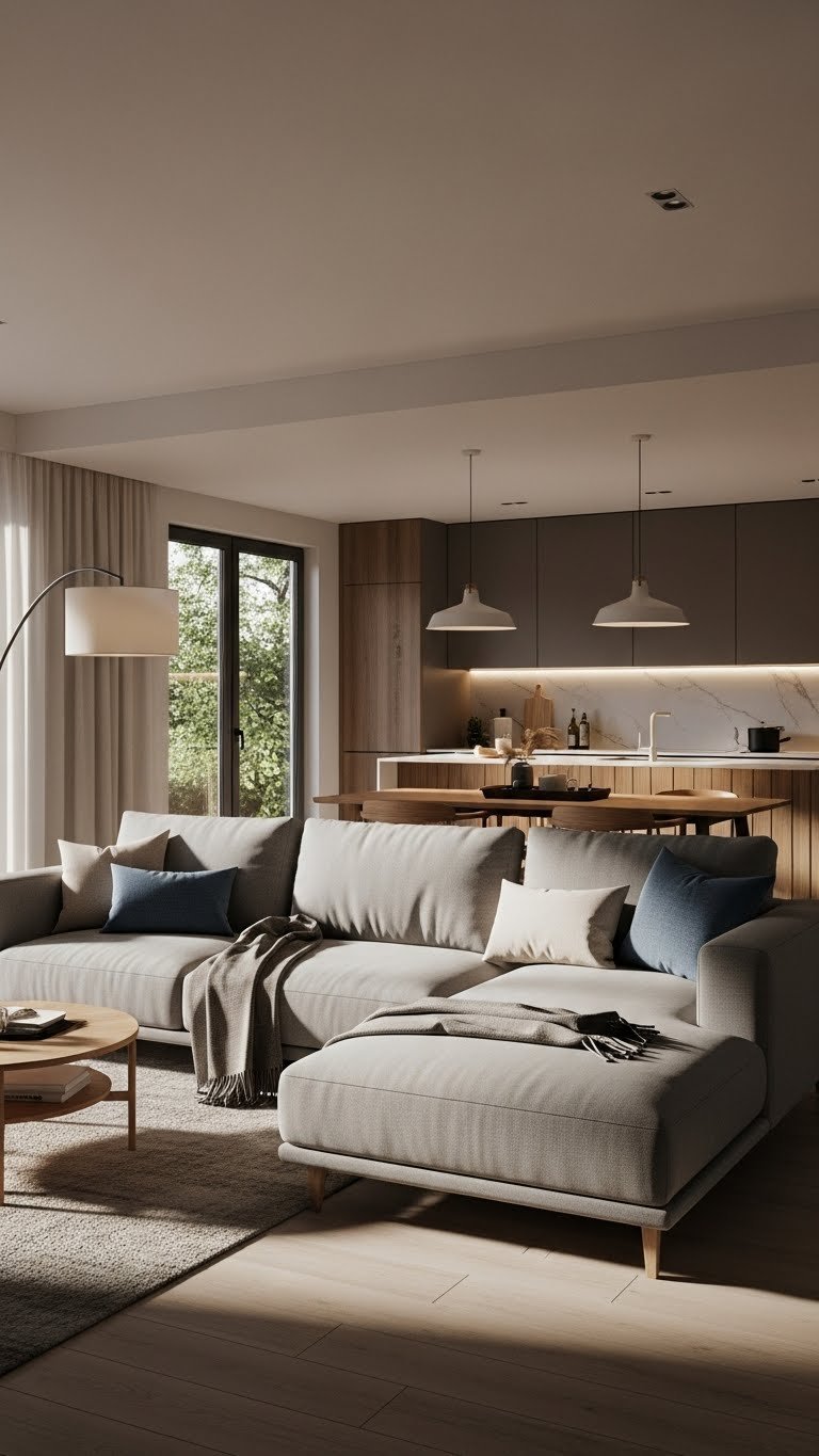
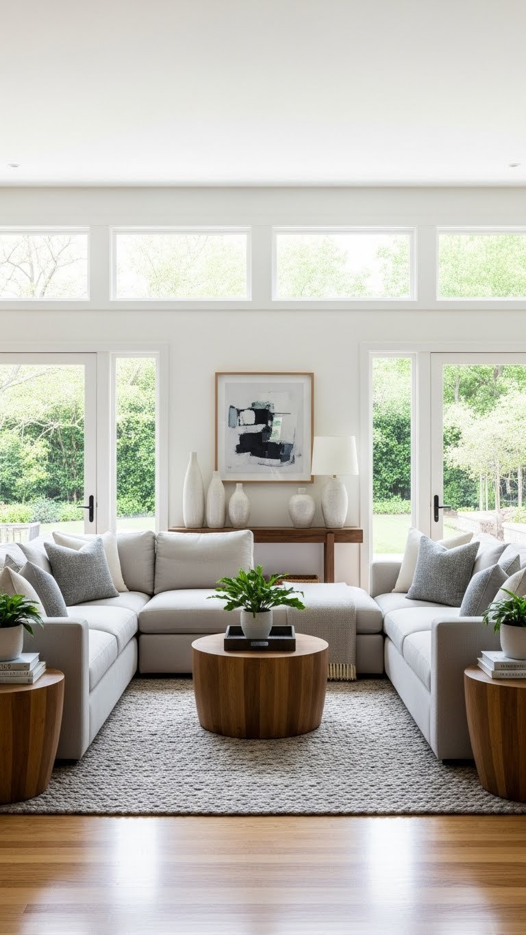
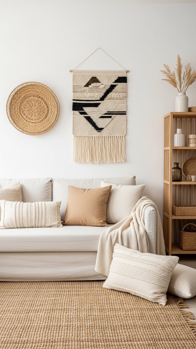
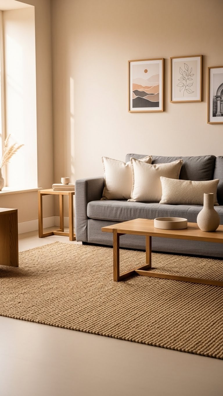
    There’s something about neutral colors that just makes a room feel right—calm, welcoming, and somehow timeless. But here’s the thing: neutral doesn’t mean boring. The right palette can make your space feel intentional, sophisticated, and deeply comfortable all at once. Whether you’re dealing with a small apartment, a rental, or just tired of trendy colors that feel dated within a year, these 27 neutral room color schemes prove that restraint can be incredibly luxurious. From warm creams and cool greiges to rich chocolate browns and soft sage undertones, you’ll discover combinations that work with what you already have and feel good year after year. Let’s dive into color pairings that actually make your home feel like a retreat.

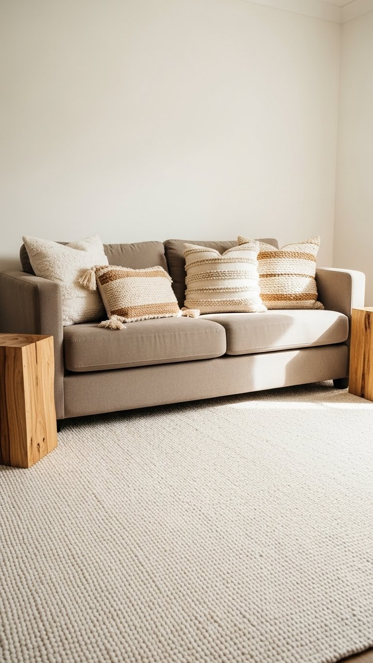
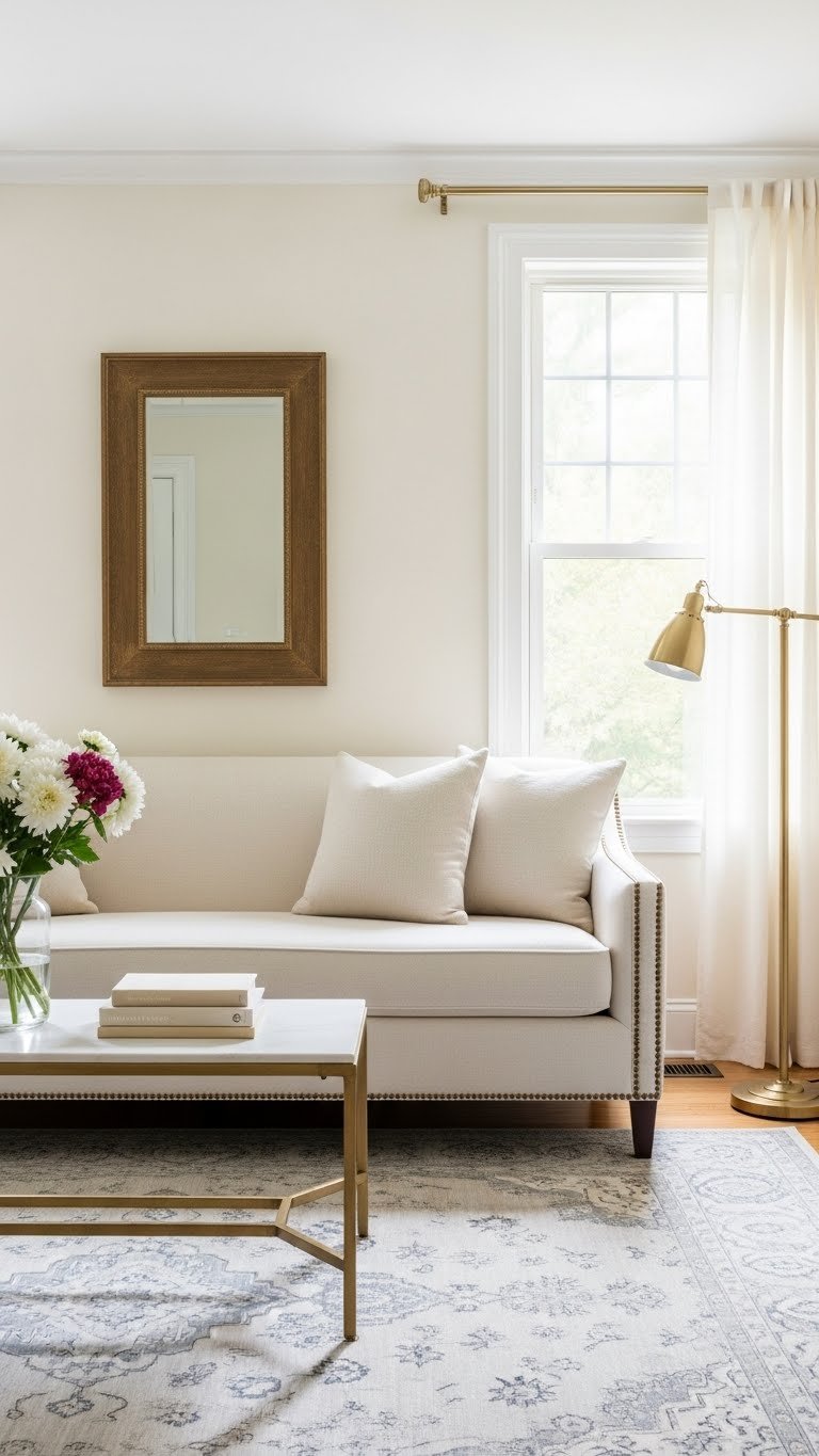
    1. Warm Cream with Soft Taupe Accents

    Cream walls paired with taupe accents create an airy, sophisticated base that works in almost any room. The combination feels lifted and modern while staying deeply warm and inviting.

    Paint your walls a warm cream (Benjamin Moore’s Swiss Coffee or Sherwin-Williams’ Alabaster work beautifully). Add taupe through soft furnishings—think upholstered chairs, area rugs, or throw blankets. If you’re renting, use removable wallpaper in taupe as an accent feature. The pairing costs nothing if you’re swapping items you already own, or budget $50–$150 if you’re buying a new rug or chair. This takes zero time if you’re styling with existing pieces, or one weekend if you’re painting.

    Pro tip: Layer different shades of cream and taupe together—don’t make them match exactly. The variation creates depth.

    Your space gains an elegant, gallery-like quality that feels fresh and sophisticated without relying on color.

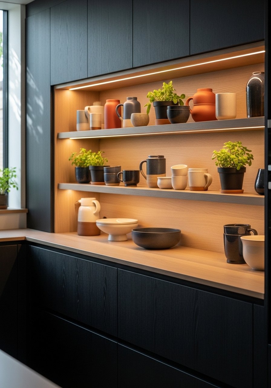
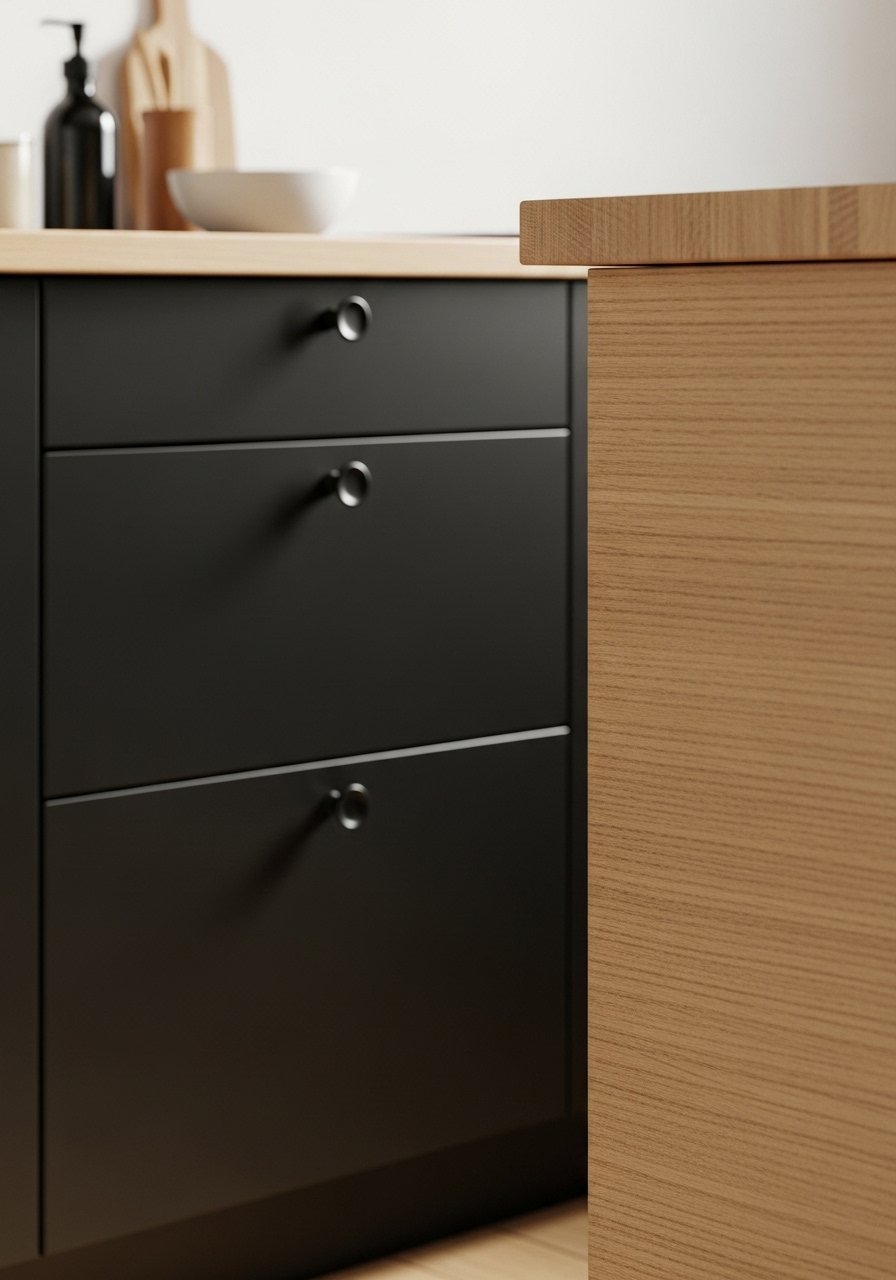
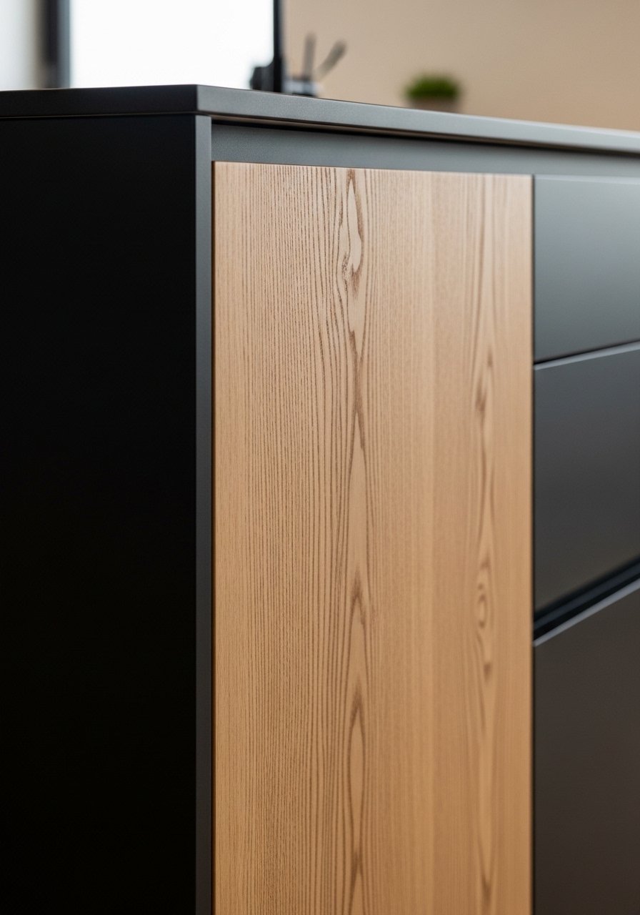
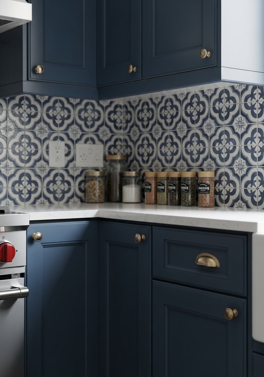
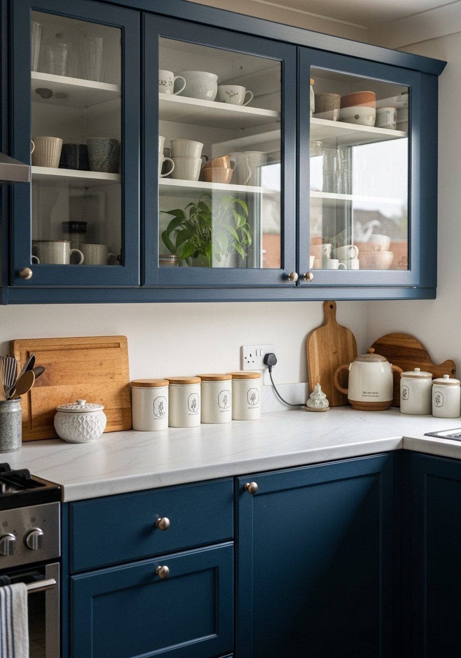
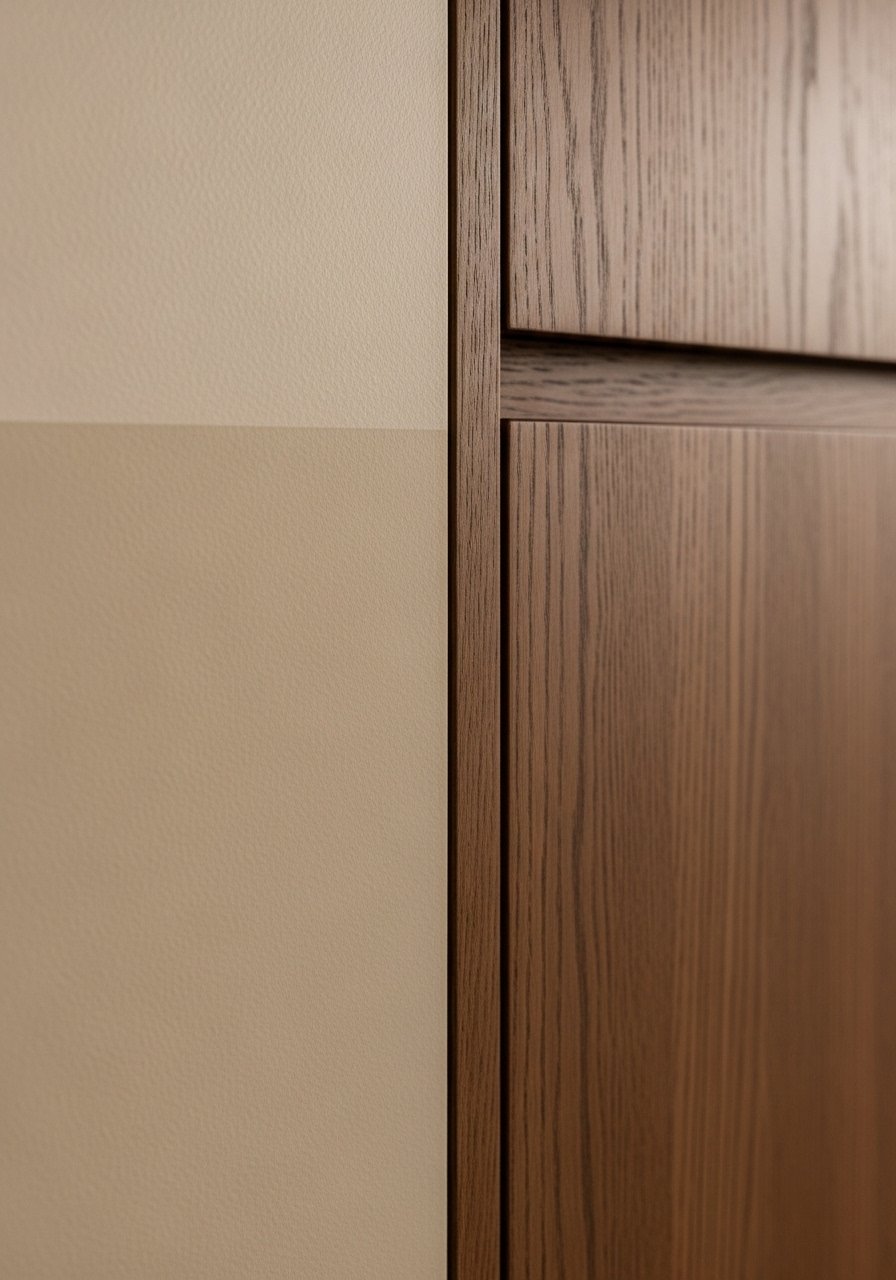
    2. Greige (Gray-Beige) with Warm Wood Tones

    Greige is the neutral that’s stealing the show in 2025—it’s gray’s warmer cousin and brings serious sophistication. Combined with honey-toned or natural wood, it feels grounded and modern.

    Choose a greige paint like Sherwin-Williams’ Accessible Beige or Farrow & Ball’s String. Keep wood furniture natural and warm-toned rather than whitewashed. Add texture through woven elements—jute rugs, linen curtains, or wooden wall shelving. Paint runs $30–$60 per can, and styling is free if you’re working with what you have. This is a quick weekend project if painting, or instant if you’re just styling.

    The magic here is how greige bridges the gap between cool and warm—it works with almost any wood tone and looks refined without trying too hard.

    Your room develops a curated, designer-like quality that feels both current and timeless.

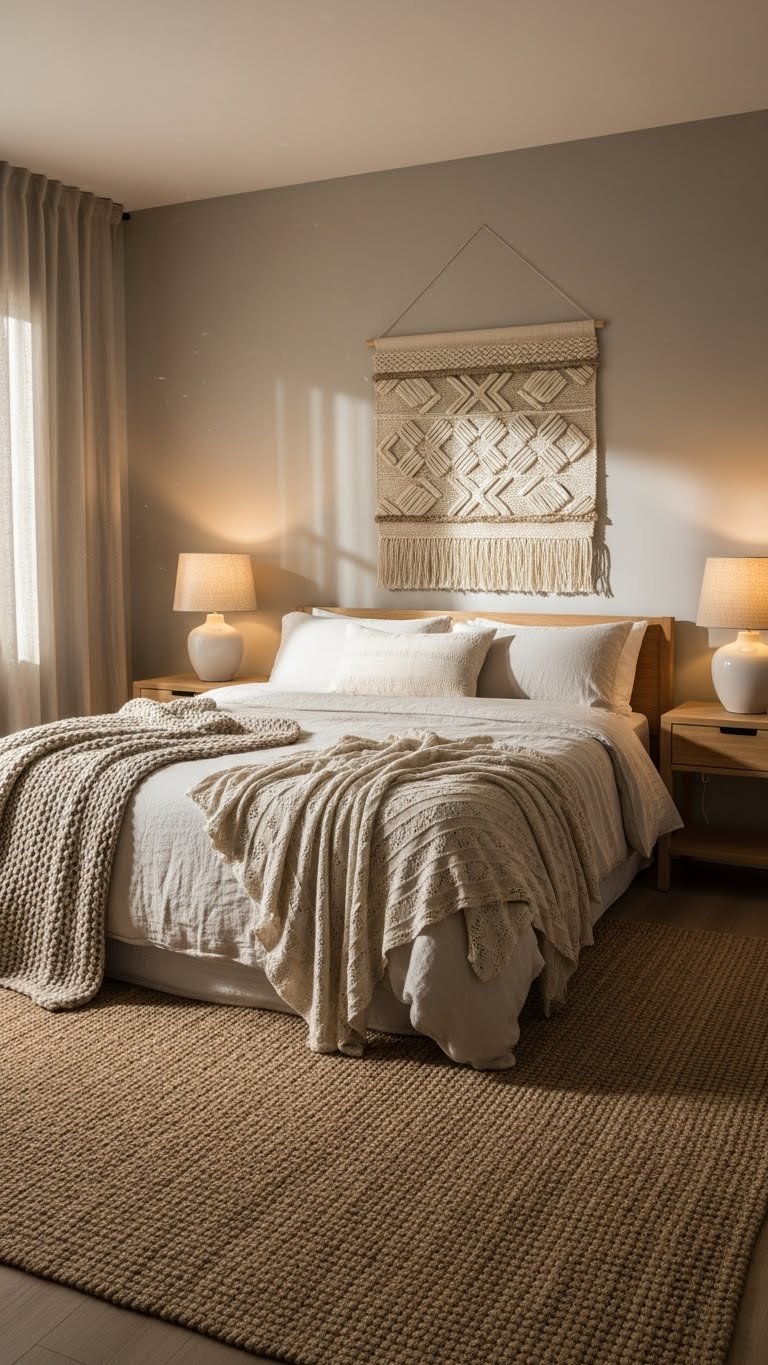
    3. Soft Sage Green Walls with Cream Everything Else

    Soft sage green is having a major moment, and when paired with cream accents, it creates a spa-like calm that works especially well in bedrooms and offices. It’s earthy without being heavy.

    Paint walls a muted sage like Sherwin-Williams’ Evergreen Fog or Benjamin Moore’s Healing Aloe. Keep all other elements cream, white, or natural wood to let the green be the star without overwhelming. Add greenery (real or high-quality faux plants) to echo the color. Paint costs $30–$60, and this refresh happens in a weekend. It’s incredibly renter-friendly if you use removable peel-and-stick wallpaper in sage instead.

    The softness of sage means it won’t feel cold or clinical—instead, the room becomes your personal retreat.

    You get a serene backdrop that actually encourages relaxation instead of adding visual noise to your day.

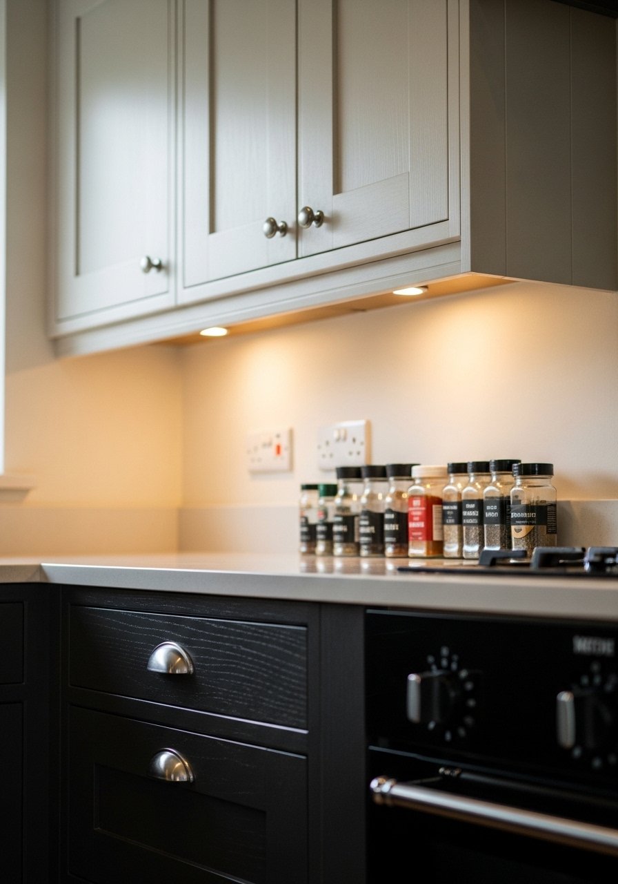
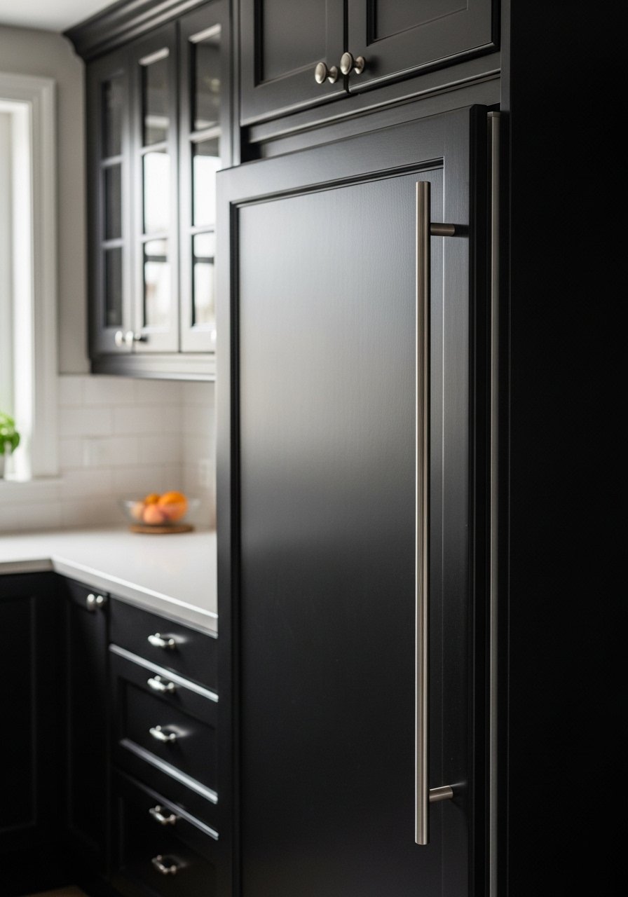
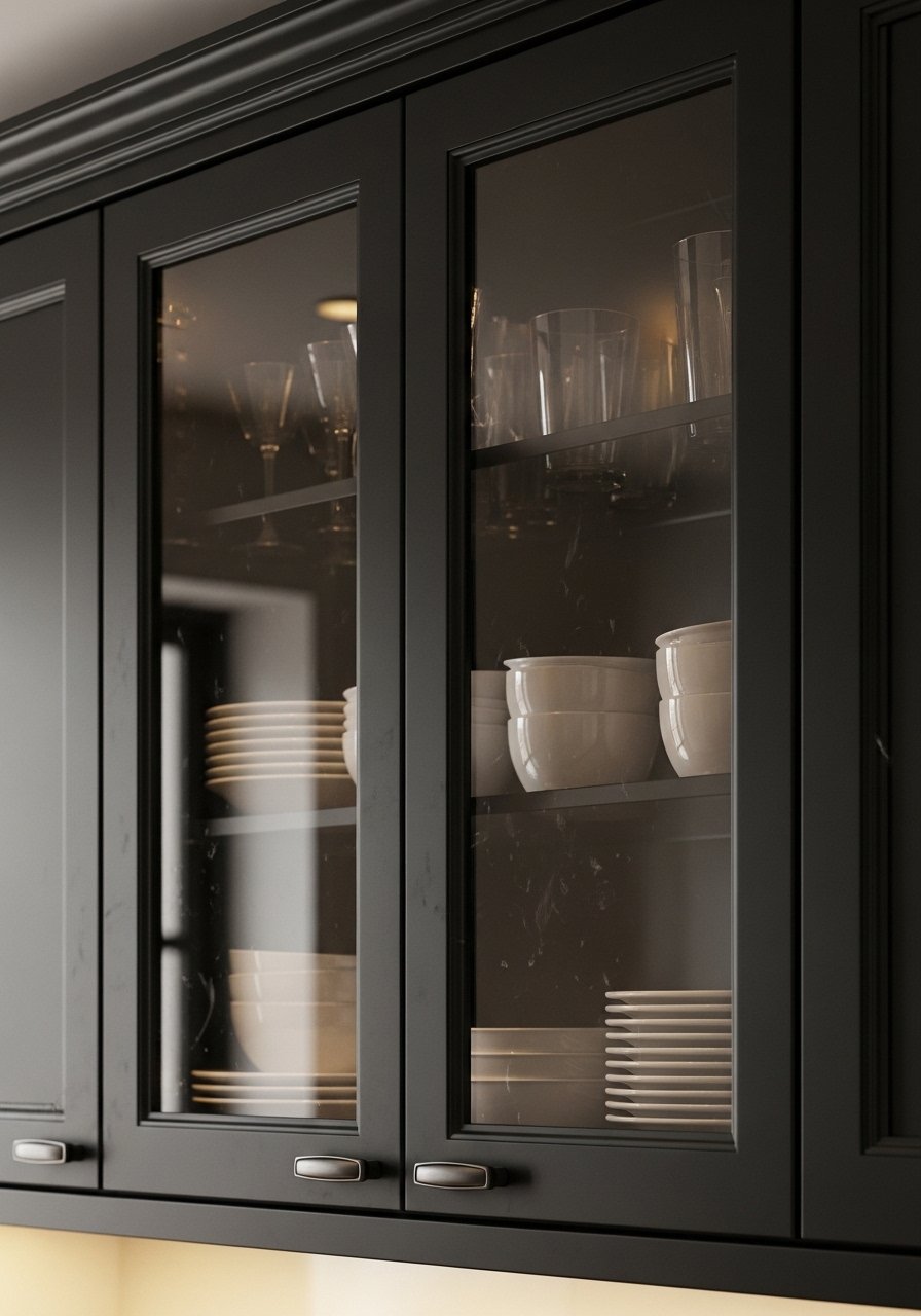
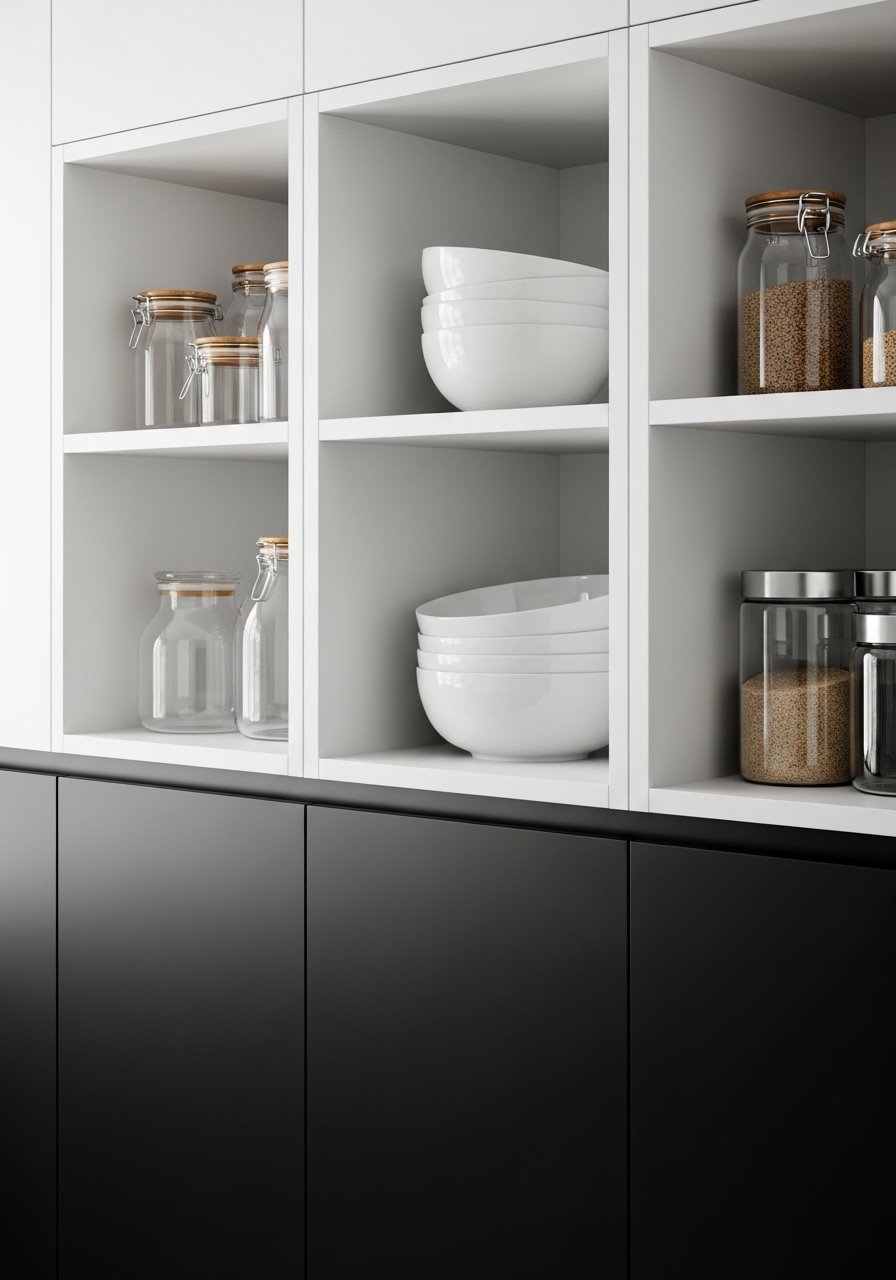
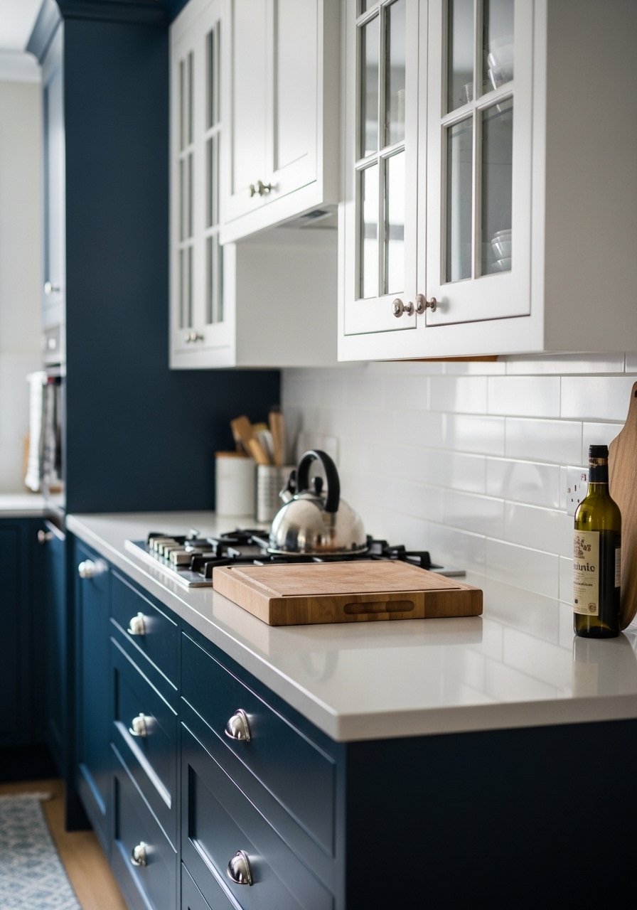
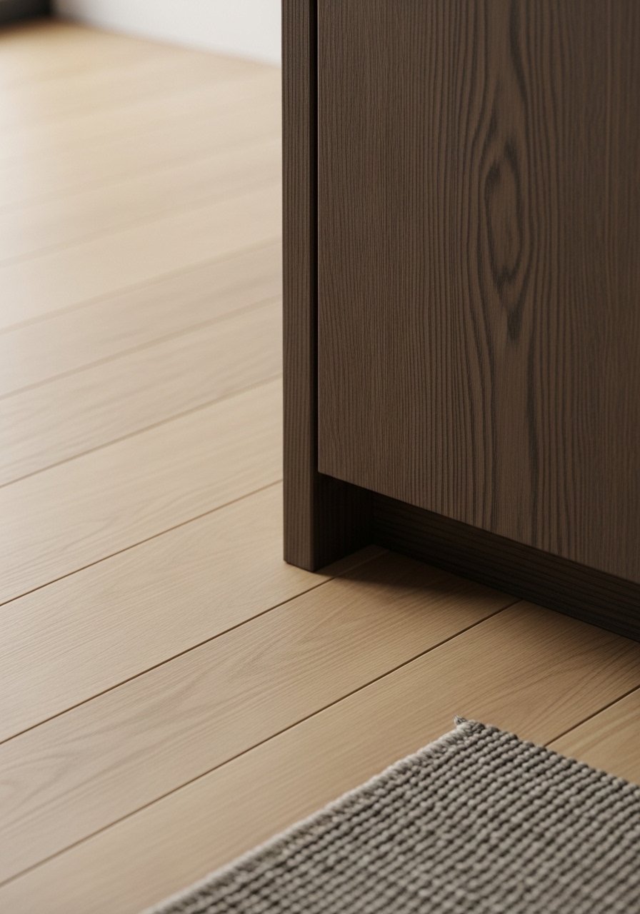
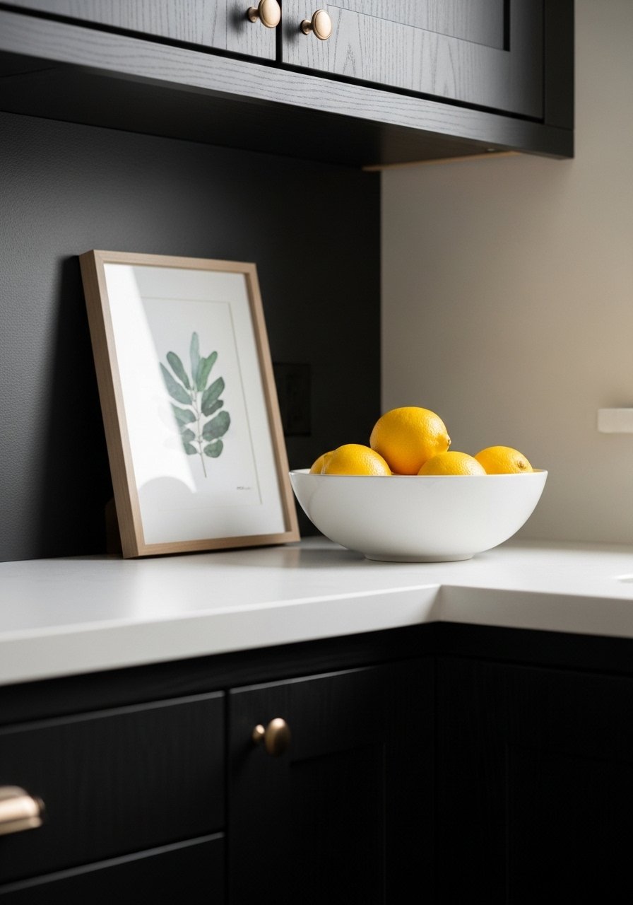
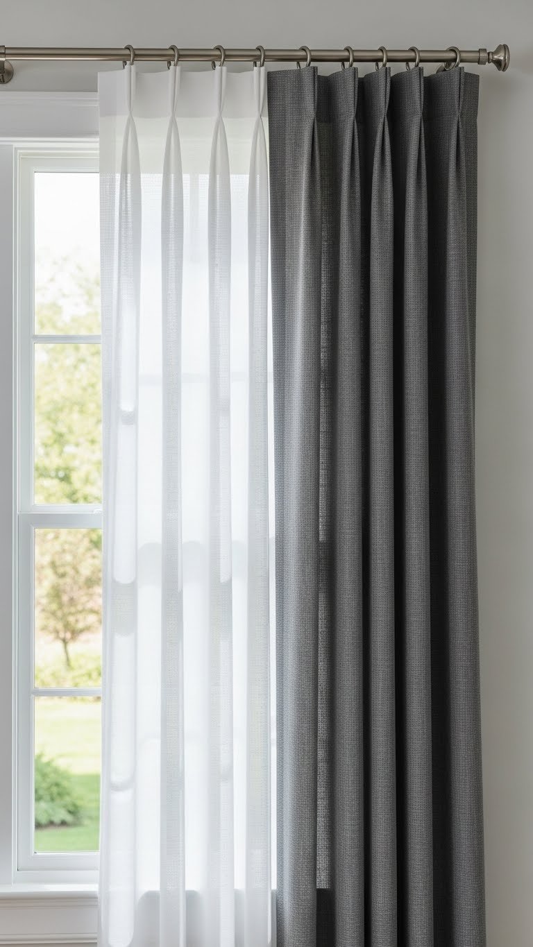
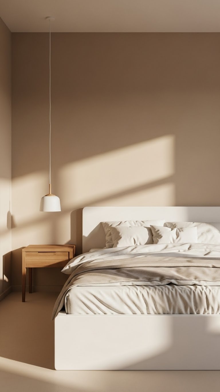
    4. Warm White with Chocolate Brown Accents

    This combination walks the line between cozy and sophisticated. Warm white keeps things bright and open, while chocolate brown grounds the space and adds unexpected richness.

    Paint walls a warm white like Sherwin-Williams’ Alabaster or Benjamin Moore’s Cloud White (not stark white—pick one with warm undertones). Introduce chocolate through one statement piece: a sofa, accent chair, or feature wall. If you’re renting, use brown through removable wallpaper or large area rugs. Paint is $30–$60, and adding brown accents can be free if you’re rearranging furniture you own. This is as fast or slow as you want—instant if styling, one weekend if painting.

    Pro tip: Chocolate brown photographs beautifully and doesn’t show dust like lighter colors do.

    The room gains warmth and personality while staying light and airy—the best of both worlds.

    5. Soft Gray with Warm Gold Metallics

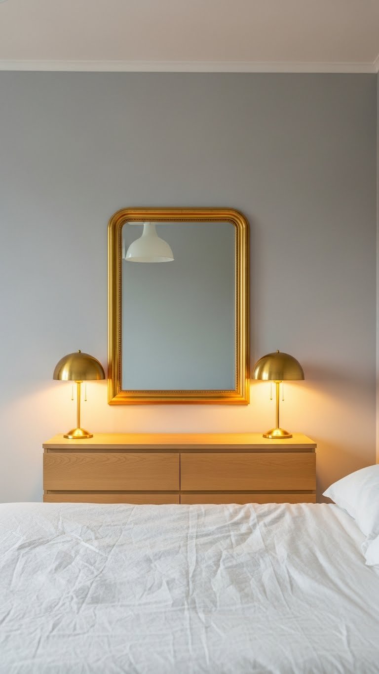
    Soft gray alone can feel cold, but pair it with warm metallics and suddenly it’s sophisticated and inviting. This combo works beautifully in bedrooms and bathrooms where you want calm plus a touch of elegance.

    Choose a soft gray like Sherwin-Williams’ Urbane Gray or Benjamin Moore’s Healing Aloe (yes, some grays have warm undertones). Add warm gold through lighting, mirrors, and decorative accessories rather than large furniture pieces. You can find gold-framed mirrors and light fixtures at Target, IKEA, or Wayfair for $20–$80. Paint is $30–$60. This is a weekend project if painting, or instant if you’re just adding metallics.

    Gold metallics reflect light and make spaces feel larger—they’re more practical than purely decorative.

    Your space becomes a quiet luxury retreat that feels elevated without being fussy.

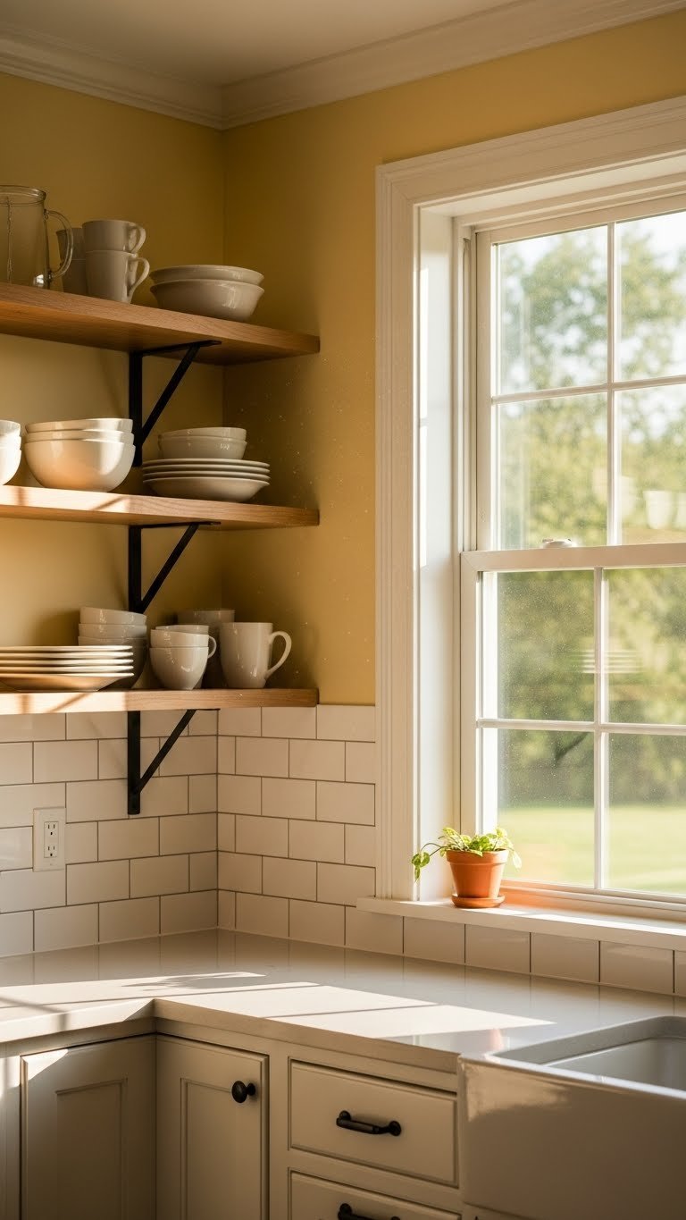
    6. Butter Yellow Walls with Crisp White Trim

    Butter yellow is neutral in the warmth department—it’s not bold or primary, just deeply welcoming. Paired with crisp white trim, it feels classic and intentional, never accidental.

    Paint walls a soft butter yellow like Benjamin Moore’s Pale Oak or Sherwin-Williams’ Soft Sunlight. Ensure trim, doors, and cabinets are bright white (Benjamin Moore’s Simply White or Sherwin-Williams’ Pure White). This combo works especially well in kitchens and dining areas where warmth encourages gathering. Paint costs $30–$60 per can (you’ll need two colors), and trim painting adds a weekend or two. If you’re renting, focus the yellow on an accent wall only.

    Butter yellow has a quirky charm—it’s familiar but not predictable, so your space feels personal.

    The combination creates a naturally happy atmosphere without requiring any personality from furnishings.

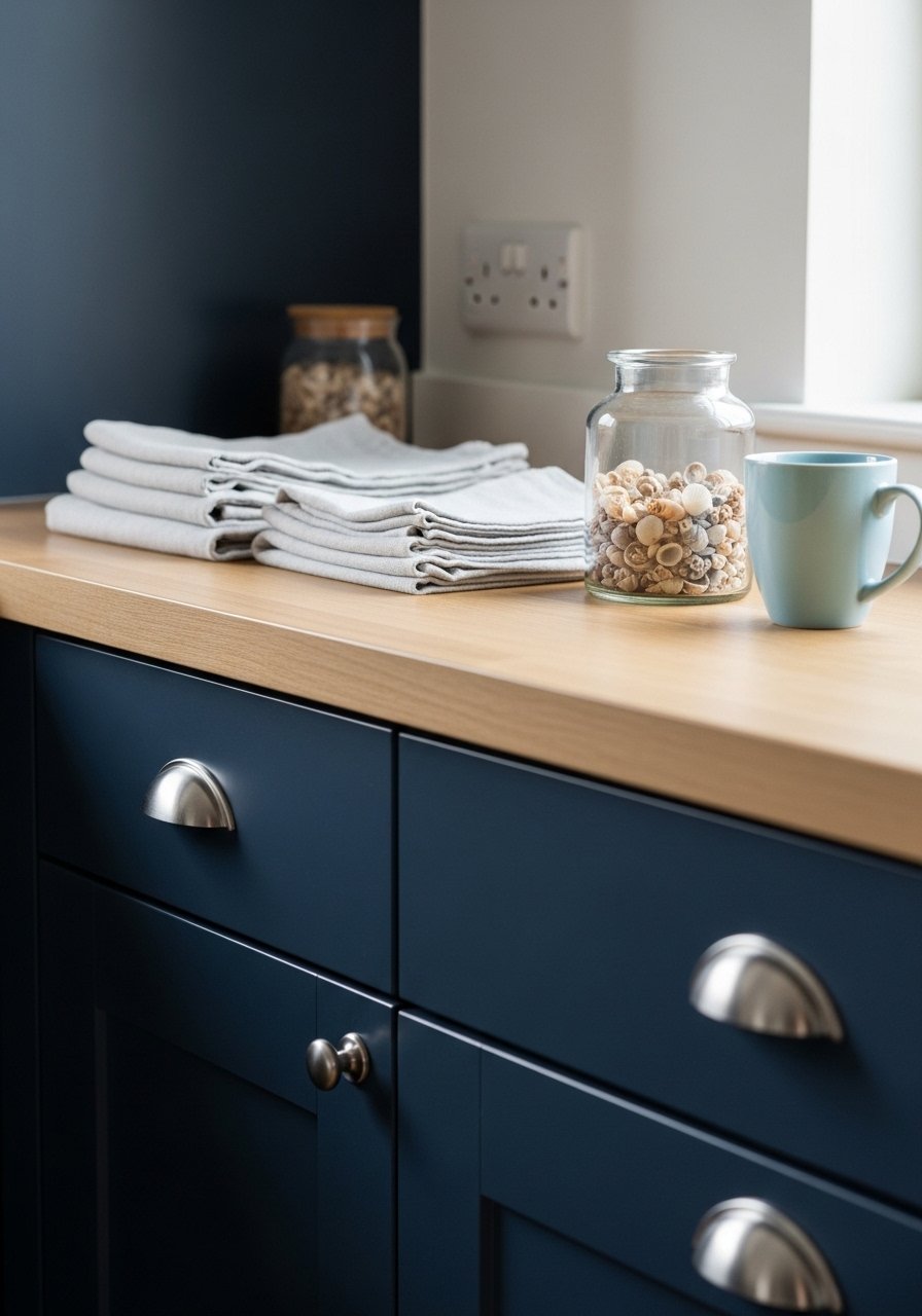
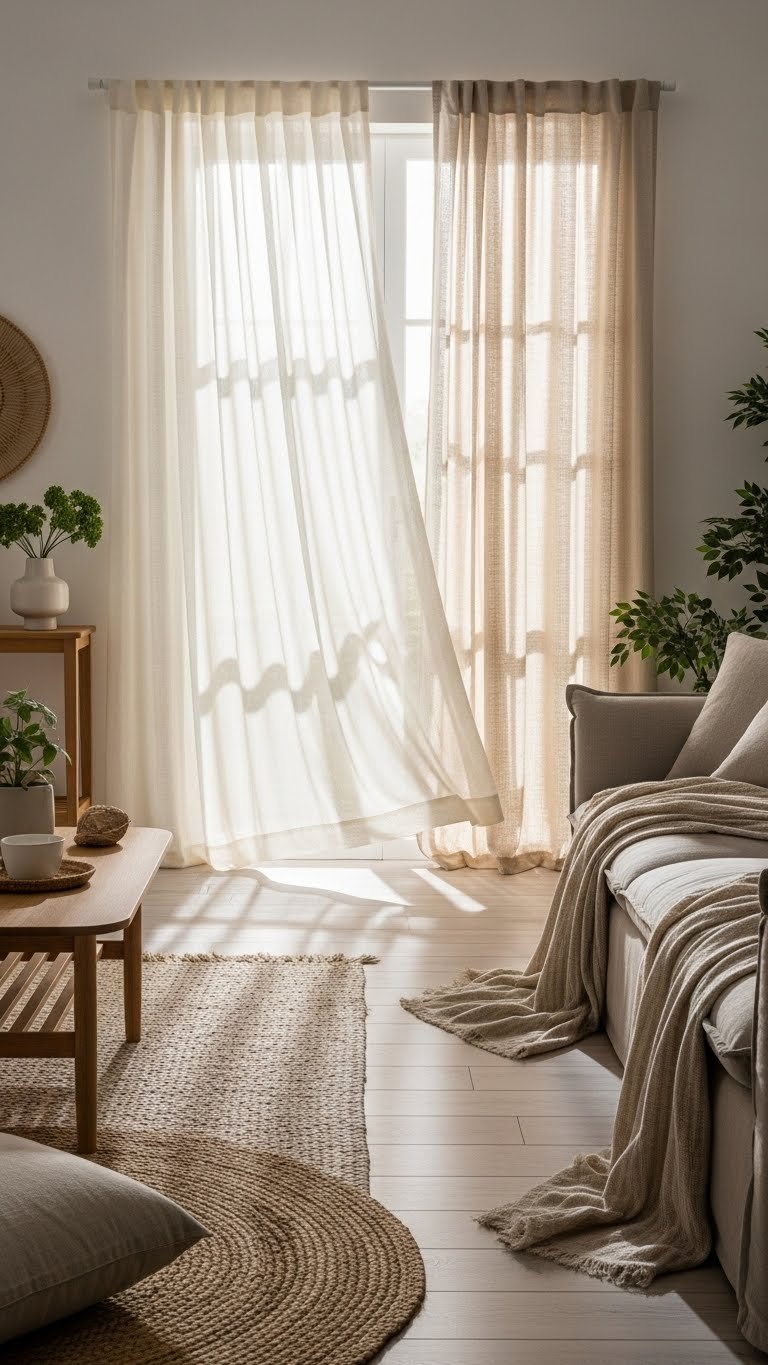
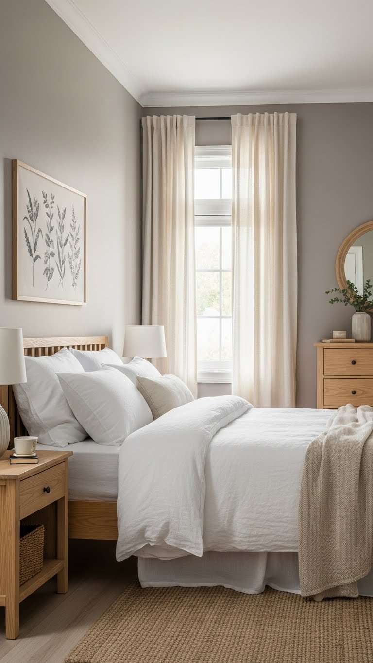
    7. Cool Taupe with Crisp White and Natural Linen

    This is the neutral that feels like a luxury hotel—cool taupe grounded by white and natural fabrics. It works in bedrooms, guest rooms, or any space where you want people to feel rested.

    Paint walls a cool taupe (avoid anything too warm or grayish-brown). Look for Sherwin-Williams’ Accessible Beige or Farrow & Ball’s Mouse’s Back. Layer white bedding with natural linen throws for texture. Taupe is naturally sophisticated, so you don’t need to do much styling. Paint is $30–$60, and linen throws run $20–$50 from Target or Wayfair. This is a weekend paint project, or instant if just styling with what you have.

    Linen wrinkles slightly—this isn’t a flaw, it’s proof the fabric is real and adds character.

    Your bedroom becomes a personal sanctuary that encourages good sleep and genuine relaxation.

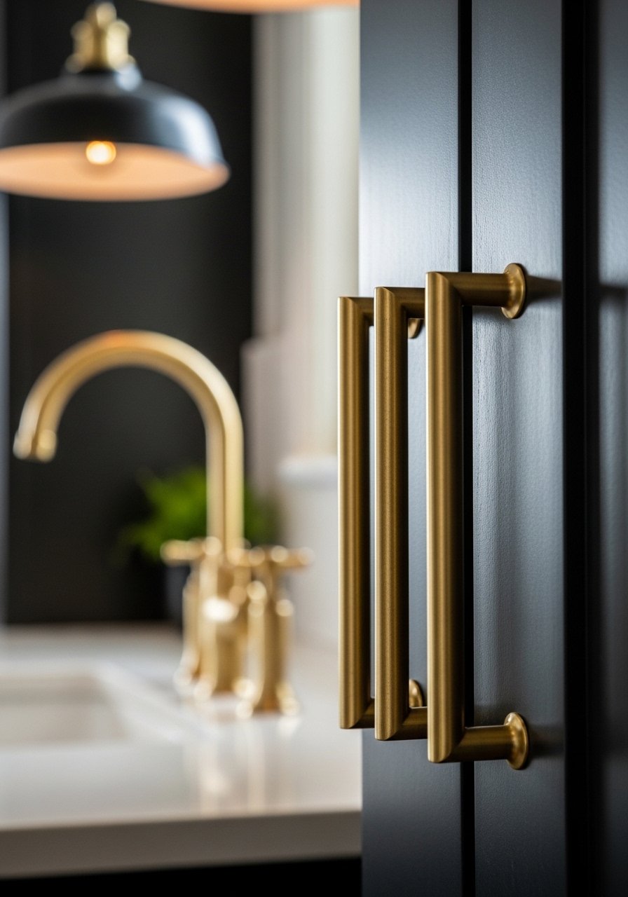
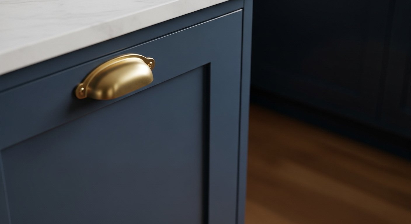
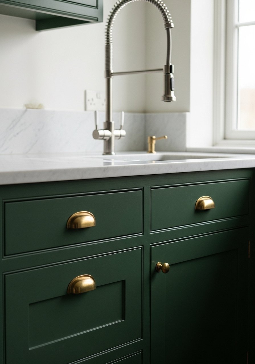
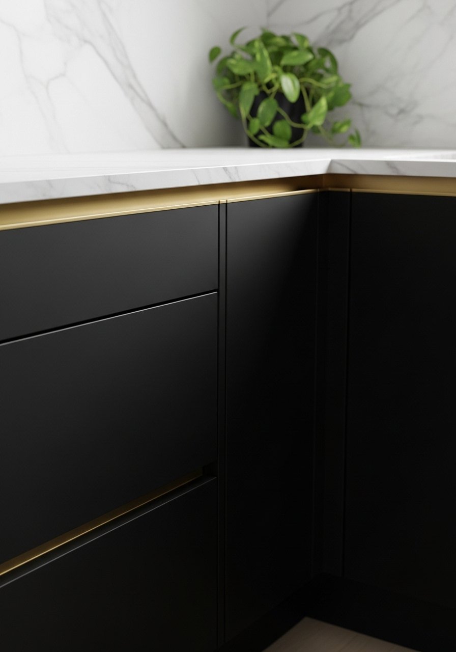
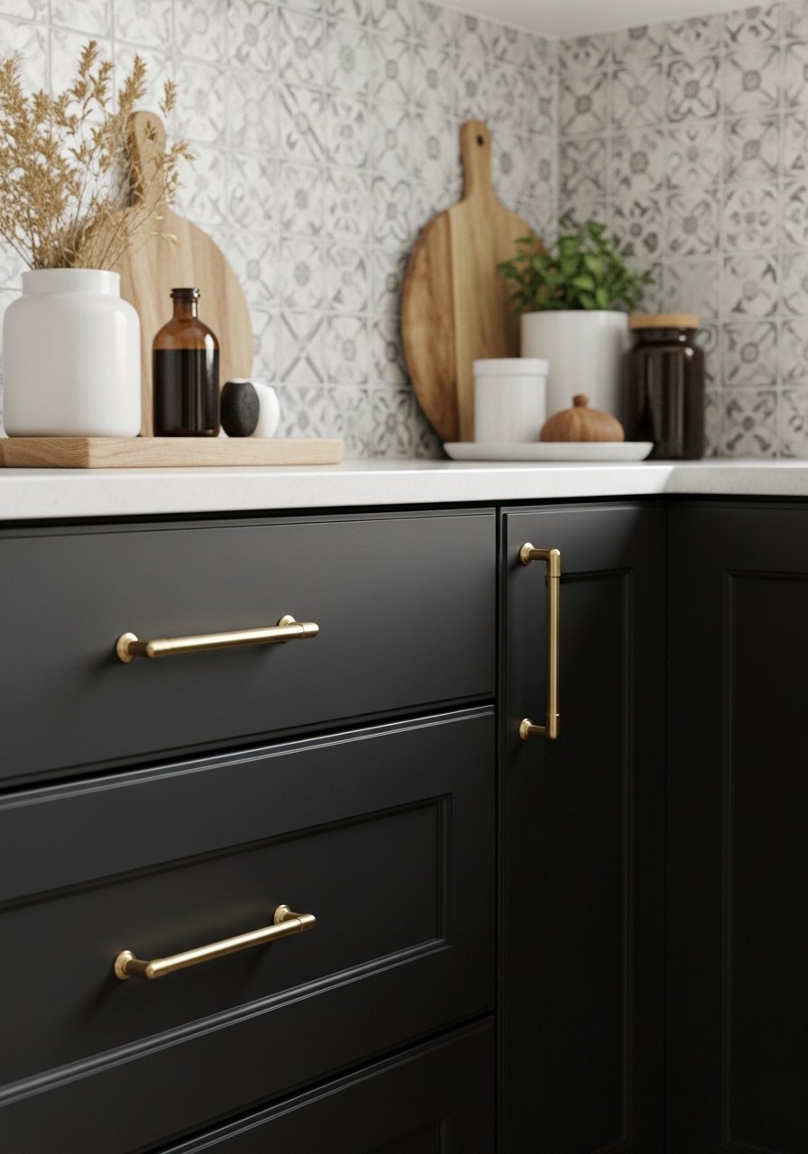
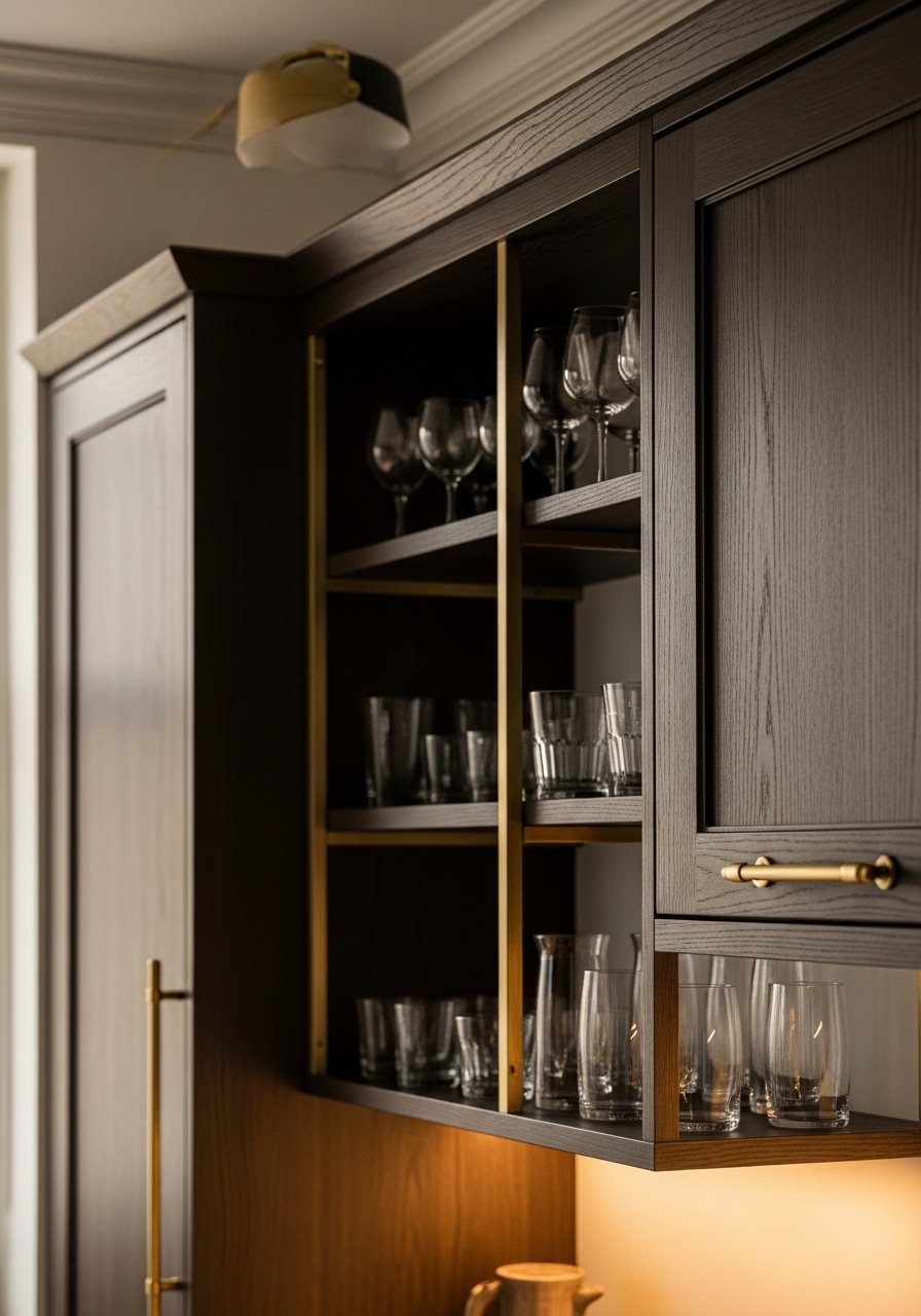
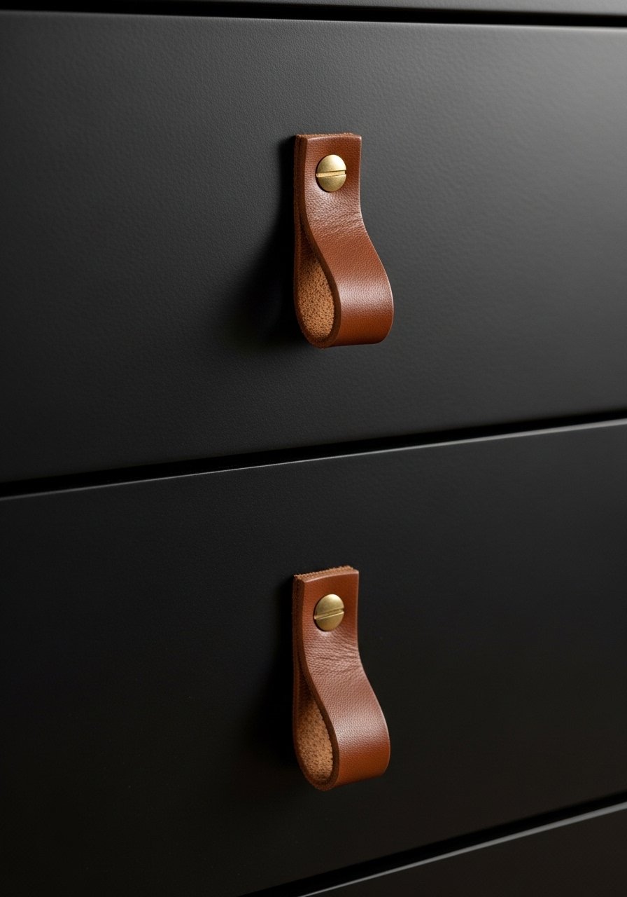
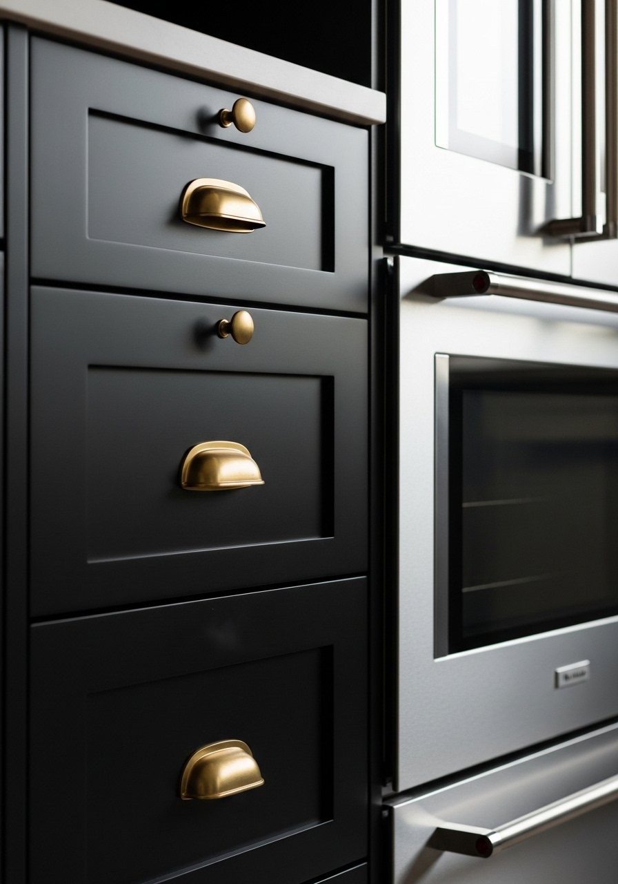
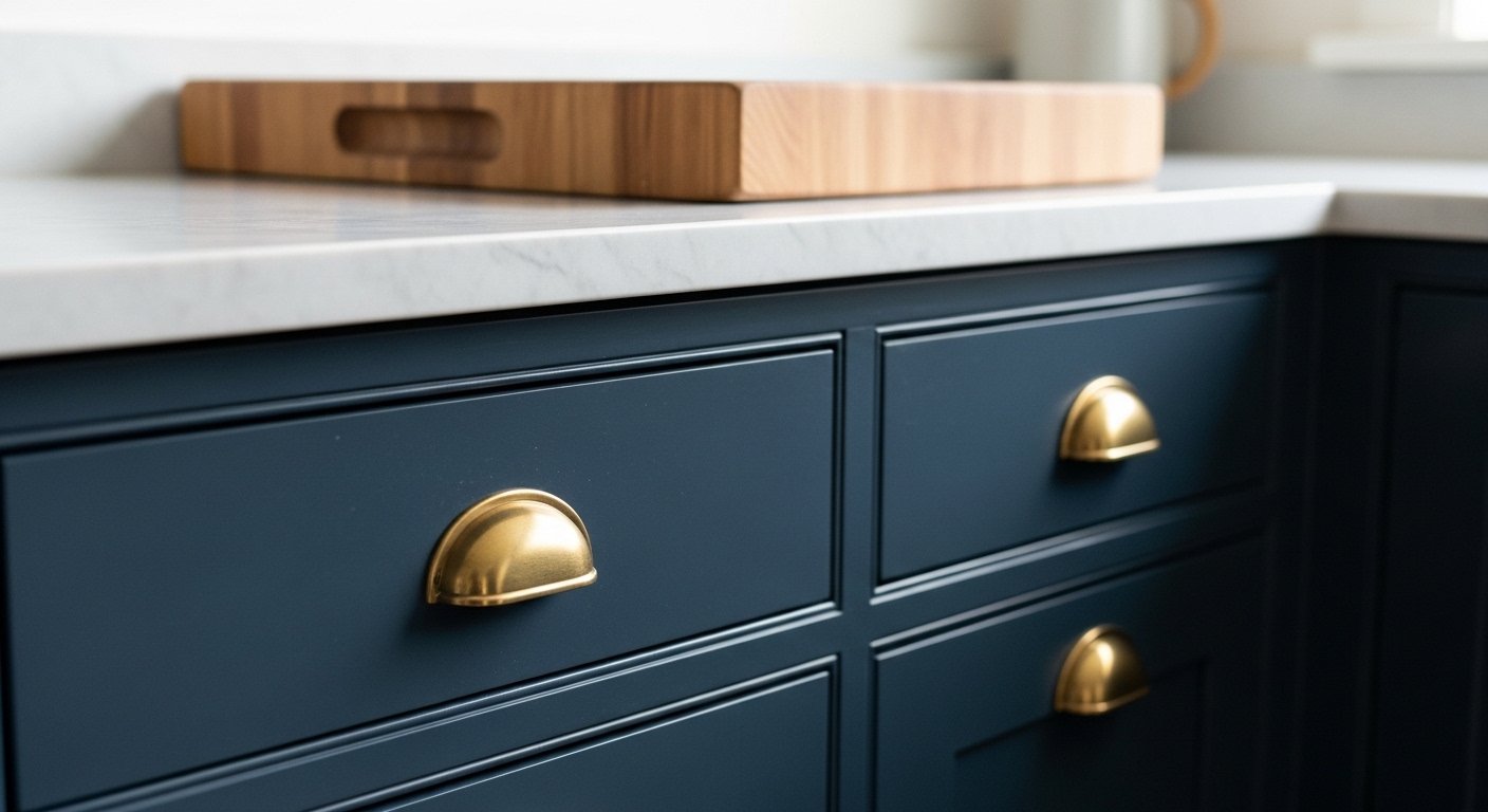
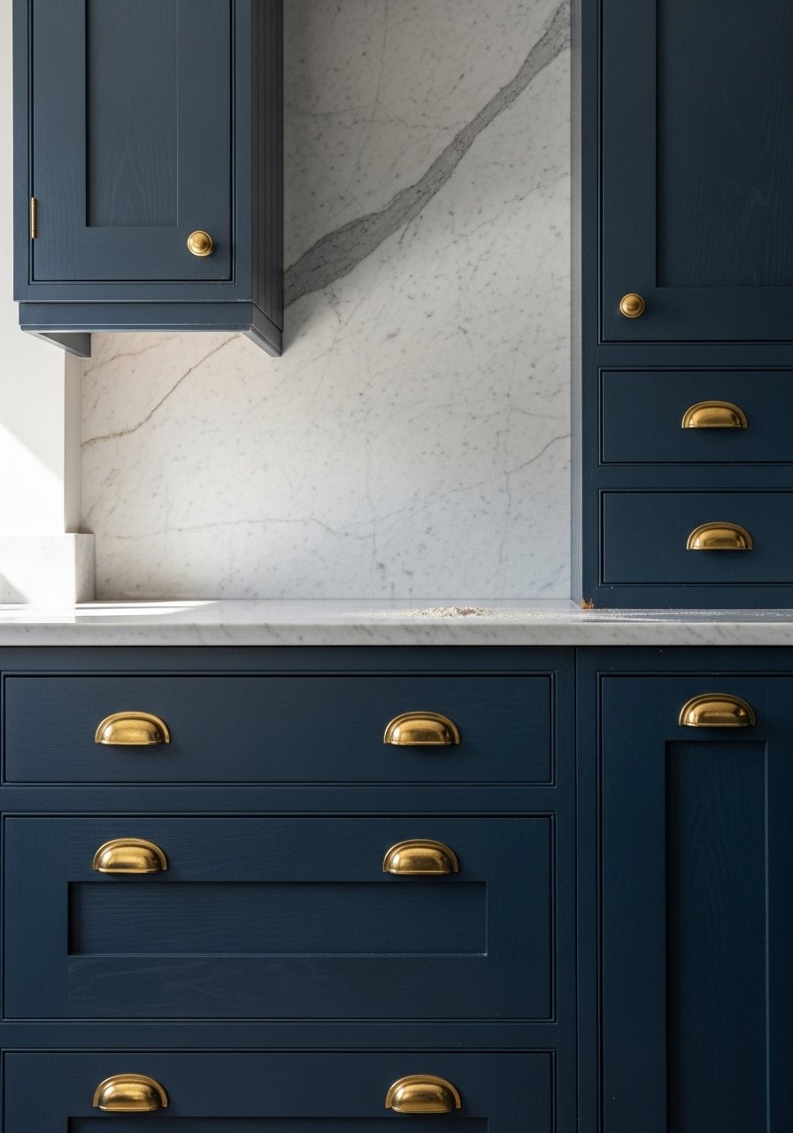
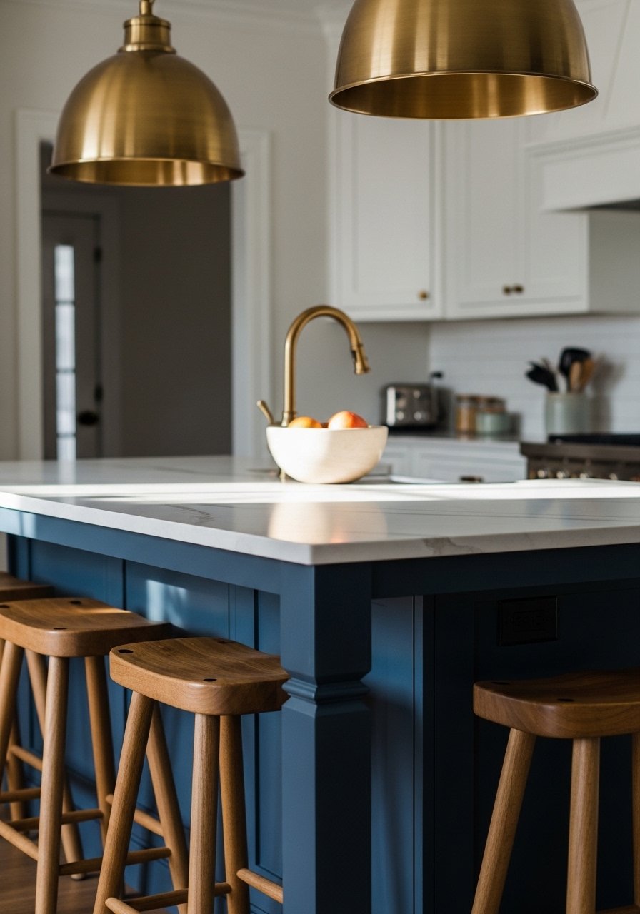
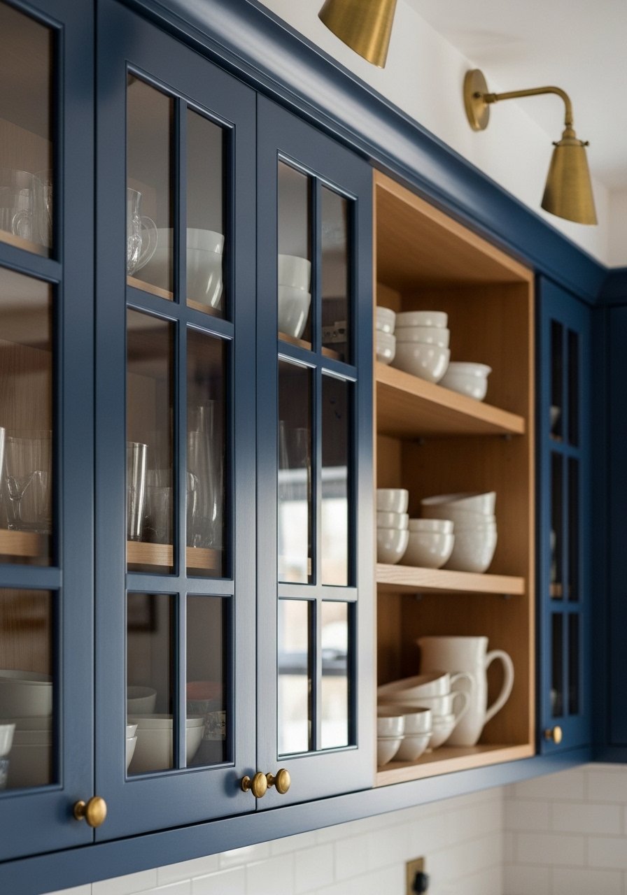
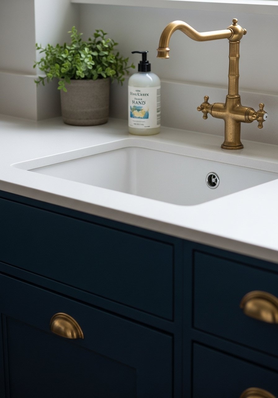
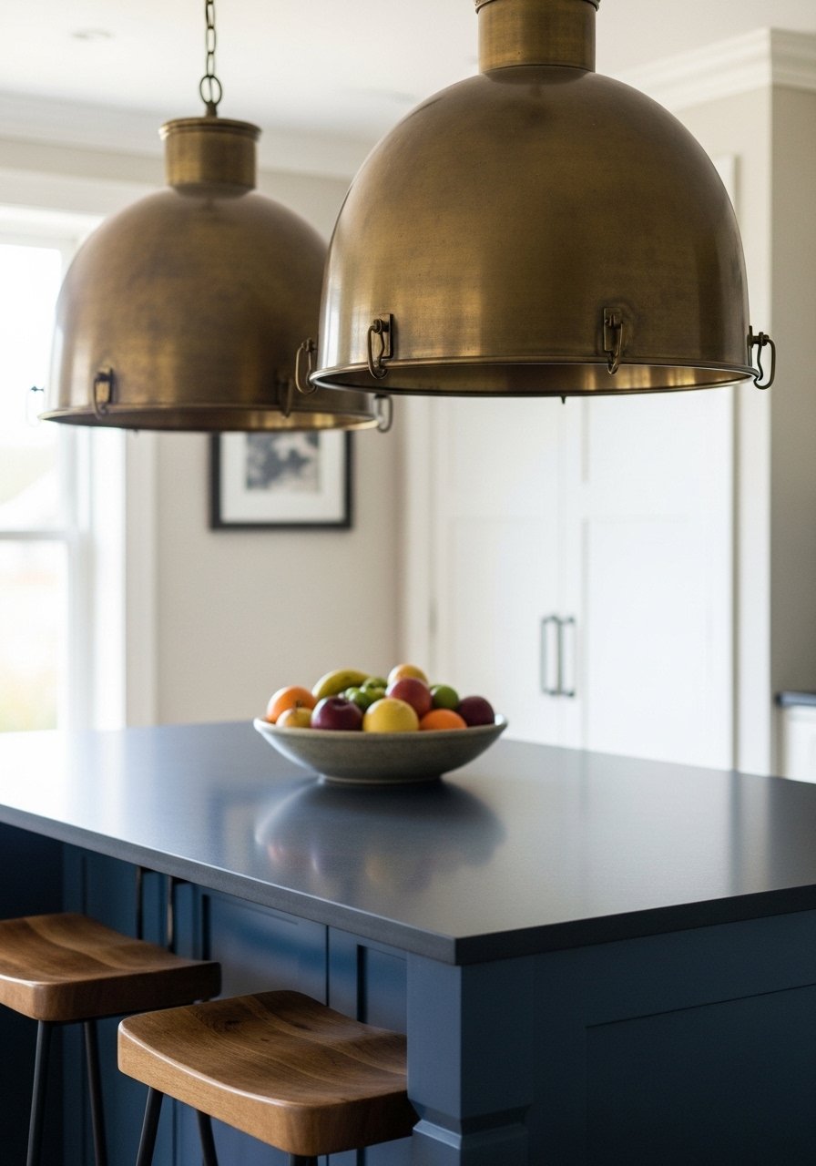
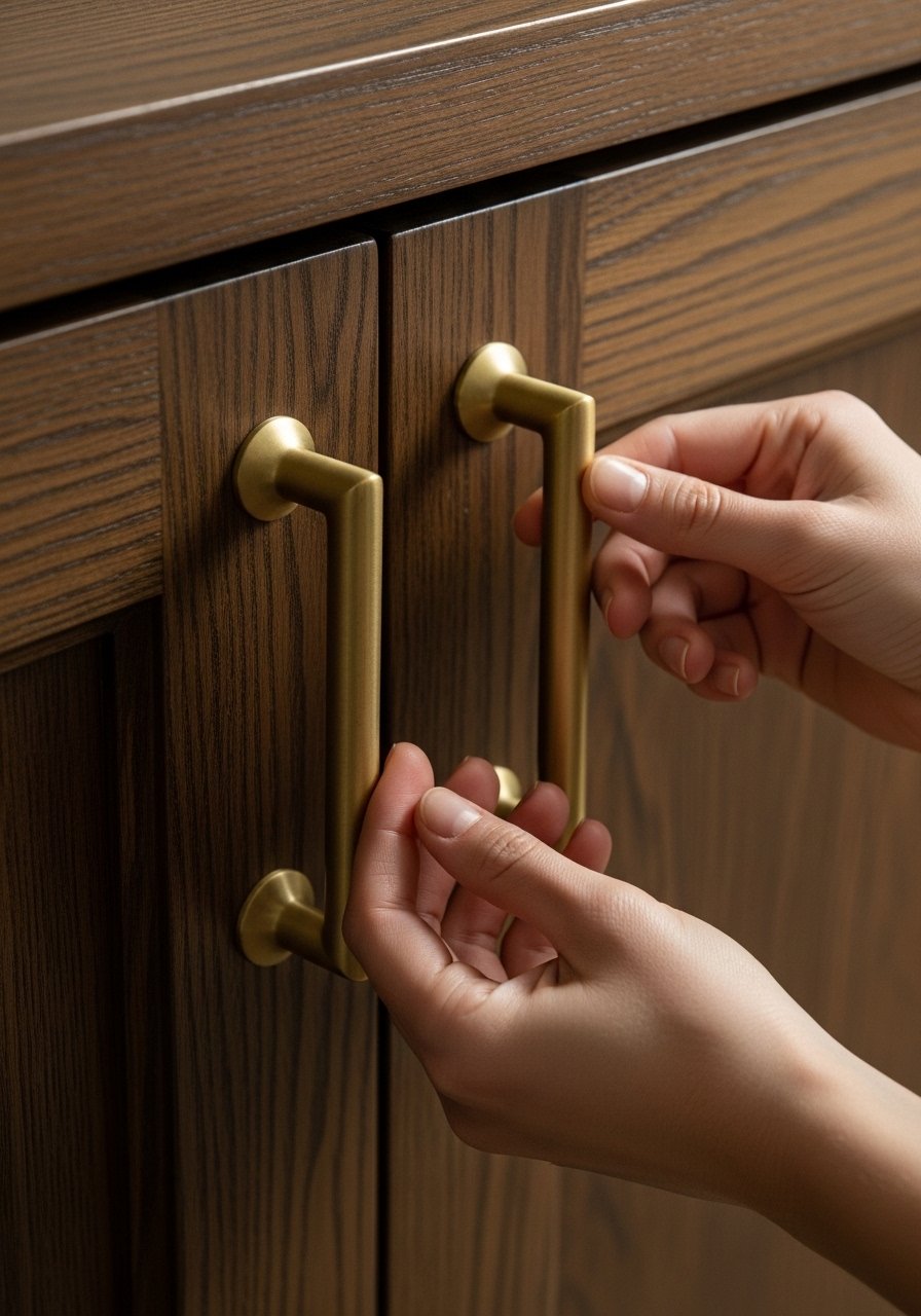
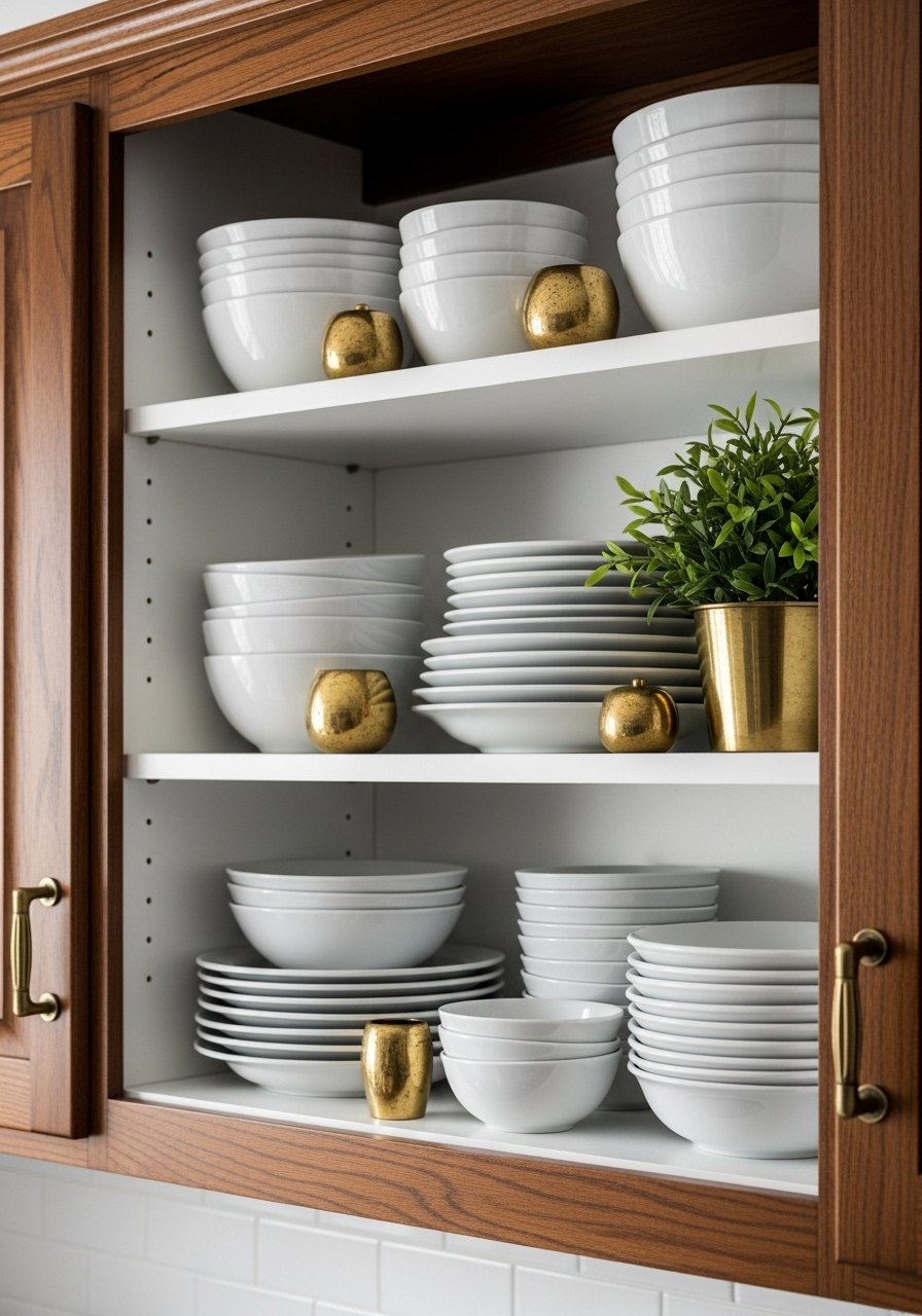
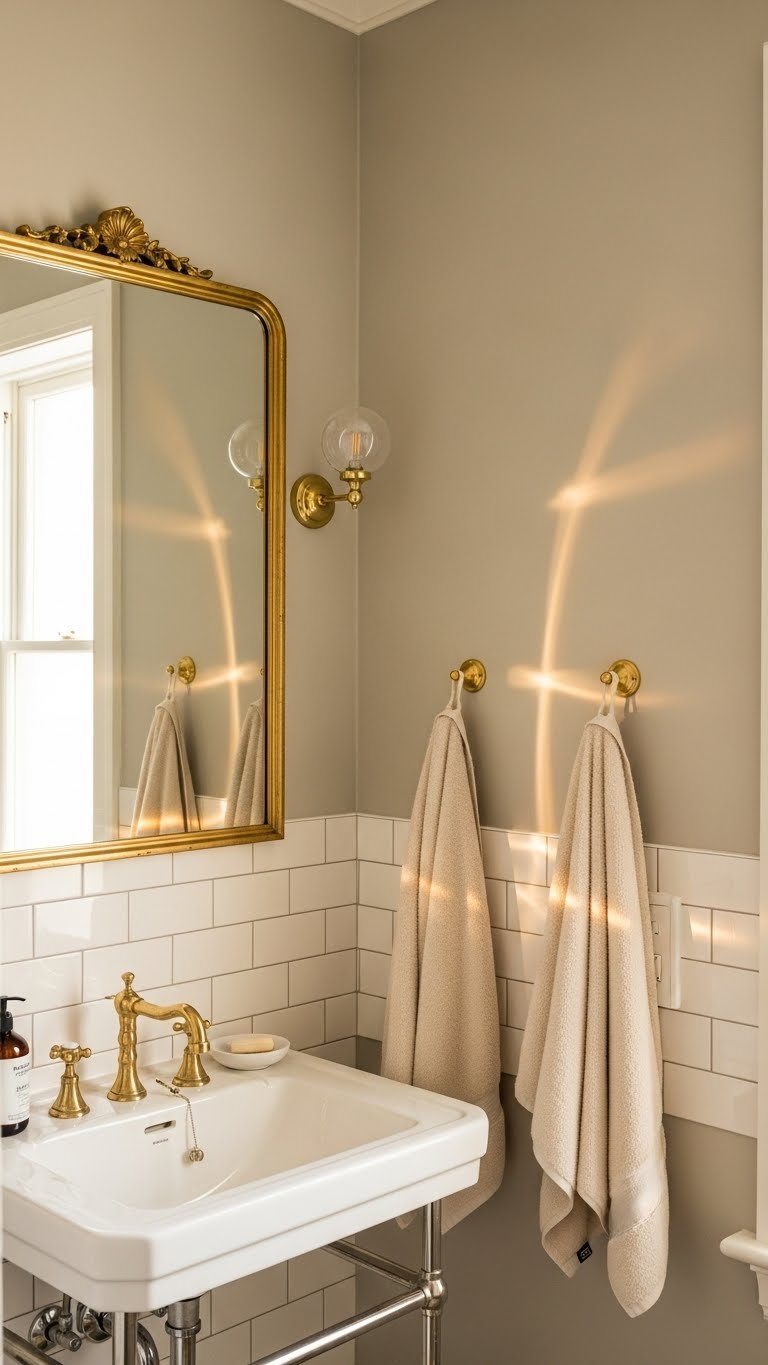
    8. Pale Greige with Warm Brass Accents

    Greige has enough sophistication to pair well with statement metallics. Brass (warmer than silver) brings richness and vintage charm without the room feeling dated.

    Paint walls a pale greige like Benjamin Moore’s Revere Pewter or Sherwin-Williams’ Urbane Gray. Source brass fixtures and hardware from Anthropologie, Schoolhouse, or even Home Depot for $30–$150 depending on how many pieces you’re replacing. Paint is $30–$60. Replacing fixtures takes a few hours if you’re handy, or budget a plumber visit ($150–$250). This is a weekend project if DIY, or a half-day if hiring help.

    Pro tip: Mix brass with wood tones—they complement each other beautifully and prevent the room from feeling too metallic.

    The space gains warmth and character while staying timeless and refined.

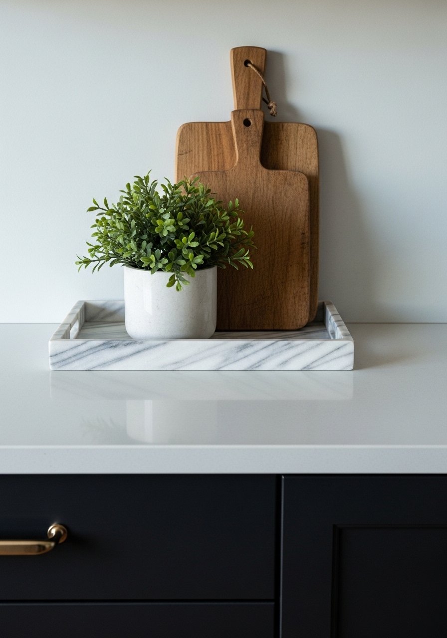
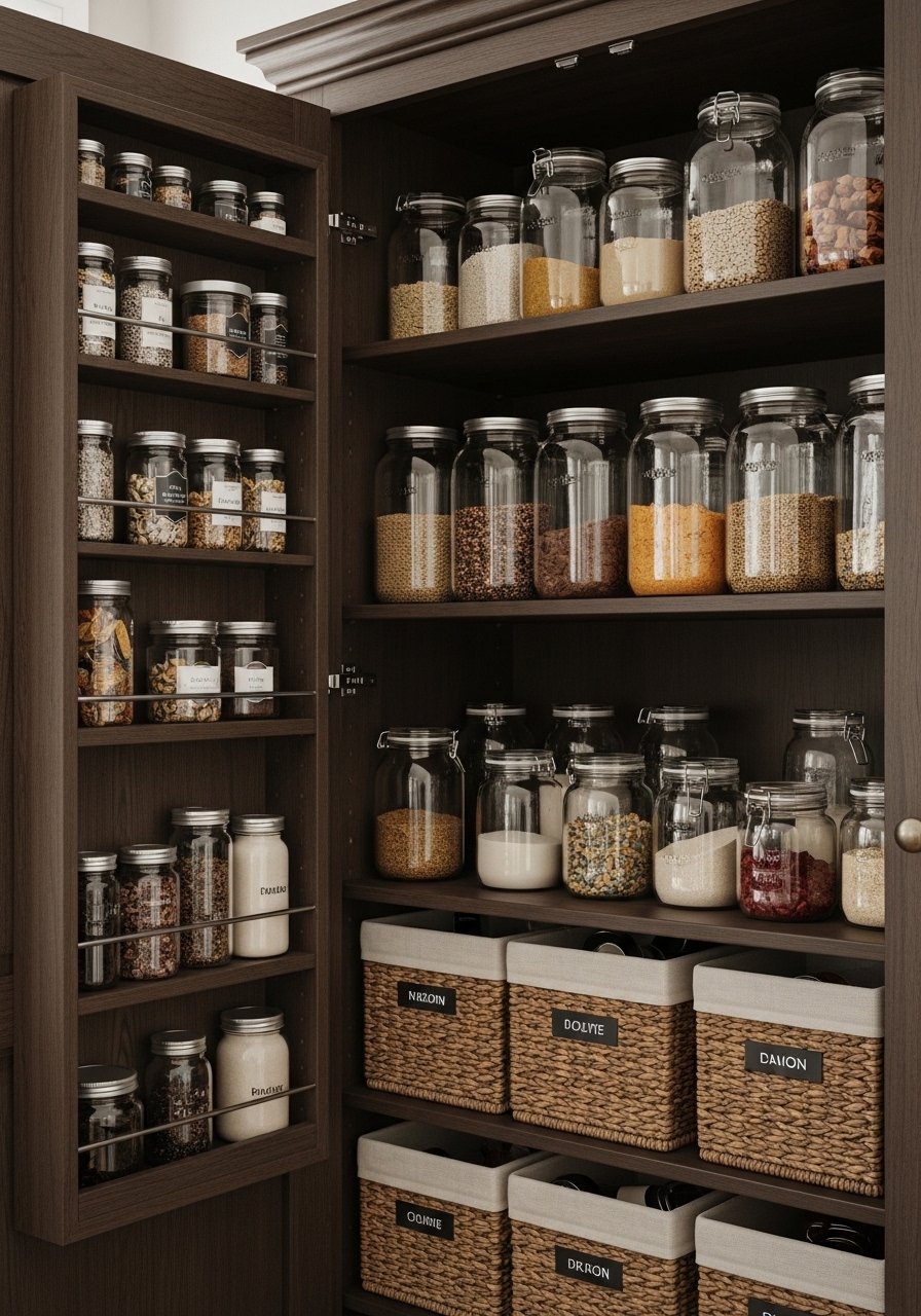
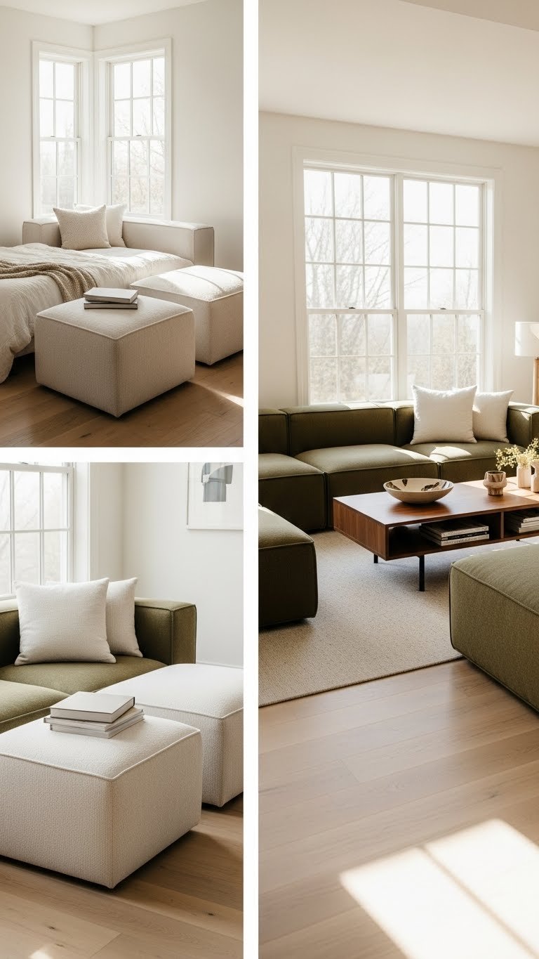
    9. Warm Off-White with Layered Texture (No Paint Required)

    If you can’t paint or you’re renting, this is your answer: create depth through texture alone. Multiple cream and off-white tones layered together feel intentional and sophisticated.

    Keep existing walls off-white or cream (or paint them if you can). Layer furnishings in varying neutral tones: ivory, oatmeal, cream, natural linen, wool, and jute. Mix one seating piece you love with rugs, throws, and pillows from Target, IKEA, or Wayfair. A quality sofa runs $400–$1,200, but area rugs are $50–$200 and throw pillows are $10–$30 each. You can do this entirely with budget pieces. Styling takes an afternoon, zero construction time needed.

    Texture is the secret weapon of neutral design—it’s what makes minimalism feel warm instead of sterile.

    Your space becomes visually interesting and deeply inviting without a single wall color change.

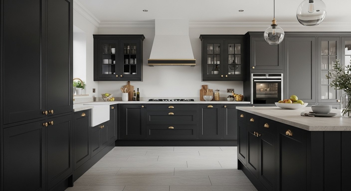
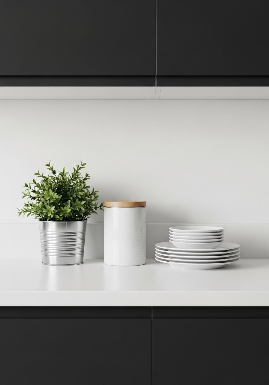
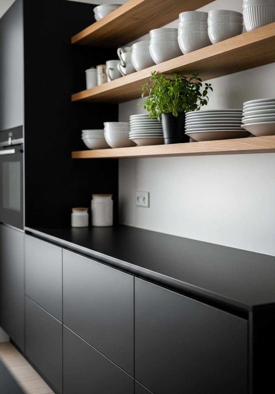
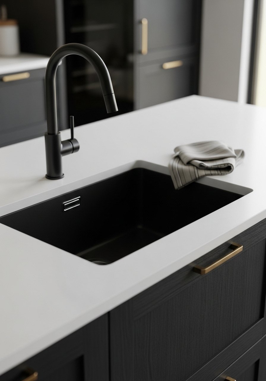
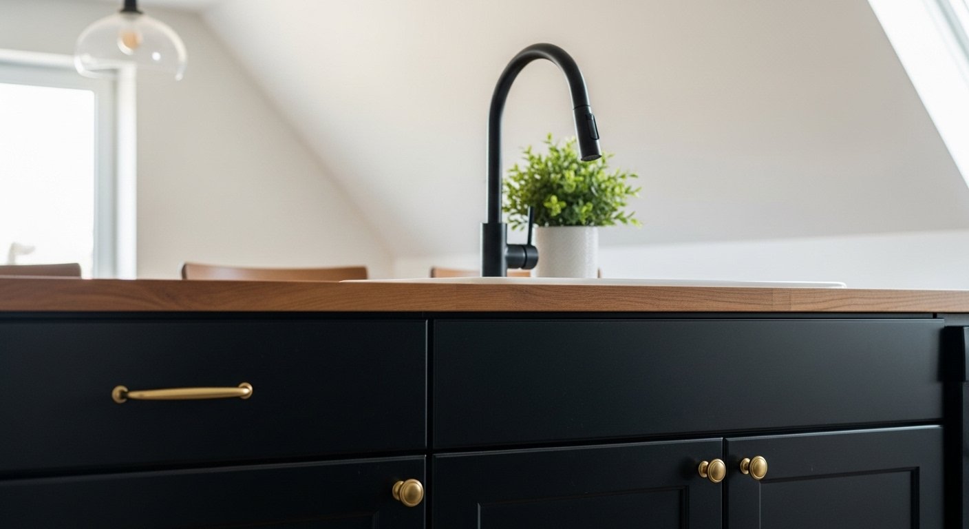
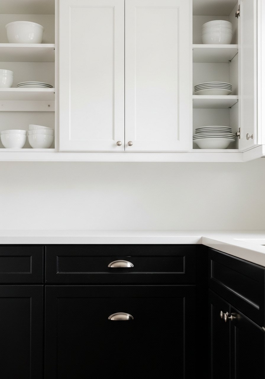
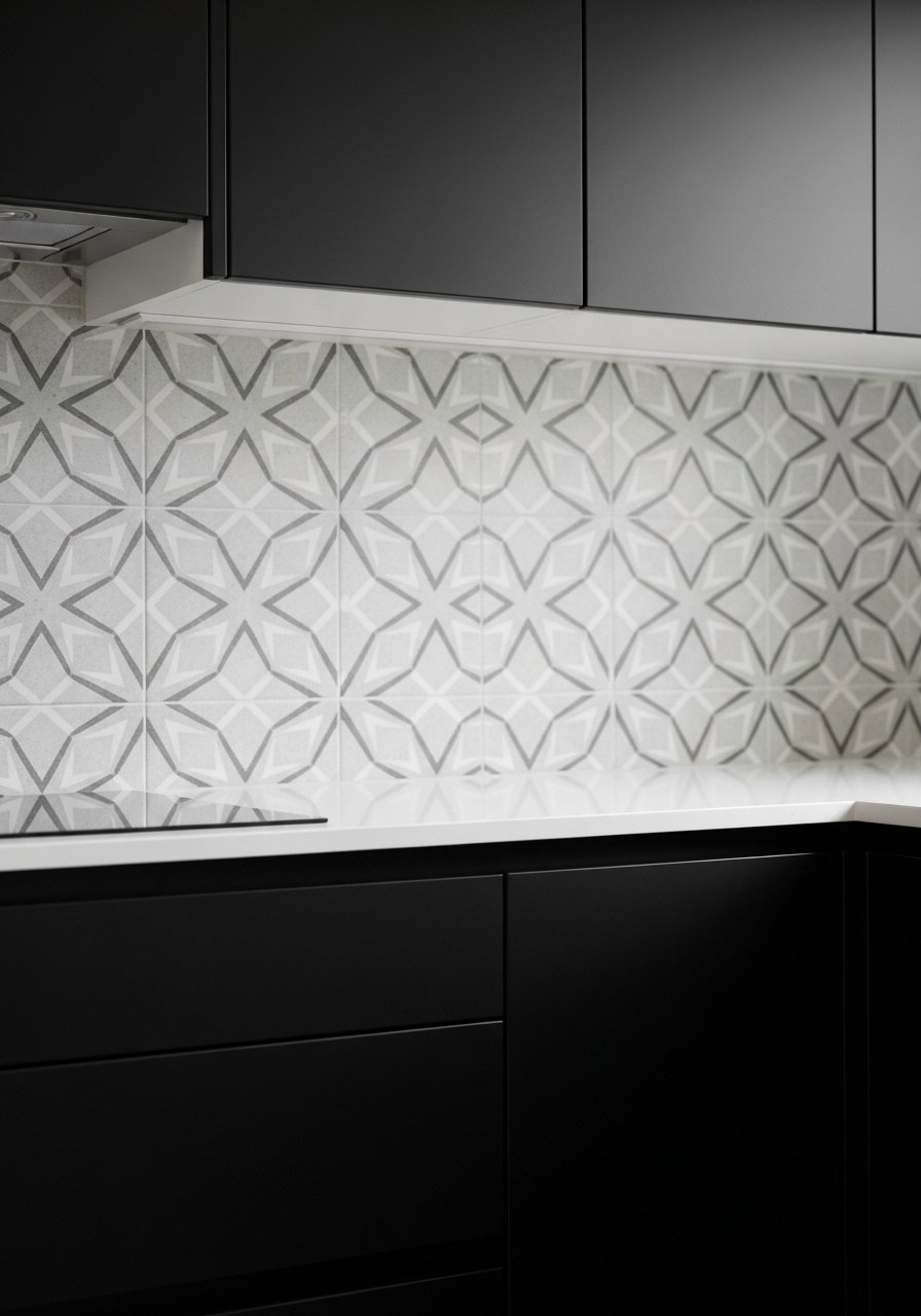
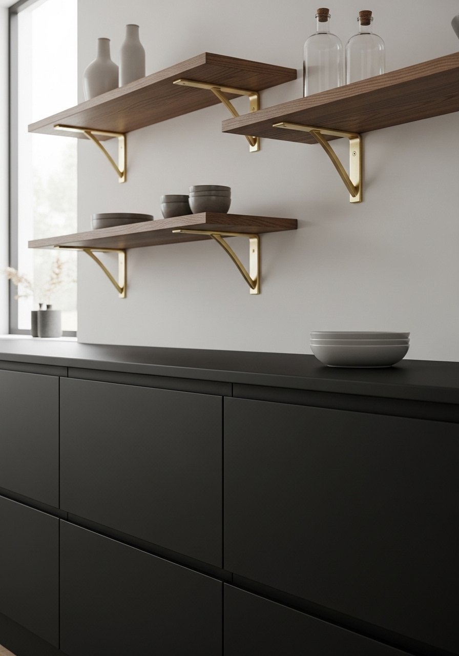
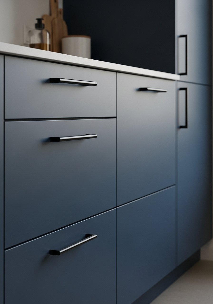
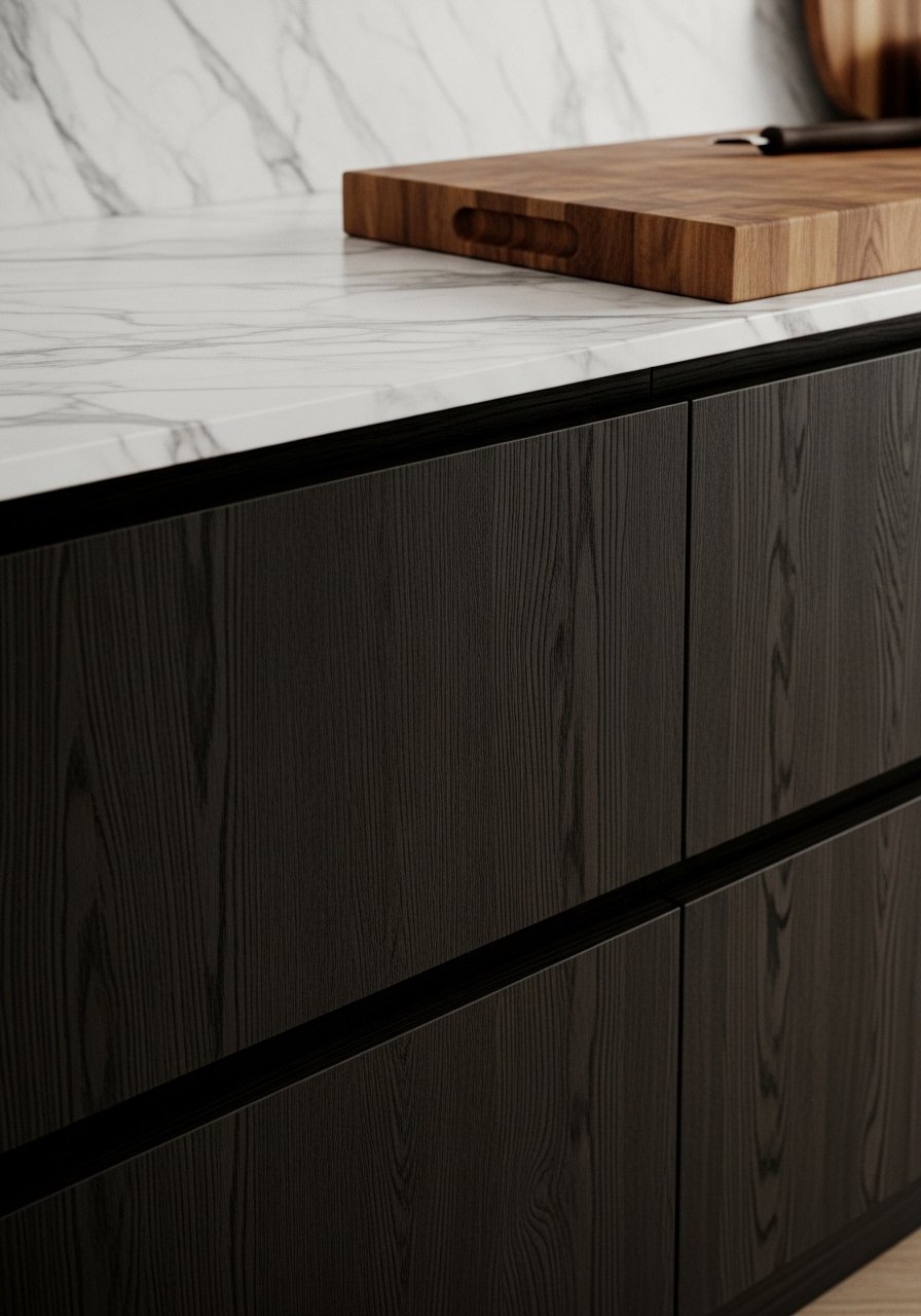
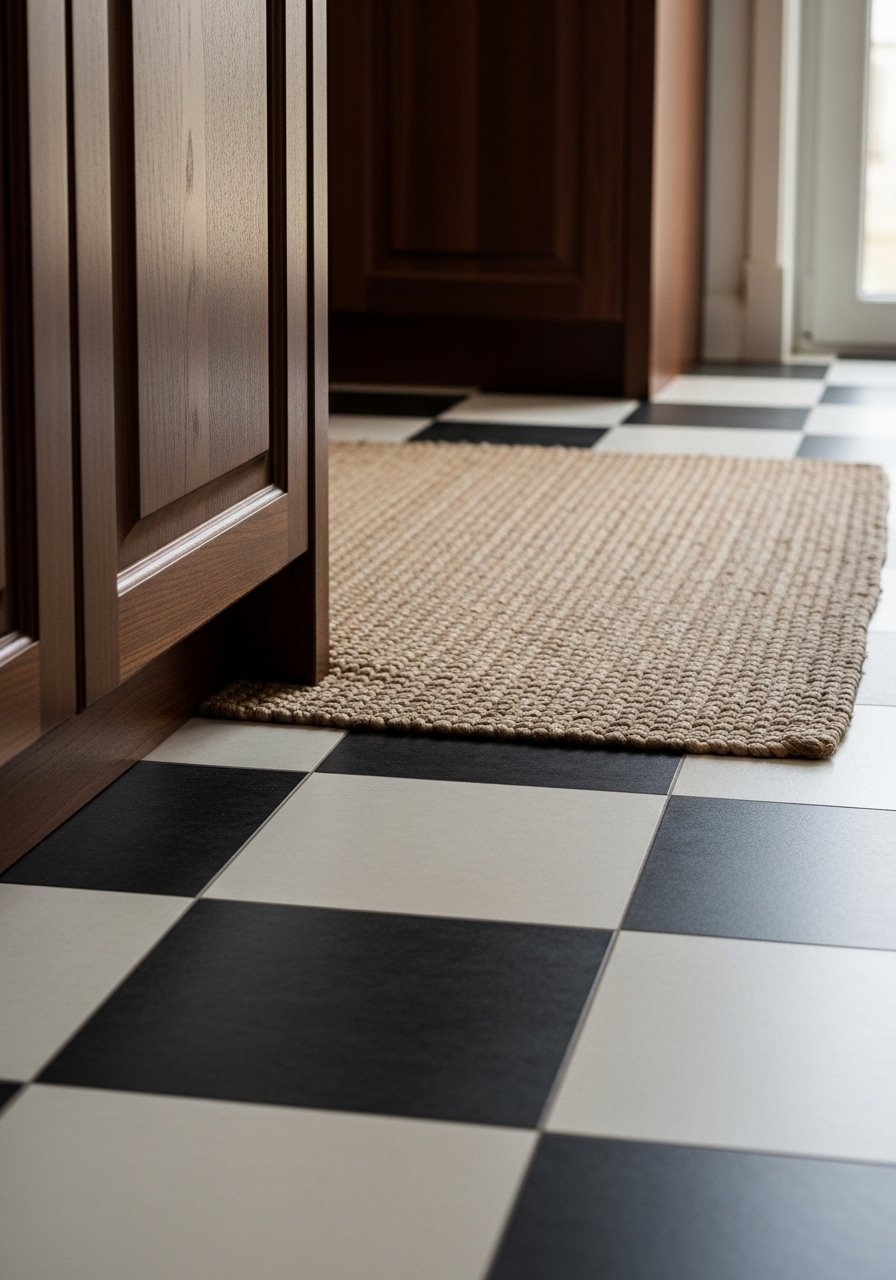
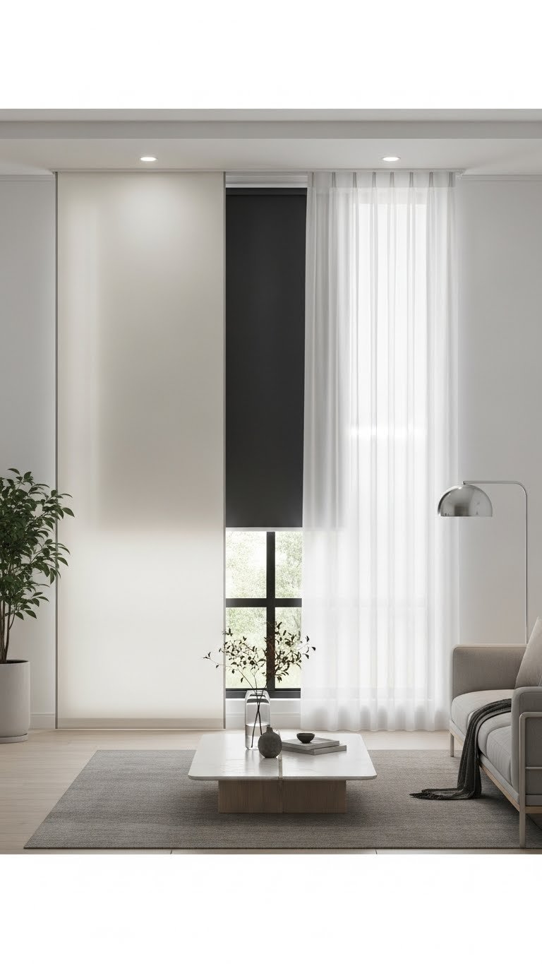
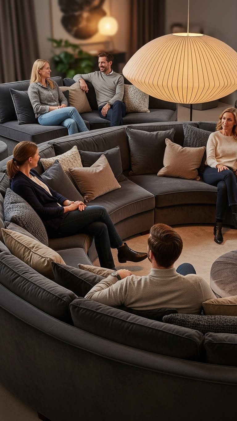
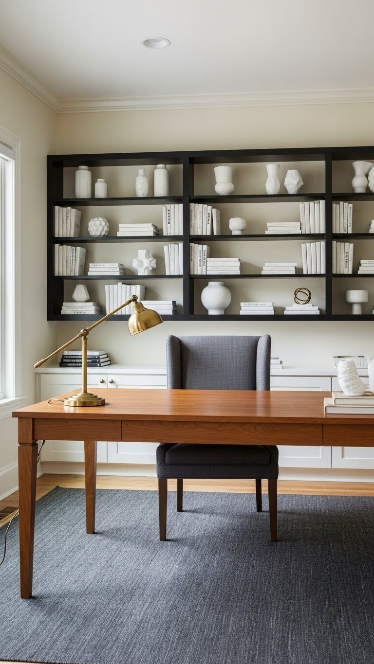
    10. Soft Stone Gray with Black Accents

    Stone gray isn’t quite taupe and isn’t quite greige—it’s its own sophisticated thing. Add black accents (frames, metal furniture, window trim) and suddenly it feels modern and intentional rather than bland.

    Paint walls a soft stone gray like Benjamin Moore’s Stone Mountain Gray or Sherwin-Williams’ Urbane Gray. Introduce black through furniture, artwork frames, or window trim rather than painting large areas black. Black metal bed frames, nightstands, or shelving from IKEA, Target, or Wayfair run $80–$400. Paint is $30–$60. This is a weekend project if painting, plus whatever time you need for furniture assembly.

    Black grounding makes gray feel more confident and modern—it’s the difference between “boring” and “intentional.”

    Your room develops a gallery-like, curated quality that feels both contemporary and restful.

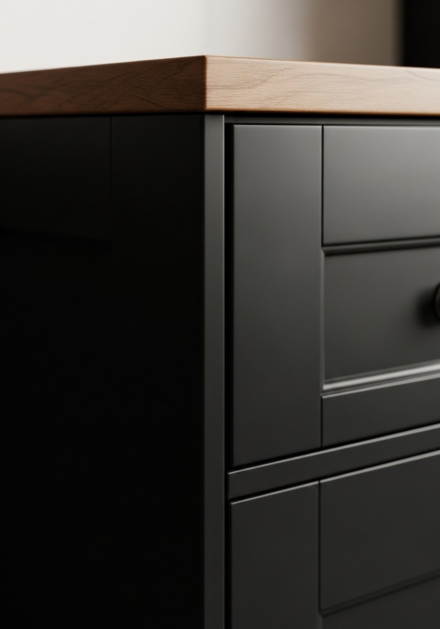
    11. Warm Sand with Deep Charcoal Trim

    This is a classic high-design move: light walls with dark trim. It creates visual architecture and sophistication without relying on bold color.

    Paint walls a warm sand like Benjamin Moore’s Balanced Beige or Sherwin-Williams’ Urbane Gray (yes, it can read as sand depending on lighting). Paint trim, baseboards, and doors a deep charcoal like Sherwin-Williams’ Iron Ore or Benjamin Moore’s Cavern Clay. This requires more prep work and care than a single color, but the payoff is a custom, designed feel. Paint for both colors is $30–$60 each. This is a 2–3 weekend project as trim takes more time and precision than walls.

    Pro tip: A paint sprayer makes trim painting faster and smoother if you’re renting or doing this in a smaller space—you can rent one for $20–$40 per day.

    The defined trim lines create visual interest and make rooms feel intentionally designed rather than default.

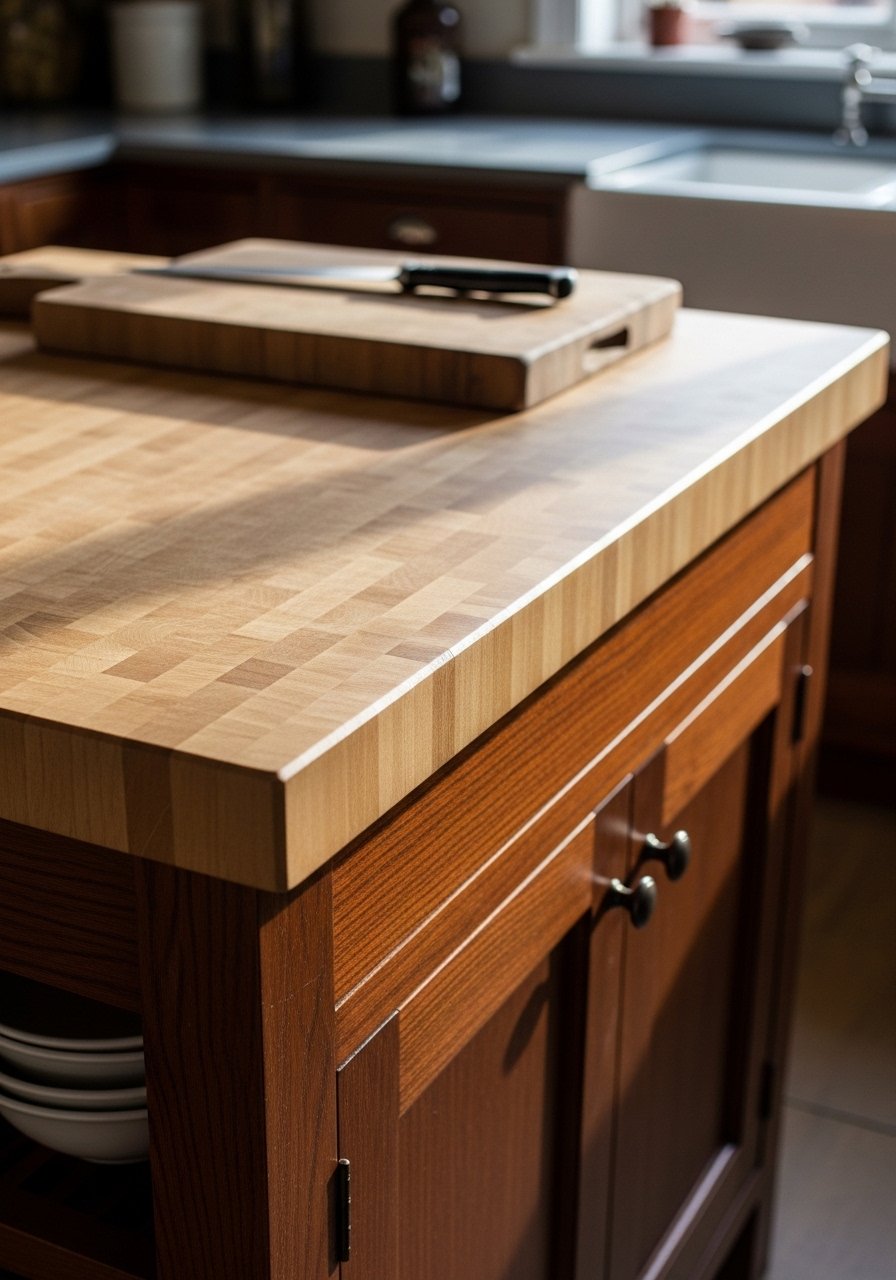
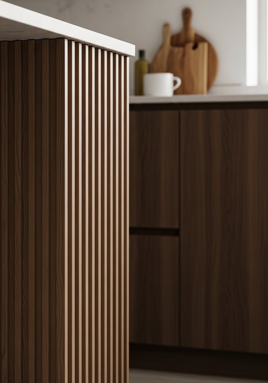
    12. Creamy Neutral with Warm Wood Drenching

    Wood drenching (covering large areas in wood) is trending, and when paired with cream, it creates a warm, organic, nature-inspired space that feels expensive and thoughtful.

    Paint walls a creamy neutral like Benjamin Moore’s Ivory White or Sherwin-Williams’ Accessible Beige. Add wood to one accent wall (or ceiling) using shiplap, board-and-batten, or peel-and-stick wood paneling. Shiplap installation costs $300–$800 if hired out, or peel-and-stick wood paneling runs $30–$80 per sheet. Paint is $30–$60. DIY shiplap takes a full weekend; peel-and-stick is done in 2–3 hours.

    The wood adds warmth, texture, and visual interest—it’s the secret to making cream feel cozy instead of sterile.

    Your space gains organic, layered texture that feels like an intentional design choice, not a default.

    13. Soft Ivory with Cream Upholstery and Brass Details

    Ivory is warmer than pure white but still bright and airy. Layering it with cream furnishings and brass accents creates visual interest through material contrast, not color contrast.

    Paint walls a soft ivory like Benjamin Moore’s Cloud White or Sherwin-Williams’ Alabaster (check undertones—you want the warm version). Choose upholstered pieces in cream with brass nailhead trim or metal legs. You can find nailhead-trim chairs at Article, West Elm, or Wayfair for $300–$800, or score vintage pieces at thrift stores for $30–$100. Paint is $30–$60. Styling this look takes an afternoon; painting takes a weekend.

    The brass nailhead detail adds visual sophistication without needing bold color or pattern.

    Your space becomes a study in texture and material contrast—refined without being fussy.

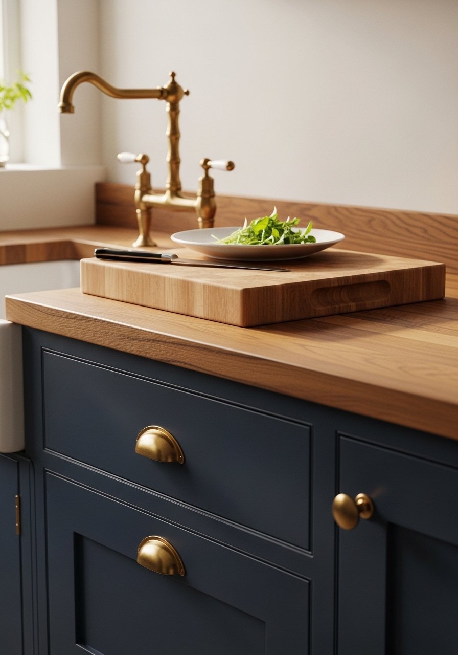
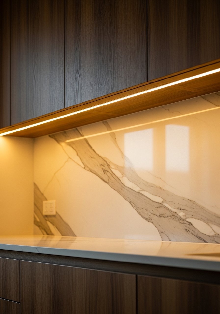
    14. Pale Concrete Gray with Warm Wood and Linen

    Concrete gray sounds industrial, but when it’s pale and paired with warm wood and soft linen, it becomes sophisticated and calm. This works beautifully in offices and bedrooms.

    Paint walls a pale concrete gray like Benjamin Moore’s Coventry Gray or Sherwin-Williams’ Urbane Gray. Balance with warm wood furniture (honey tones, not white-washed) and soft linen textiles. Keep metal accents warm (brass, copper, warm steel). Paint is $30–$60, and styling pulls from pieces you likely already own. This is a weekend paint project, or instant if just rearranging.

    The combination feels modern and grounded—it’s the neutral palette of current high-end hotels.

    Your workspace becomes focused and calm, encouraging productivity without feeling sterile or cold.

    15. Buttery Neutral with Warm Metallics and Vintage Finds

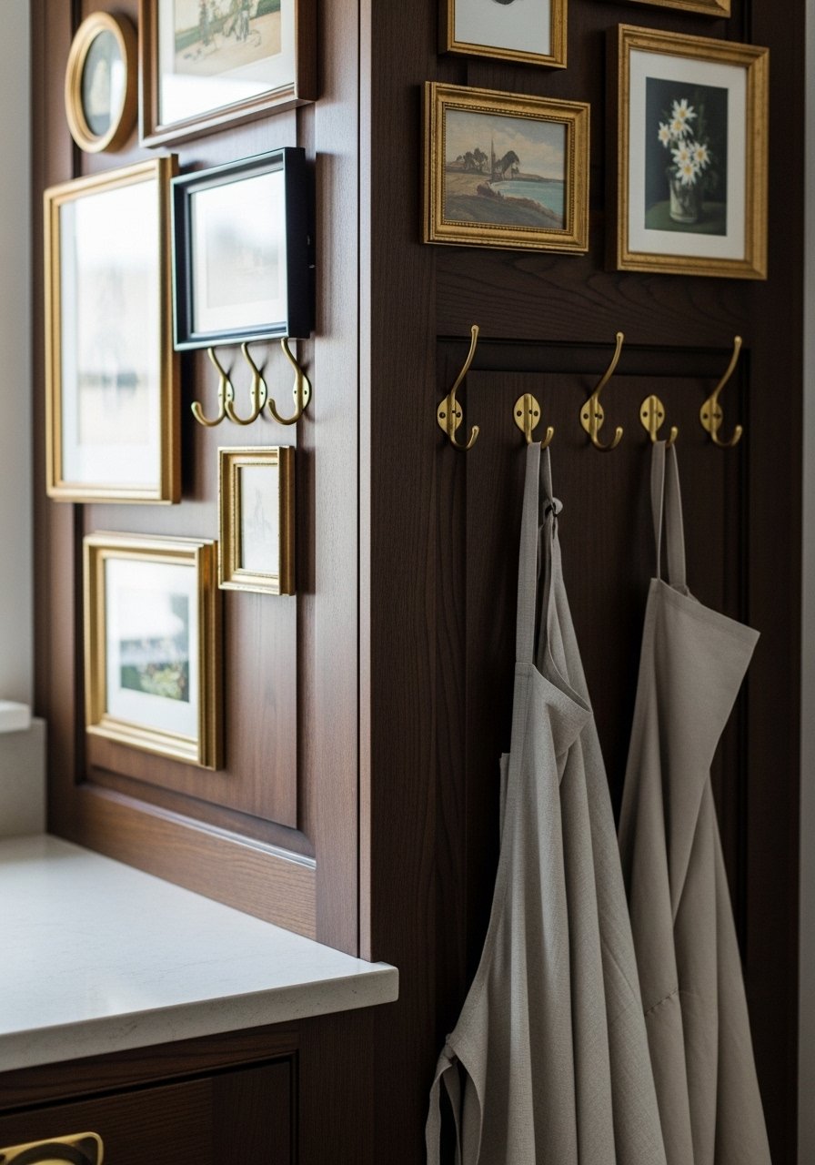
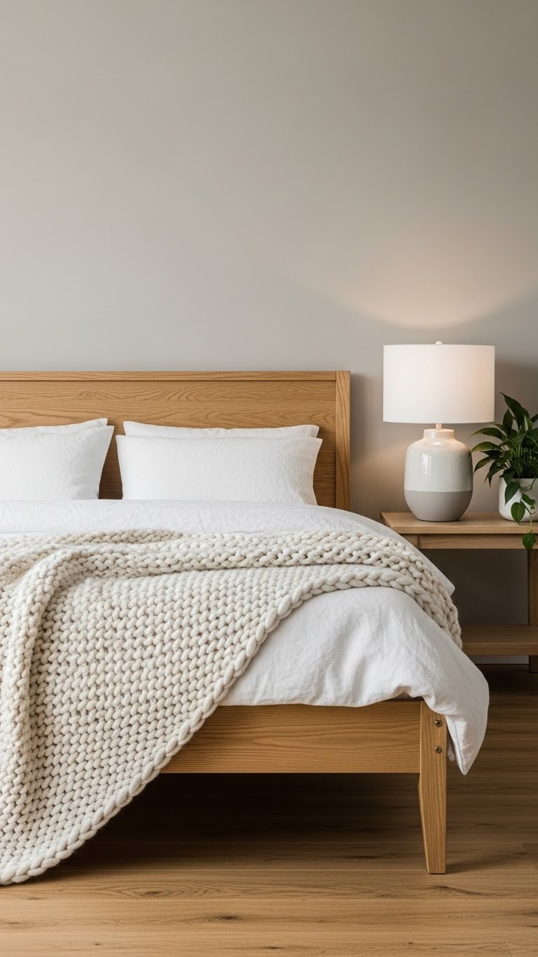
    Buttery neutrals (warmer than standard beige, less yellow than butter) pair beautifully with vintage brass and one-of-a-kind finds. This creates a personal, lived-in luxury feel.

    Paint walls a buttery neutral like Benjamin Moore’s Pale Oak or Sherwin-Williams’ Soft Sunlight. Layer in vintage finds: brass bed frames, ornate mirrors, or antique brass lamps from thrift stores ($10–$50 per piece), Etsy, or Chairish. One great vintage piece makes a space feel curated. Paint is $30–$60. Styling happens as you find pieces—this is an ongoing project you enjoy.

    Vintage pieces tell a story—they’re proof your space reflects actual taste, not a catalog order.

    Your bedroom becomes a personal sanctuary that feels collected over time, even if you found everything last month.

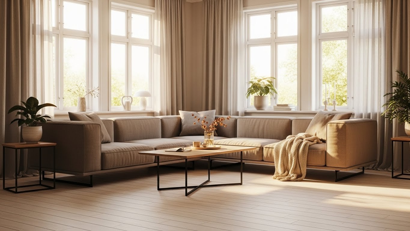
    16. Cool White with Soft Gray and Warm Wood Flooring

    This is the Scandinavian-inspired neutral that works in almost any home. Cool white and gray are crisp and clean, while warm wood flooring adds soul.

    Paint walls a cool white like Benjamin Moore’s Cloud White or Sherwin-Williams’ Alabaster (prioritize the version with cool undertones). Choose gray upholstered pieces and keep wood warm. If you’re refinishing floors, honey or natural tones work best—professional refinishing costs $2–$4 per square foot, but you can achieve similar warmth with area rugs ($50–$300) if you’re renting. Paint is $30–$60. Painting is a weekend; flooring is a larger project best done with professionals.

    The contrast between cool whites and warm wood creates visual interest without color boldness.

    Your home gains a clean, intentional feel that ages beautifully and never feels trendy or dated.

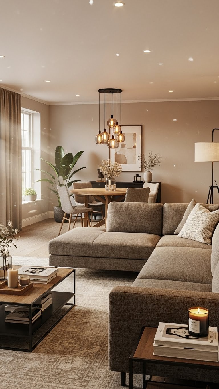
    17. Warm Greige with Natural Jute and Linen Layering

    Greige is flexible, but when you lean into warm undertones and layer natural materials, it becomes deeply comfortable. This is the palette of modern farmhouse without the trendy elements.

    Paint walls a warm greige like Sherwin-Williams’ Accessible Beige or Benjamin Moore’s HC-86 (a warm greige from their Historical Collection). Layer jute rugs ($40–$150), linen bedding ($80–$200), and natural fiber throws ($30–$80) from Target, West Elm, or Wayfair. Add a wooden bed frame and simple wood shelving. Paint is $30–$60. Styling this takes an afternoon; painting takes a weekend.

    Natural materials improve with age—they don’t look dated because they don’t rely on trends.

    Your bedroom becomes a sensory experience: warm, touchable, and deeply inviting.

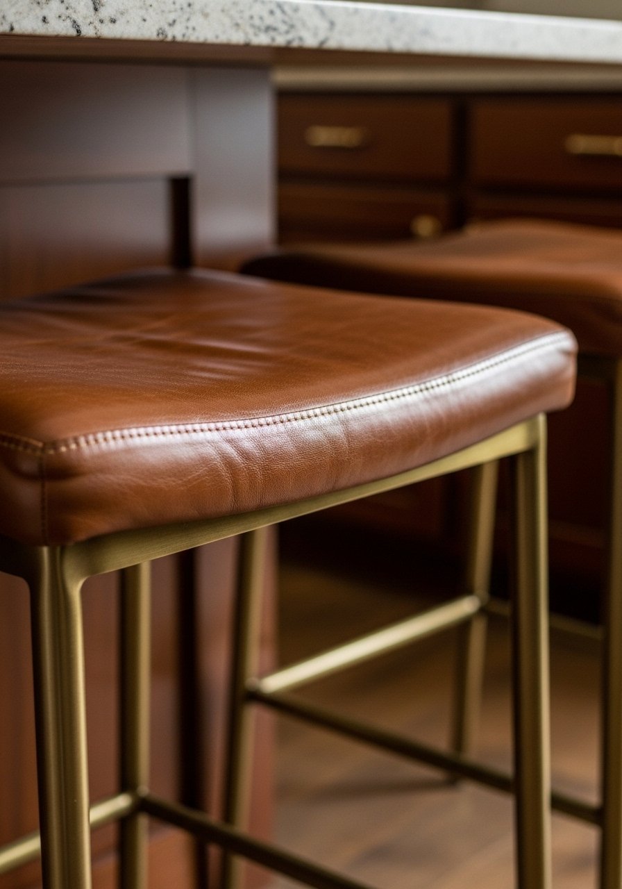
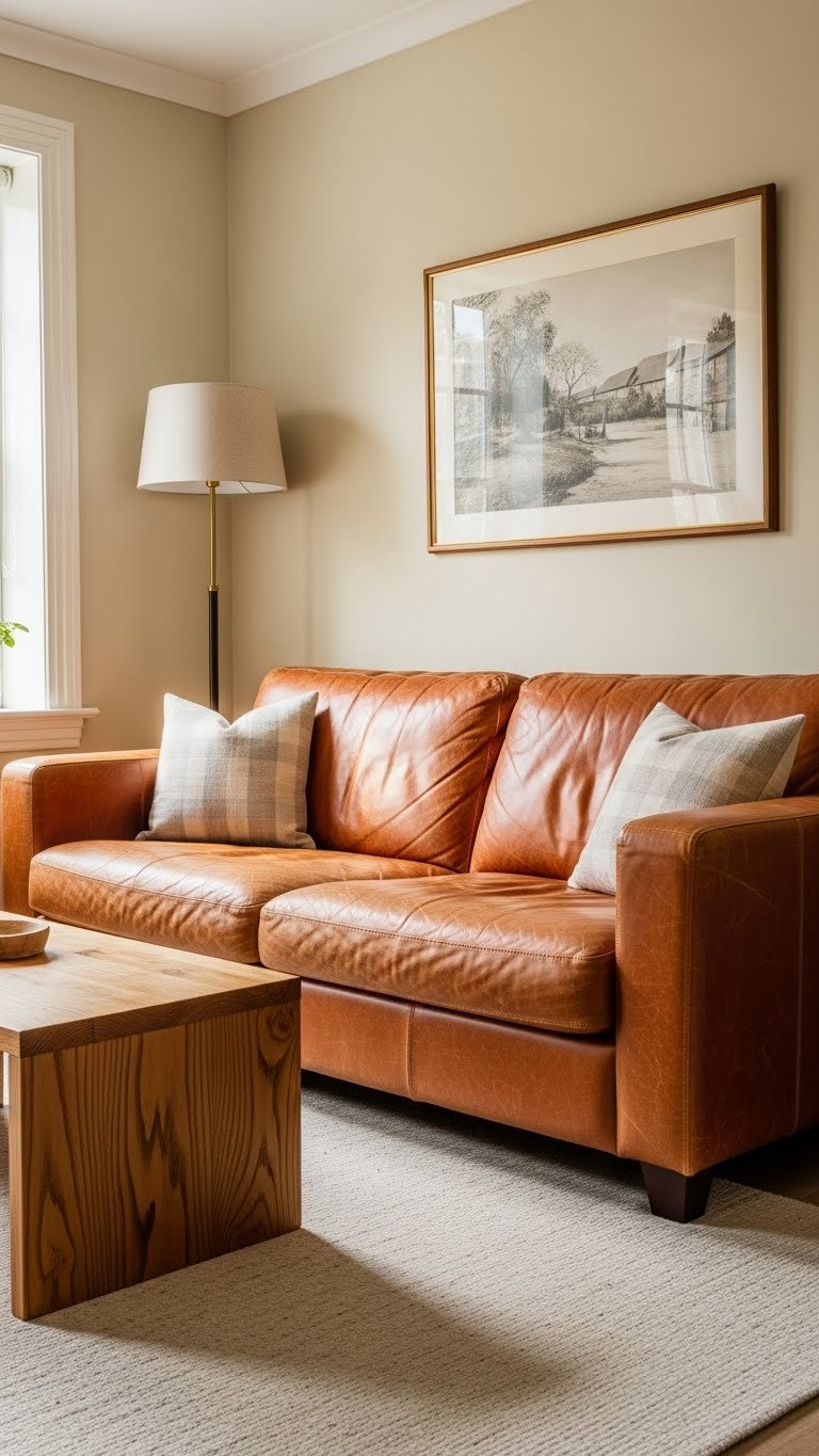
    18. Pale Sand with Soft Brown Leather Accents

    Sand alone can feel generic, but add warm brown leather and suddenly it’s sophisticated. Leather ages beautifully and develops character over time.

    Paint walls a pale sand like Benjamin Moore’s HC-60 (Pale Oak) or Sherwin-Williams’ Urbane Gray (if it reads sandy in your lighting). Source a leather sofa in cognac or warm brown from Article, Room & Board, or Facebook Marketplace. A quality leather sofa runs $800–$2,000 new, but you can find vintage leather pieces for $200–$600. Paint is $30–$60. This is a weekend paint project; the furniture is an ongoing investment.

    Leather softens as it ages—it becomes more beautiful with wear, not less.

    Your space gains warmth and authenticity through one statement piece that will last for decades.

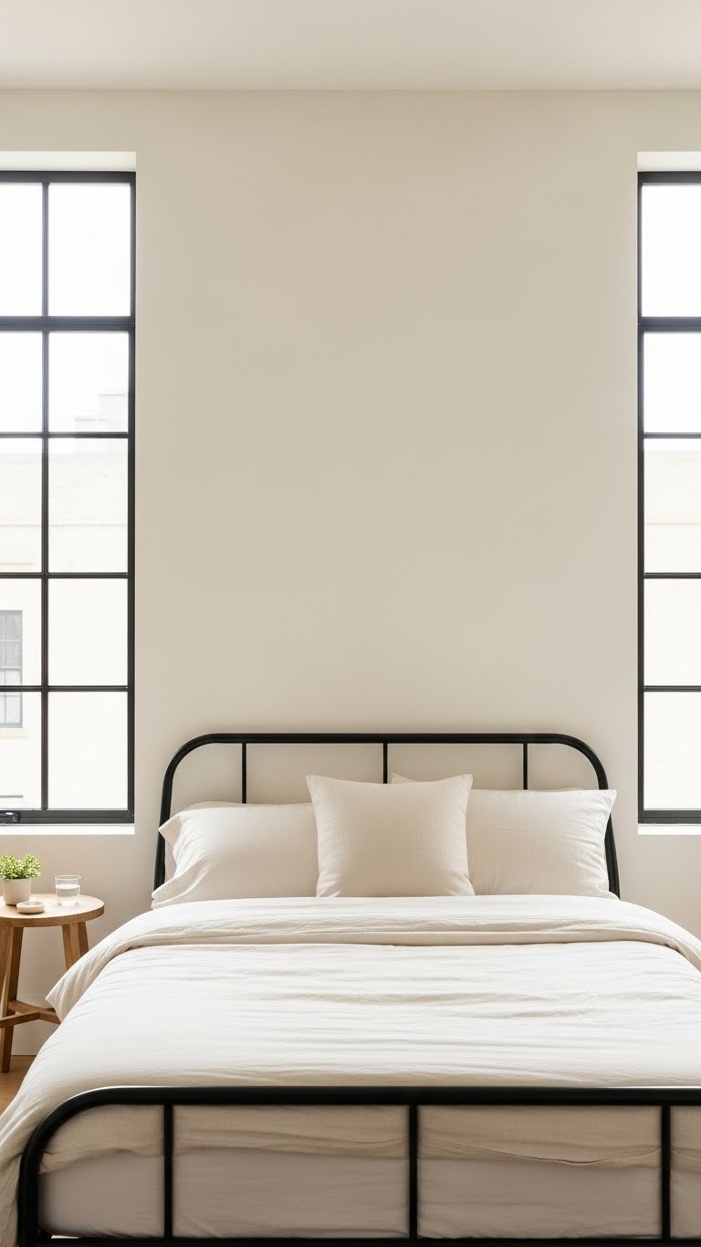
    19. Cream Walls with Black Window Frames and Linen

    This is modern cottage core—cream keeps it soft, black frames add edge, and linen ensures it doesn’t feel precious or fussy.

    Paint walls a warm cream like Benjamin Moore’s Cloud White or Sherwin-Williams’ Alabaster. Paint window frames (and potentially doors) black—Benjamin Moore’s Iron Ore or Sherwin-Williams’ Black Magic. Choose cream linen bedding and minimal styling. If repainting window frames is too much, focus on black accents: a bed frame ($300–$800 from IKEA or Article), black pendant lights ($30–$80 each), or a black door frame. Paint for walls and trim is $30–$60 each. This is a 2–3 weekend project if painting frames, or instant if just adding black furniture.

    Black grounds cream and prevents it from feeling washed out—it adds intentionality.

    Your space becomes a sophisticated retreat that feels current without following trends too closely.

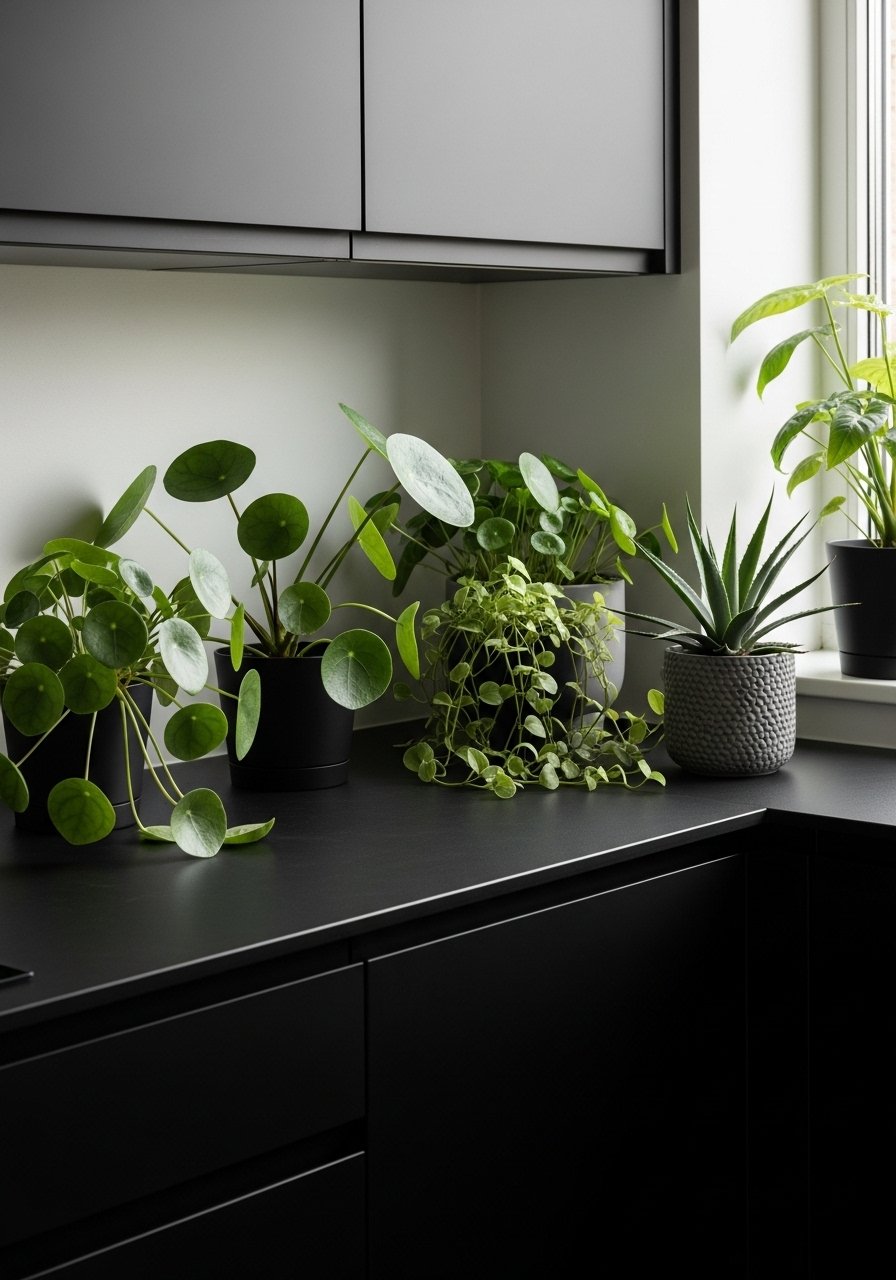
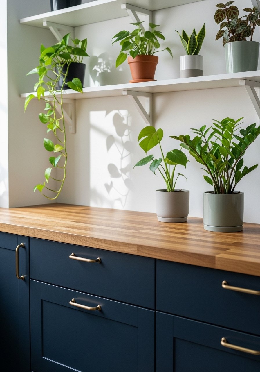
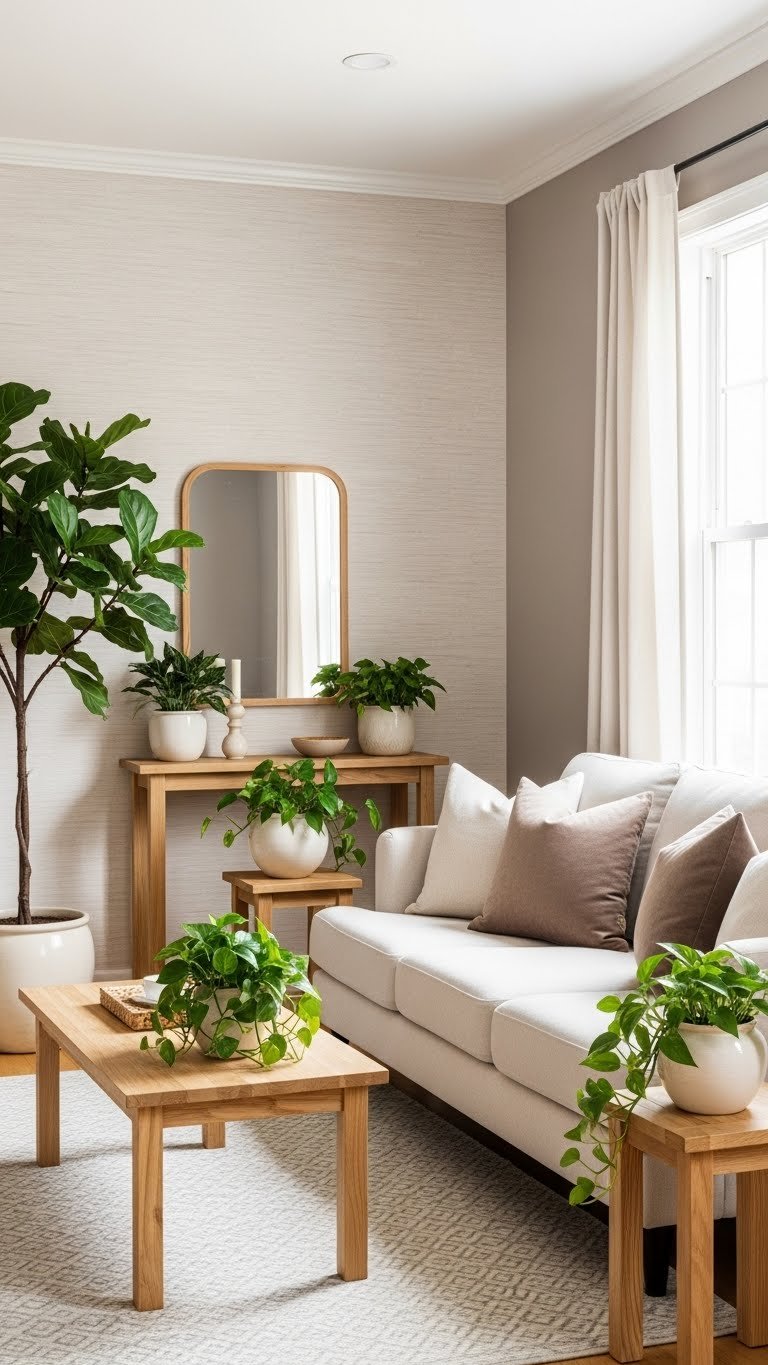
    20. Soft Taupe with Cream Textures and Green Accents

    Taupe plus green feels organic without being heavily botanical. The green comes through accessories (plants, small decor) so you can change it without repainting.

    Paint walls a soft taupe like Sherwin-Williams’ Accessible Beige or Farrow & Ball’s String. Use peel-and-stick textured wallpaper on one wall ($30–$50) in cream to add dimension. Introduce green through living plants and ceramic planters ($10–$40 per plant and pot). Keep greenery mostly potted plants rather than printed patterns so you can update it seasonally. Paint is $30–$60. This comes together in an afternoon of styling; painting takes a weekend.

    Living plants literally improve air quality and mood—they’re not just decorative.

    Your space gains life and organic warmth while staying completely neutral and sophisticated.

    21. Warm Off-White with Rich Charcoal Accents and Brass

    This sophisticated trio (off-white, charcoal, brass) creates a space that feels intentionally designed and current. It works beautifully in offices, studies, and formal living rooms.

    Paint walls a warm off-white like Benjamin Moore’s Cloud White or Sherwin-Williams’ Accessible Beige. Add charcoal through an upholstered chair ($200–$600), area rug ($80–$200), and potentially wall paneling or artwork. Brass accents come through lighting, desk accessories, and hardware. Paint is $30–$60. Styling takes an afternoon; painting takes a weekend. If adding paneling, budget another weekend.

    The charcoal makes off-white feel cleaner and more graphic—it adds visual structure.

    Your space becomes a focused, professional environment that feels both creative and grounded.

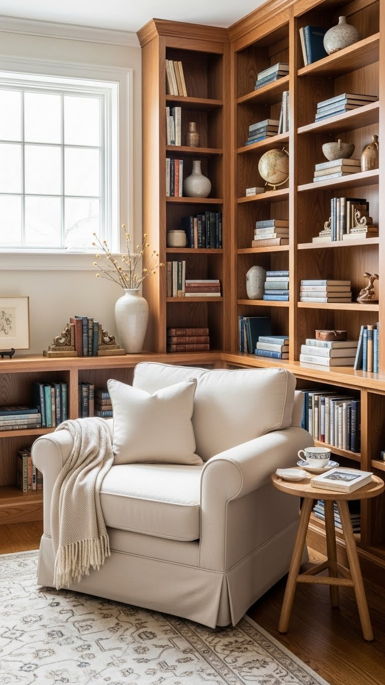
    22. Creamy Neutral Walls with Warm Wood Shelving and Books

    Books are beautiful, and when shelving is warm wood and walls are cream, the books themselves become the color and pattern. This is neutral design that’s far from boring.

    Paint walls a creamy neutral like Benjamin Moore’s Ivory White or Sherwin-Williams’ Alabaster. Install warm wood shelving (or use floating shelves from IKEA for $15–$30 each). Style with your existing books and a few decorative objects in cream, wood, and metal. Paint is $30–$60, and shelving depends on whether you’re building ($100–$400) or using ready-made ($50–$150 for several shelves). This takes a weekend to paint and install.

    Books provide organic color, texture, and pattern—they’re design elements that serve a purpose.

    Your space becomes a visually interesting retreat that celebrates what you actually read and love.

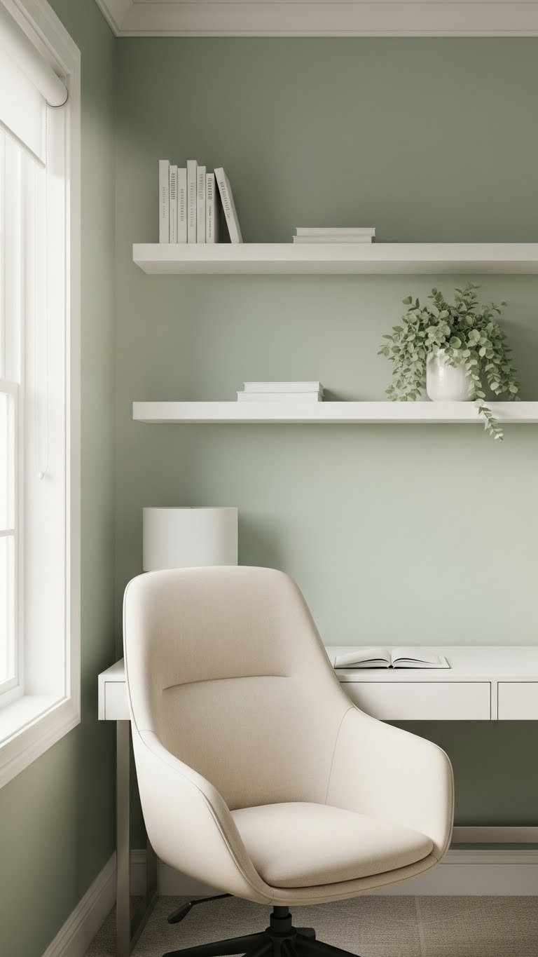
    23. Soft Gray-Green with Warm Brass and Natural Fibers

    Gray-green is that perfect cool-warm hybrid. It’s earthy without being yellow, and when paired with brass and natural fibers, it feels like a luxury retreat.

    Paint walls a soft gray-green like Sherwin-Williams’ Sea Salt or Benjamin Moore’s HC-122 (a subtle gray-green). Layer with brass accents: bed frame ($400–$1,000), table lamps ($60–$150 each), or mirror frame ($50–$150). Add natural fiber bedding and throws in cream, oatmeal, and ivory. Paint is $30–$60. This creates a cohesive, luxury-hotel look in a weekend of painting plus styling.

    The gray-green acts like a sophisticated green without being bold or trend-focused—it’s timeless.

    Your bedroom becomes a serene sanctuary that feels high-end and deeply restful.

    24. Pale Ivory with Warm Wood Beams and Linen Ceiling

    Ceiling treatments are underrated. Pale ivory walls with exposed or added warm wood beams creates instant architectural interest and warmth.

    Paint walls pale ivory like Benjamin Moore’s Cloud White or Sherwin-Williams’ Alabaster. If you have existing beams, keep them warm and natural; if you’re adding them, faux wood beams are available as peel-and-stick or lightweight options for $100–$300 per beam. Paint is $30–$60. Hanging curtains is instant; adding beams takes a weekend if DIY or a few hours if hiring help.

    Pro tip: Even adding one beam over the bed creates visual impact without a major renovation.

    Your space gains architectural interest and warmth that makes it feel designed and intentional.

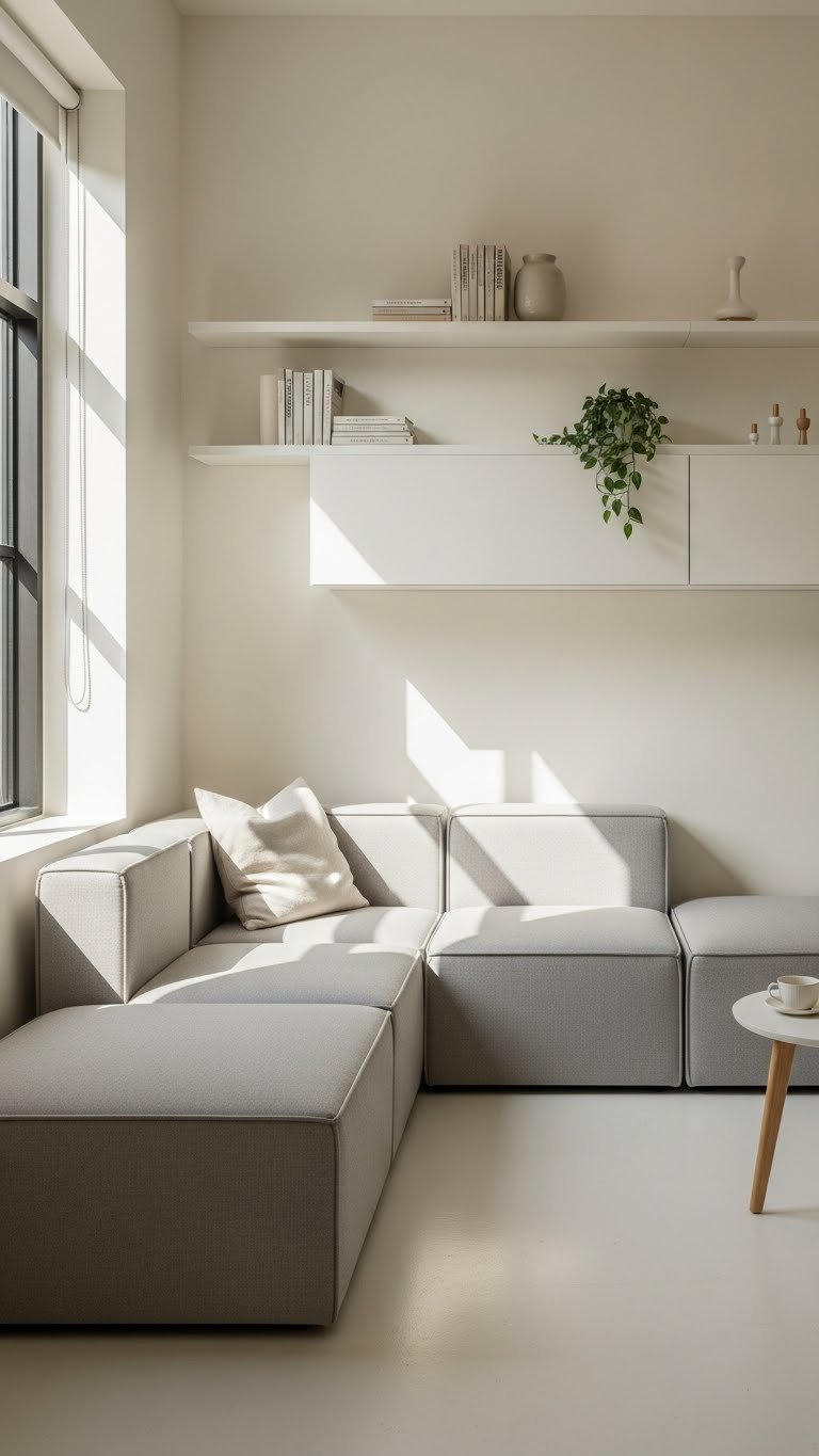
    25. Warm Beige with Layered Textures and Minimalist Styling

    This is warm minimalism—it’s the trend for 2025. Beige walls, intentional restraint, and texture-based layering create a calm, curated, deeply personal space.

    Paint walls a warm beige like Benjamin Moore’s HC-68 (Pale Oak) or Sherwin-Williams’ Urbane Gray (if it reads warm in your space). Layer cream and white textured bedding, add one or two high-quality wooden pieces, and resist the urge to fill space. Keep styling minimal: one plant, one artwork, one throw. Paint is $30–$60. This is a weekend painting project plus an afternoon of intentional styling (which involves removing items, not adding them).

    Restraint is the hardest part of minimalism—it’s more sophisticated than having fewer things.

    Your bedroom becomes a personal retreat where every object means something—nothing is filler.

    26. Soft Stone with Warm Gray and Natural Linen

    Stone (that undefined warm-gray-beige hybrid) pairs beautifully with warm gray and linen for a look that’s both sophisticated and approachable.

    Paint walls a soft stone color like Benjamin Moore’s Stone Mountain Gray or Sherwin-Williams’ Urbane Gray. Choose a gray linen sofa ($600–$1,500 from Article, West Elm, or similar) or style with gray upholstered seating you already own. Layer cream throws ($30–$80) and jute rugs ($50–$150). Paint is $30–$60. Sofa shopping can take time, but styling existing pieces takes an afternoon; painting takes a weekend.

    Linen has a relaxed, lived-in quality—it wrinkles, and that’s the point. It proves the fabric is real.

    Your space becomes a sophisticated gathering place that feels warm, welcoming, and intentionally designed.

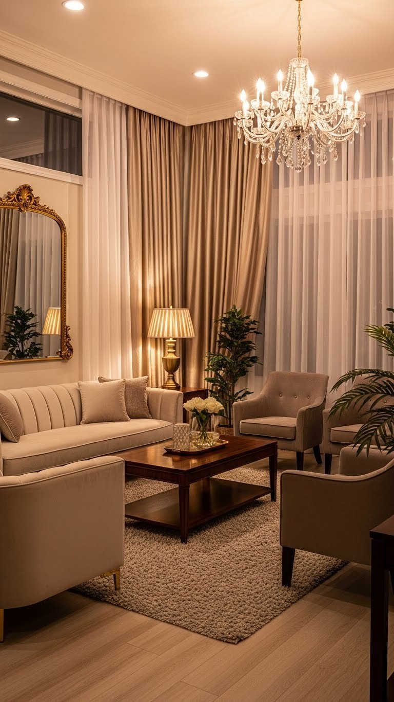
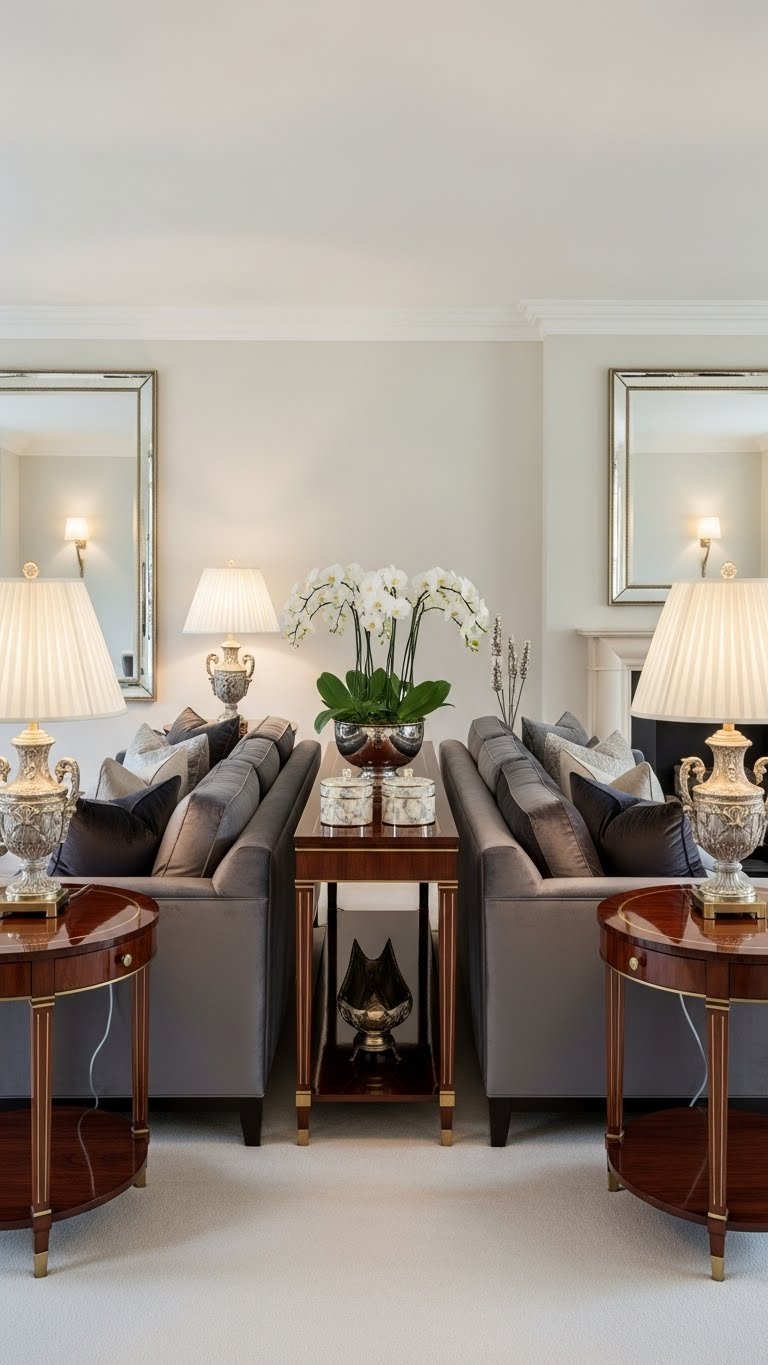
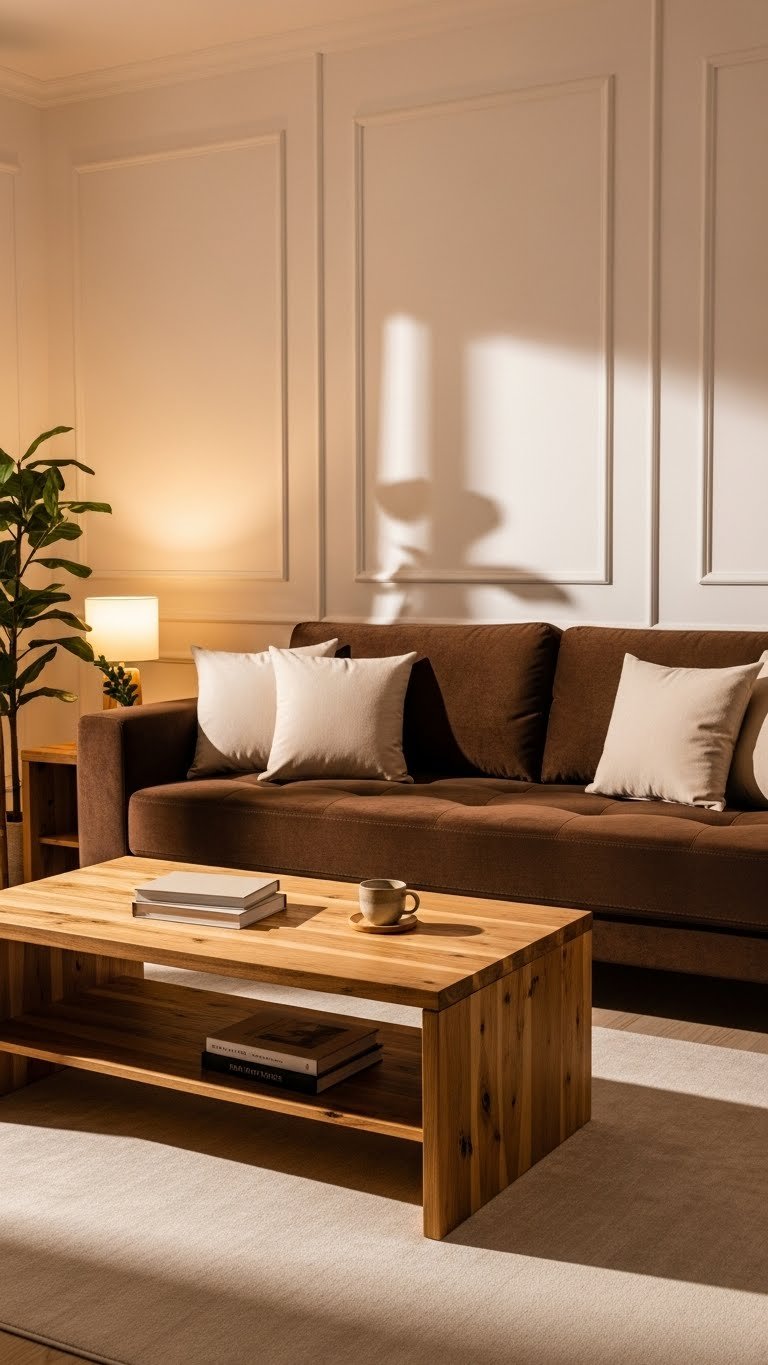
    27. Cream Walls with Deep Wood Tones and Warm Lighting

    Deep wood paired with cream creates contrast and drama without bold color. The warm lighting ties everything together into a cohesive, inviting space.

    Paint walls a cream like Benjamin Mason’s Swiss Coffee or Sherwin-Williams’ Alabaster. Source or keep deep wood furniture in walnut or dark oak—this creates visual weight and sophistication against cream. Install warm brass or copper lighting ($50–$200 per fixture from Wayfair, IKEA, or vintage sources). Paint is $30–$60. Lighting installation takes a few hours if you’re handy, or budget a professional electrician ($150–$300). This comes together over a weekend of painting plus lighting updates.

    Deep wood looks richer when surrounded by light colors—cream is the perfect neutral to showcase it.

    Your space becomes a sophisticated, welcoming gathering place that feels both warm and refined.


    SAVE THIS POST for your next room refresh, and bookmark the color that speaks to you. Pick one palette this weekend and try it with paint samples first—they’re free at most hardware stores and dry in hours, so you can live with the color before committing. Which neutral palette are you drawn to?